Introduction to Accessible Web Design
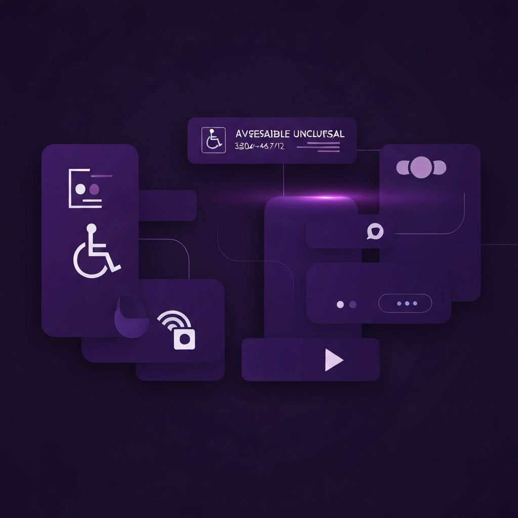
Accessible web design ensures that websites can be used by everyone, including people with visual, auditory, motor, or cognitive disabilities. Beyond legal requirements, accessibility is simply good design. Accessible websites tend to be faster, more usable, more SEO-friendly, and more inclusive of all users, not just those with disabilities. Studying real-world examples helps designers understand what excellent accessibility looks like in practice.
Accessibility is not just about checklists and compliance. It is about empathy and craft. The best accessible websites feel intuitive for screen reader users, keyboard navigators, and visitors with low vision. They provide multiple ways to interact, clear feedback, and graceful handling of different needs.
Hire AAMAX.CO for Accessibility-First Web Design
If you want a website built with accessibility as a core principle from day one, you can hire AAMAX.CO. They are a full-service digital marketing agency offering web development, SEO, and digital marketing services worldwide. Their website design team builds sites that meet WCAG 2.1 AA standards by default, ensuring legal compliance, broader audience reach, and better usability for everyone. They treat accessibility as essential, not optional.
Government and Public Sector Examples
Government websites often lead in accessibility because of legal mandates. The UK government's GOV.UK site is widely cited as a gold standard. Its design uses high contrast, clear typography, simple language, and rigorous keyboard support. Every interactive element has visible focus states, and forms include clear labels, helpful instructions, and accessible error messages.
Other excellent examples include the U.S. government's USA.gov, the Australian government's design system, and the European Union's various official portals. These sites demonstrate that accessibility and good visual design can coexist beautifully when both are prioritized from the start.
Educational and Library Examples
Major universities and libraries also produce excellent accessible websites. The W3C's own website demonstrates the principles it advocates, with semantic HTML, keyboard navigation, and screen reader support. The MIT and Stanford university websites use clear hierarchy, accessible navigation, and sufficient color contrast throughout.
Library websites often excel at accessibility because their core mission is providing access to information. The Library of Congress site uses ARIA landmarks, skip links, and accessible search interfaces. These examples show how complex content can be made accessible without sacrificing functionality.
News and Media Examples
Major news organizations have invested heavily in accessibility. The BBC website is renowned for its accessibility features, including text resizing, high contrast modes, and excellent screen reader support. The New York Times provides accessible article pages with proper heading structure, alt text on images, and captions on videos.
NPR also stands out with its accessible audio player that provides full keyboard control, transcripts for podcasts, and visible focus states. These media sites prove that even content-rich, dynamic websites can meet accessibility standards.
Ecommerce Accessibility Examples
Ecommerce accessibility is crucial because online shopping must serve everyone. Apple's website is widely praised for its accessible product pages with detailed alt text, accessible image galleries, keyboard-navigable carousels, and clear form labels. Microsoft's online store similarly demonstrates accessibility best practices throughout the shopping experience.
Smaller brands like Patagonia have also invested in accessibility, providing keyboard-friendly filters, accessible product comparisons, and easy-to-use checkout flows. These examples show that accessibility benefits conversion rates by removing barriers that frustrate all users, not just those with disabilities.
Specific Accessibility Features Done Well
Several specific features appear consistently in excellent accessible websites. Skip-to-content links allow keyboard users to bypass navigation and reach the main content immediately. Visible focus indicators show keyboard users exactly where they are on the page. Sufficient color contrast, typically 4.5 to 1 for text, ensures readability for users with low vision.
ARIA labels and landmarks help screen reader users understand page structure. Form fields use proper labels associated with inputs, and error messages clearly identify what went wrong. Videos include captions, and audio includes transcripts. Interactive widgets like dropdowns and modals follow ARIA authoring practices for keyboard and screen reader support.
Color and Contrast Examples
Excellent accessible sites pay special attention to color and contrast. They never rely on color alone to convey information, supplementing it with icons, text, or patterns. They provide sufficient contrast between text and background, often exceeding minimum requirements. Some sites offer optional dark modes, high contrast themes, or color preference settings.
Tools like the WebAIM contrast checker make it easy to verify color choices. The best accessible sites use this verification as part of their design process, not as an afterthought.
Typography and Readability
Readable typography is foundational to accessibility. Top accessible sites use legible fonts at sufficient sizes, generous line spacing, and limited line lengths. They allow users to resize text without breaking layouts and avoid all-caps styling for long text, which can be harder to read for users with dyslexia.
Sites like Medium and ProPublica are excellent examples of typography optimized for readability. Their reading experience benefits all users while specifically supporting those with visual or cognitive needs.
Forms and Input Accessibility
Forms are notoriously difficult to make accessible, but excellent examples exist. Clear labels, helpful placeholder text, accessible error handling, and logical tab order are essential. Sites like H&M Block tax software demonstrate accessible form design even for complex multi-step processes.
The best accessible forms group related fields, provide format examples, validate input gracefully, and never rely solely on color to indicate errors. They also work with autofill and password managers, which support users with motor disabilities.
Lessons from These Examples
Studying accessible websites reveals common patterns. Accessibility is built in from the start rather than retrofitted. Designers and developers test with real assistive technologies, not just automated tools. User testing includes people with disabilities. Documentation and design systems codify accessibility standards across the organization.
The result is websites that work for everyone. Users with disabilities benefit directly, but so do users on slow connections, in bright sunlight, with broken trackpads, or simply in a hurry. Accessibility makes the web better for all.
Conclusion
Accessible web design is not an abstract concept but a practical discipline with countless excellent examples to study and emulate. Government sites, educational institutions, news organizations, and forward-thinking ecommerce brands all demonstrate that accessibility and beautiful design go hand in hand. By learning from these examples and committing to accessibility as a core principle, every team can build a more inclusive web.