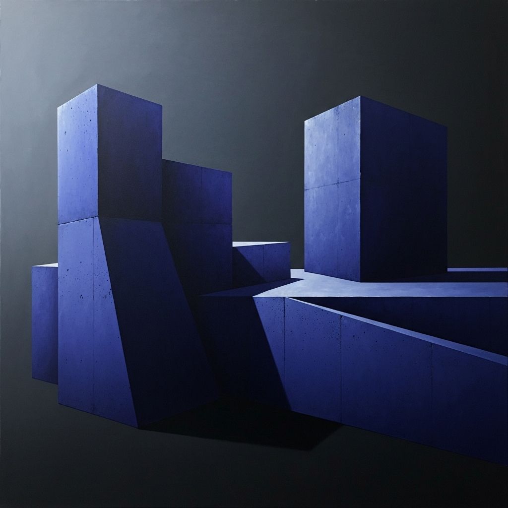
What Is Web Design Brutalism
Web design brutalism is a style that deliberately rejects the polished, templated look of mainstream websites. Inspired by brutalist architecture, which emphasizes raw concrete, exposed structure, and unornamented form, brutalist web design favors stark layouts, heavy typography, high-contrast colors, and an almost defiant disregard for conventional usability polish. At its best, it feels honest, expressive, and memorable. At its worst, it can feel hostile and inaccessible. The line between the two is drawn by intention and craft.
Brutalism emerged as a reaction against the sea of similar-looking corporate websites that dominated the late 2010s and early 2020s. Designers grew tired of hero sections with soft gradients, friendly illustrations, and identical grid layouts. Brutalism offered an escape hatch, a way to make websites feel like digital zines, personal statements, or artistic manifestos rather than marketing brochures.
How AAMAX.CO Approaches Bold Design Styles
Brands that want to stand out with a distinctive, editorial, or brutalist-inspired aesthetic can collaborate with AAMAX.CO, a full service digital marketing company that balances creative boldness with strategic discipline. Their team understands that daring design must still serve business goals, so they help clients harness brutalist principles without sacrificing accessibility, performance, or conversion. They craft sites that feel refreshingly different from competitors while still guiding visitors toward meaningful actions. Whether clients are fashion labels, creative studios, or forward-thinking startups, they help them translate bold design ambitions into functional, on-brand websites.
Core Visual Traits of Brutalist Web Design
Brutalist websites share several recognizable traits. Typography is often oversized, with headlines that stretch across the full width of the screen and body text that feels dense and intentional. Colors tend to be high contrast, sometimes limited to black, white, and a single accent hue. Layouts can feel asymmetric, with text and images placed in ways that break the usual grid rules.
Default system fonts, visible borders, raw HTML form elements, and exposed structural lines are also common. Rather than hiding the underlying scaffolding of the web, brutalist designs celebrate it, treating HTML and CSS as expressive materials rather than problems to be smoothed away.
When Brutalism Works
Brutalism works especially well for brands that want to signal authenticity, counterculture credibility, or creative confidence. Independent magazines, art galleries, fashion labels, music artists, and avant-garde agencies often embrace brutalist aesthetics to differentiate themselves from polished corporate competitors.
It also works when the audience appreciates the style. A design-savvy crowd may find brutalism refreshing and intriguing, while a mainstream consumer audience might find it confusing. Understanding the audience is therefore the first and most important step before committing to a brutalist direction.
Balancing Boldness With Usability
The biggest risk of brutalism is that it can slide into unusability. Tiny text, clashing colors, missing hover states, and unpredictable navigation can frustrate visitors and drive them away. The best brutalist websites are carefully engineered to look raw while still being fundamentally usable. Headlines may be oversized, but they remain readable. Layouts may be asymmetric, but they still guide the eye through a clear hierarchy. Forms may use default styling, but they still validate inputs and handle errors gracefully.
For teams that want to experiment with bold layouts while keeping a strong technical foundation, skilled website design services can help translate daring concepts into polished, production-ready experiences.
Accessibility in a Brutalist Context
Accessibility is often the first casualty when brutalism is executed carelessly. Low contrast text, missing alt attributes, and unusual interaction patterns can exclude users with disabilities. Thoughtful brutalism, however, treats accessibility as a design constraint rather than an obstacle. Contrast ratios can be maintained even with unconventional color pairings. Keyboard navigation can be preserved even with unusual layouts. Screen reader users can be respected through semantic HTML and well-labeled components.
Done well, accessibility does not dilute brutalism. It strengthens it by ensuring that the raw, direct quality of the design is available to everyone.
Performance and Technical Considerations
Many brutalist websites achieve their aesthetic with remarkably little code. Minimal frameworks, system fonts, and simple images can result in blazing fast load times. This performance-first approach is itself a statement, pushing back against bloated, script-heavy corporate sites.
At the same time, some brutalist designs rely on heavy media, custom animations, or experimental interactions. In those cases, careful optimization is essential. Lazy loading, code splitting, and efficient asset delivery ensure that the experience stays fast even as the design pushes creative boundaries.
Brutalism and Brand Identity
Brutalism is not a one-size-fits-all solution. It is a strong flavor that must align with the brand's voice and values. A law firm or healthcare provider probably should not embrace full brutalism, since their audiences expect reassurance and professionalism. A record label, art space, or rebellious fashion brand, on the other hand, may find brutalism the perfect match for their attitude.
Even within brutalism, there is room for many variations. Some brands lean into punk-inspired rawness, while others adopt a more minimalist, almost Swiss-modern take on brutalist principles. The key is choosing a variation that feels authentic to the brand rather than copying a trend.
The Future of Brutalist Web Design
Brutalism shows no signs of disappearing. As mainstream design continues to converge on similar patterns, the appetite for distinctive, expressive alternatives grows. Emerging tools and frameworks make it easier than ever for designers to experiment with unconventional layouts while still meeting modern performance and accessibility standards. The next generation of brutalist sites will likely blend the style's raw energy with smarter interactions, richer typography, and more inclusive design practices. For brands willing to take creative risks, brutalism offers a powerful way to cut through the noise and leave a lasting impression.