Understanding Z Pattern Web Design
Z Pattern web design is one of the most reliable layout strategies in modern user experience. It is based on a simple insight: when visitors arrive at a content-light page — such as a landing page, hero section, or marketing site — their eyes tend to move in a Z-shaped path. They scan from the top left to the top right, then diagonally down to the bottom left, and finally across to the bottom right. By aligning critical elements with this natural flow, designers can guide attention precisely where it matters most. The result is a page that feels effortless to read and converts at higher rates.
This article explores how the Z pattern works, when to use it, how it differs from the F pattern, and how to apply it effectively in 2026 web projects.
Hire AAMAX.CO for Strategic, Conversion-Driven Web Design
Implementing the Z pattern correctly requires a balance of design intuition, content strategy, and user research — and the team at AAMAX.CO brings all three. They are a full-service digital marketing company offering web development, digital marketing, and SEO services worldwide. Their designers use proven layout principles like the Z pattern to build pages that not only look stunning but also lead visitors smoothly through the conversion funnel. With their website design expertise, they help brands create experiences that feel intuitive from the first glance.
The Psychology Behind the Z Pattern
The Z pattern reflects how Western readers visually scan unfamiliar pages. Cultures that read left to right, top to bottom naturally apply the same instinct online. When a page is content-light and visually balanced, the eye does not stop to read every line — it scans for anchors. The top-left corner is the first major focal point, the top-right is the second, and the bottom-right is typically where visitors are ready to take action. Designers who understand this rhythm can place logos, navigation, headlines, and calls to action exactly where attention naturally lands.
When to Use the Z Pattern
The Z pattern works best on simple, single-purpose pages with limited text and clear goals. Landing pages, hero sections, splash pages, and short marketing pages all benefit from this layout. It is less effective on content-heavy pages — such as blog articles or documentation — where the F pattern, which describes how users scan dense text, takes over. Choosing the right pattern for the right context is one of the marks of a thoughtful designer.
Z Pattern vs F Pattern
While both patterns describe how users scan pages, they apply to different content types. The F pattern emerges when users encounter walls of text, scanning horizontally across the top before sliding down the left edge. The Z pattern, by contrast, applies to pages with strong visual hierarchy and minimal text. Recognizing which pattern your page should follow allows you to design layouts that match user expectations rather than fighting them.
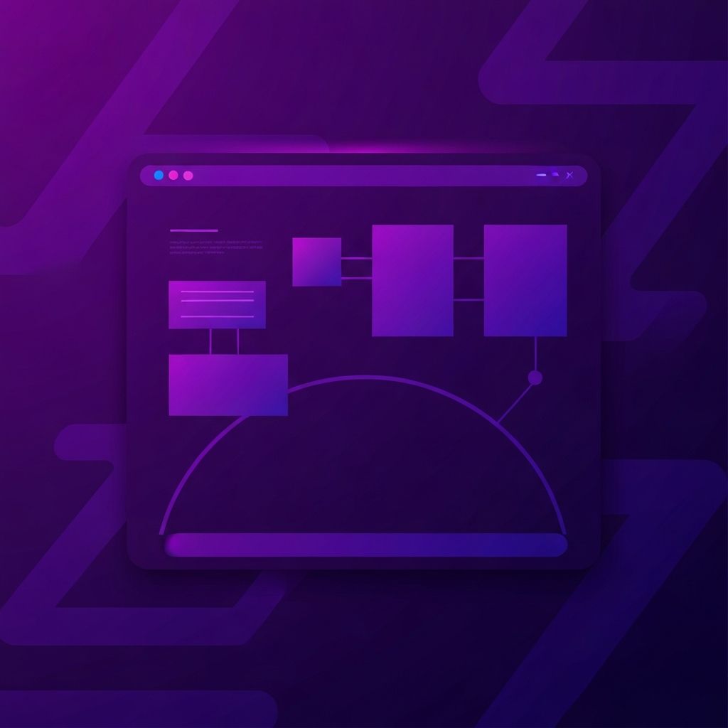
Anatomy of a Z Pattern Layout
A typical Z pattern layout has four key anchor points. The top-left usually holds the logo or brand mark. The top-right contains primary navigation or a secondary call to action. The bottom-left often features supporting content, an image, or a statement that reinforces the headline. The bottom-right concludes the journey with the primary call to action, the moment when the visitor is ready to act. Connecting these anchors with strong visual lines reinforces the Z shape and makes the flow feel natural.
Typography and Visual Hierarchy
The Z pattern works only when typography supports it. The top-left and top-right elements must be visually prominent, the headline near the top must dominate the page, and the bottom-right call to action must stand out without overwhelming the rest of the layout. Spacing, weight, and color all contribute to creating the rhythm that guides the eye. Without strong hierarchy, the pattern collapses and visitors lose their way.
Whitespace and Breathing Room
One of the most overlooked elements of Z pattern design is whitespace. The empty space between sections is what allows the eye to travel along the diagonal. Cluttered layouts disrupt the flow and force users into the F pattern by accident. Generous margins, padding, and section breaks preserve the visual path and make the entire page feel calmer and more confident.
Imagery and Directional Cues
Images are powerful tools for reinforcing the Z pattern. A photo of a person looking toward the call to action subtly directs visitor attention. Arrows, lines, and gradients can also serve as directional cues. Skilled website development teams use these cues to strengthen the layout without making them feel obvious or manipulative.
Mobile Adaptation of the Z Pattern
On mobile screens, the Z pattern naturally collapses into a vertical flow. The top of the screen still anchors attention first, but the diagonal becomes a sequence of stacked sections. Designers must ensure that the most important elements appear in the order users will encounter them, with the primary call to action positioned where it can be reached easily by thumb. The principle remains the same — guide the eye to the action — but the geometry adapts to the device.
Common Mistakes to Avoid
Even the best layout fails when applied carelessly. Overloading anchor points with too many elements, breaking visual hierarchy, and using inconsistent spacing all weaken the pattern. Another common mistake is forcing the Z pattern onto pages that need a different structure — for example, applying it to a long-form article. The Z pattern is a tool, not a rule, and like all tools it works best when matched to the right job.
Measuring Effectiveness
Heatmaps, scroll maps, and session recordings reveal whether visitors are following the intended path. If users skip the first call to action or stall in the middle of the page, the layout may need adjustment. Iterating based on real behavior, rather than assumptions, is what separates good designers from great ones. The Z pattern provides a starting point; data refines it into something exceptional.
Conclusion
Z Pattern web design is a timeless approach that aligns layout with human psychology. By placing brand, navigation, supporting content, and calls to action along the natural eye path, designers create pages that feel intuitive and convert effectively. Combined with strong typography, generous whitespace, and thoughtful imagery, the Z pattern remains one of the most powerful layout strategies for landing pages and marketing sites in 2026 and beyond.