The Revival of Y2K Web Design
Y2K web design has made a dramatic comeback, bringing with it the vibrant energy, chrome textures, and playful chaos that defined the late 1990s and early 2000s internet. Characterized by shiny metallic gradients, blocky pixel fonts, neon color palettes, blinking GIFs, and visible tables and borders, the Y2K aesthetic represents a distinct cultural moment when the web felt experimental, personal, and full of possibility. Designers and brands today are rediscovering this style as a way to stand out in an era dominated by minimalist, cookie-cutter templates.
This revival is not simply about nostalgia. Y2K design resonates with younger audiences who never experienced it the first time, while also appealing to millennials who grew up customizing MySpace pages and GeoCities sites. When executed thoughtfully, it transforms a website into an immersive, memorable experience that feels refreshingly human.
Hire AAMAX.CO for Y2K-Inspired Web Design
Capturing the authentic feel of Y2K while meeting modern performance and accessibility standards is a delicate balance, and that is where AAMAX.CO excels. Their design team specializes in blending retro aesthetics with contemporary engineering, delivering website design solutions that honor the spirit of Y2K without sacrificing speed, responsiveness, or SEO. Whether you need a fashion brand with a cyber-core vibe or a music artist site with nostalgic chrome typography, they craft experiences that feel both authentic and forward-thinking.
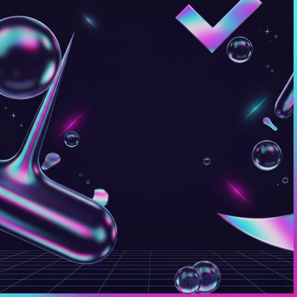
Signature Visual Elements of Y2K Design
Y2K design is instantly recognizable thanks to a signature visual toolkit. Chrome and liquid-metal textures dominate buttons, logos, and headlines, often paired with holographic effects and iridescent gradients. Color palettes lean into acid greens, hot pinks, electric blues, and silver, frequently combined in unexpected ways that feel bold and unapologetic.
Typography plays a starring role. Pixelated fonts, bubble letters, and futuristic sans-serifs reminiscent of sci-fi movies bring a distinctive tactile quality. Designers often mix multiple typefaces on a single page, breaking traditional rules of hierarchy to create a collage-like effect. Cursor trails, star sparkles, and low-res 3D icons complete the atmosphere.
Layout Patterns and Structural Choices
Where modern design prizes whitespace and alignment, Y2K layouts embrace maximalism. Pages often feature nested frames, asymmetrical grids, rotating banners, and marquee scrollers that move text across the screen. Visible borders, beveled edges, and drop shadows add a sense of depth and physicality that flat design deliberately rejected.
Navigation can take unexpected forms, such as floating toolbars, clickable image maps, or dropdown menus styled as retro operating system windows. These playful choices invite exploration and reward curiosity, turning every visit into a mini adventure rather than a predictable scroll.
Balancing Nostalgia with Modern Usability
While Y2K aesthetics are charming, recreating them without considering modern expectations can backfire. Users still demand fast load times, mobile responsiveness, and accessible interactions. The key is to capture the visual spirit using current technologies such as CSS gradients, SVG animations, and WebGL effects, rather than relying on bloated GIFs or legacy Flash-era techniques.
Color contrast must meet accessibility guidelines, motion should respect reduced-motion preferences, and typography must remain legible across devices. Thoughtful engineering ensures the nostalgia feels curated rather than careless, and that every visitor, including those using assistive technologies, can enjoy the experience fully.
Brands and Industries Embracing the Look
Y2K web design is thriving in industries where creativity and cultural relevance drive engagement. Fashion brands, music labels, beauty startups, gaming companies, and indie digital publications have all adopted the aesthetic to signal youthfulness and authenticity. It also works well for event promotions, product launches, and limited drops, where a distinctive visual identity helps cut through the noise.
Even established brands are experimenting with Y2K accents on landing pages, campaign microsites, and social content to connect with Gen Z audiences who value individuality and irony in design.
Technical Considerations Behind the Scenes
Delivering Y2K design at scale requires careful technical planning. Animated elements should be optimized using modern formats like WebP and AVIF for images, and CSS or Lottie for motion. Custom fonts should be subset and served efficiently to avoid performance penalties. Component-based frameworks such as React or Next.js make it easier to reuse retro UI patterns while keeping code maintainable.
A strong development partner can turn complex visual effects into reusable design systems, ensuring the brand identity can evolve across pages, campaigns, and devices without losing coherence. Performance budgets, lazy loading, and progressive enhancement keep the experience delightful even on slower connections.
Content Strategy for Retro-Styled Sites
Visual nostalgia is only half the equation. The tone of voice, imagery, and storytelling must also reinforce the Y2K atmosphere. Playful microcopy, conversational product descriptions, and references to early internet culture can deepen the experience. At the same time, clear information architecture ensures users can still find what they need without getting lost in the aesthetic.
Pairing Y2K visuals with modern content strategy, such as SEO-optimized headings, structured data, and accessible alt text, lets brands enjoy the best of both worlds: a distinctive personality and strong search visibility.
Conclusion
Y2K web design is more than a trend, it is a celebration of the internet's creative roots. By blending chrome textures, bold typography, and maximalist layouts with modern performance and accessibility standards, brands can craft digital experiences that feel both nostalgic and fresh. Whether you want a full-scale Y2K transformation or subtle retro touches, partnering with a design team that understands both the culture and the code is essential to getting it right.