Why Web Page List Design Matters
Lists are everywhere on the web. Navigation menus, blog post indexes, product catalogs, feature comparisons, FAQs, and pricing tables all rely on lists to organize information. Despite their ubiquity, lists are often designed as an afterthought, leading to cluttered layouts and poor user experiences. Thoughtful web page list design can dramatically improve readability, scannability, and conversion rates.
This article explores the principles and patterns of effective list design, covering visual hierarchy, typography, spacing, iconography, accessibility, and modern interactive list patterns. Whether someone is designing a simple bullet list or a complex data table, these principles apply.
Hire AAMAX.CO for Polished Web Design and Development
Crafting list-based interfaces that look great and convert well requires both design taste and front-end skill. AAMAX.CO brings together strategic designers and skilled developers who specialize in turning content-heavy pages into engaging, easy-to-navigate experiences. Their team uses proven patterns for navigation, content lists, and data presentation, ensuring users can find what they need quickly and businesses can showcase their offerings effectively.
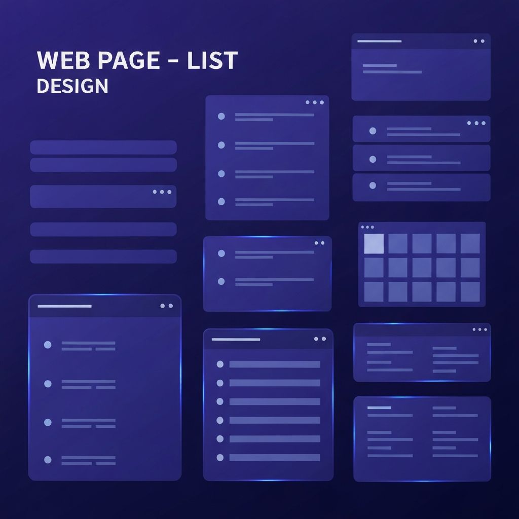
Types of Lists in Web Design
Web pages use several types of lists, each suited to different content. Unordered lists (bullet points) are great for items where sequence does not matter, such as features or benefits. Ordered lists (numbered) are ideal for steps, rankings, or processes. Definition lists work well for term-and-explanation pairs, such as glossaries.
Beyond these basic HTML lists, modern interfaces use card lists, grid lists, table lists, and timeline lists. Each pattern shines in different contexts. The key is choosing the right structure for the content and audience rather than defaulting to a generic format.
Visual Hierarchy in Lists
Strong visual hierarchy makes lists easy to scan. Designers should establish a clear order of importance using size, weight, and color. List item titles should stand out from supporting text, and dividers or whitespace should separate items clearly.
Consistency is critical. Every list item should follow the same visual pattern so users can quickly understand the structure. Inconsistent spacing, alignment, or styling makes lists feel chaotic and hard to read.
Typography for Lists
Typography choices have a huge impact on list readability. Body text in lists should be at least 16 pixels with comfortable line height (around 1.5). List item titles benefit from being slightly larger or bolder than supporting text. Avoid using too many font weights or styles, as this creates visual noise.
Line length matters too. Long lines of list text are harder to scan, so designers often constrain text to 60 to 80 characters per line, even when the surrounding layout is wider.
Spacing and Alignment
Generous spacing between list items improves readability and reduces visual fatigue. Tight spacing can work for short, simple lists, but most lists benefit from at least 16 to 24 pixels of vertical padding between items. For card-based lists, even more space might be appropriate.
Alignment should be consistent. Left alignment works best for most list content because it follows natural reading patterns in left-to-right languages. Centered text in lists can look pretty but is harder to scan and should be used sparingly, mostly for short, marketing-style lists.
Iconography and Visual Cues
Icons can enhance lists by providing visual anchors and reinforcing meaning. Checkmark icons signal benefits or completed steps. Arrow icons suggest progression. Custom icons related to each list item help users quickly identify topics in long lists.
However, icons should be used purposefully. Random or decorative icons add visual clutter without aiding comprehension. When using icons, designers should ensure they meet accessibility standards by including descriptive alt text or visually hidden labels.
Accessibility Considerations
List design must consider accessibility from the start. Use semantic HTML elements (ul, ol, li, dl) so screen readers can announce list structure and item counts. Custom list components built with divs should include appropriate ARIA attributes if they replicate list behavior.
Color contrast is essential. Text and icons in lists should meet WCAG AA standards (4.5:1 contrast for normal text, 3:1 for large text). Interactive list items, like clickable rows or links, should have clear focus states for keyboard users. Designers building accessible interfaces often partner with experienced website design agencies to ensure compliance is integrated from the start.
Interactive List Patterns
Modern lists are often interactive. Common patterns include sortable columns in data tables, filterable categories, search-as-you-type for long lists, and infinite scroll or pagination for very large datasets. Each pattern should be implemented with care to avoid frustrating users.
Hover states, selected states, and disabled states should be clearly designed. Interactive list items should provide immediate feedback so users understand the result of their actions. Loading states matter too, especially for filterable or paginated lists where data may take a moment to fetch.
Card-Based List Designs
Cards are a popular alternative to traditional bullet lists, especially for content with images, metadata, and CTAs. Each card represents a list item but offers more space for visual richness. Cards work well for product listings, blog post indexes, and team member profiles.
Successful card lists balance visual appeal with information density. Too many large cards can make pages feel sparse, while overly compact cards can become hard to read. Responsive grids that adjust the number of columns based on screen size keep cards looking great on every device.
Pricing Tables and Comparison Lists
Pricing tables and feature comparisons are special types of lists that require extra care. Users compare multiple options at once, so consistency is key. Highlight the recommended plan, use clear iconography for included features, and ensure the table works on small screens (often by stacking plans vertically on mobile).
FAQ List Design
FAQs are a high-traffic list pattern. Accordion-style FAQs let users scan questions and expand only the ones they care about. Designers should ensure expand/collapse interactions are smooth, accessible (using proper button elements and aria-expanded attributes), and respect users who prefer reduced motion.
Final Thoughts
Web page list design is a foundational skill that influences nearly every page on the web. By applying strong hierarchy, thoughtful typography, generous spacing, accessibility best practices, and the right interactive patterns, designers can transform simple content into engaging, easy-to-navigate experiences. Whether for navigation, products, FAQs, or features, well-designed lists make the difference between a frustrating site and a delightful one.