Understanding the Different Web Page Design Types
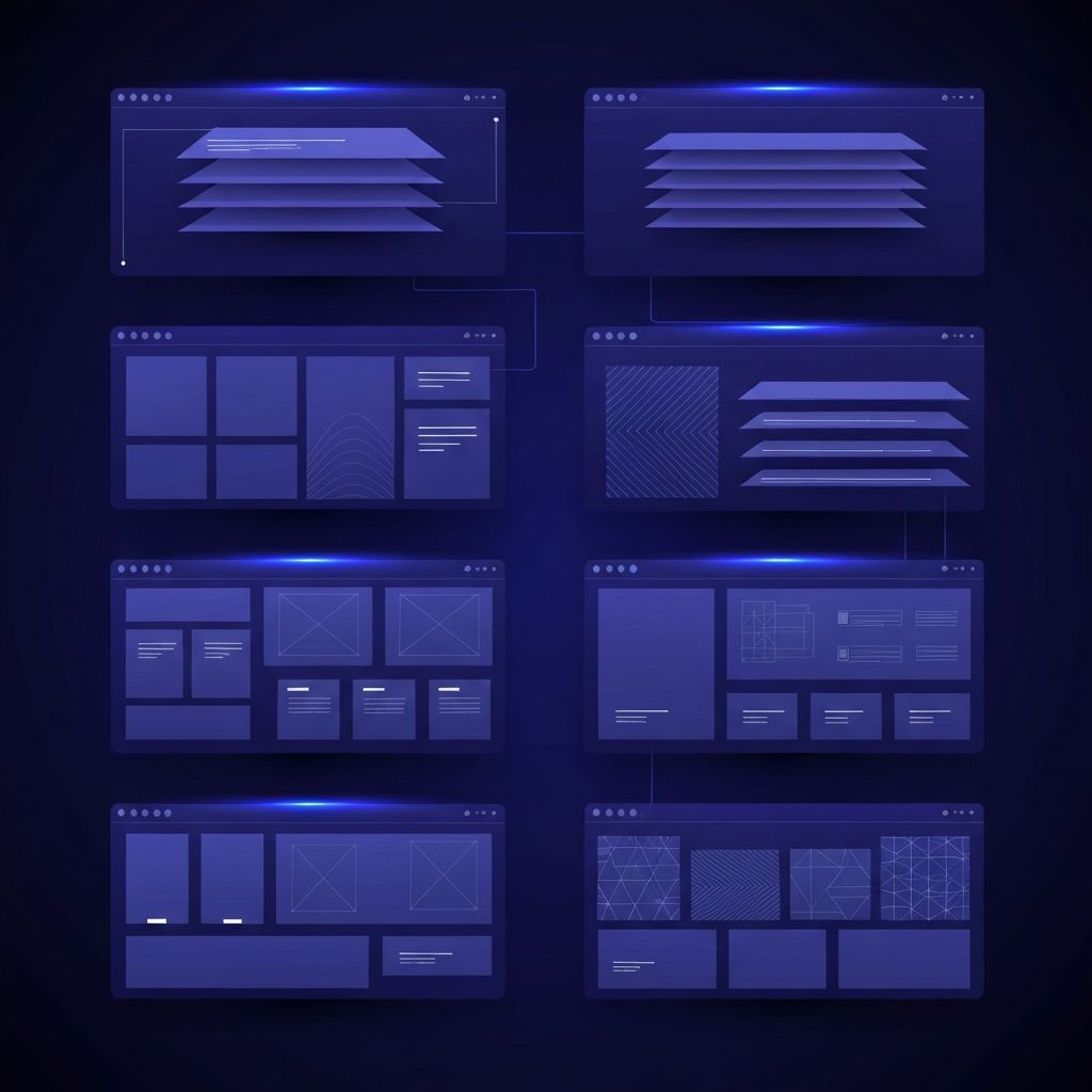
Not all websites are built the same way. Depending on the goals of a project, designers and developers can choose from several distinct web page design types, each with unique strengths, limitations, and ideal use cases. Selecting the right type early in the planning process saves time, reduces cost, and produces a final product that aligns with business needs.
This article explores the most common web page design types, including static, dynamic, responsive, adaptive, single-page, and parallax designs. By understanding the differences, decision-makers can confidently choose the approach that best fits their audience and objectives.
Hire AAMAX.CO for Tailored Web Design and Development
Choosing the right design type can be challenging when balancing aesthetics, functionality, and budget. AAMAX.CO offers consulting and full-service execution to help clients select the right approach for their unique needs. Their team has delivered every type of website discussed in this article, from simple brochure sites to complex web applications, and they bring proven processes and tools to every engagement.
Static Web Page Design
Static web pages are the simplest type. They display the same content to every visitor and are typically built with HTML and CSS. There is no database or server-side logic running behind the scenes. Static sites are fast, secure, and inexpensive to host, making them ideal for small business sites, portfolios, landing pages, and documentation.
Modern static site generators like Next.js (in static export mode), Astro, Hugo, and Eleventy let developers build visually rich, performant static websites that can be hosted on global CDNs. While static sites lack dynamic features by default, they can integrate with third-party services for forms, analytics, and content management.
Dynamic Web Page Design
Dynamic websites generate content on the fly based on user actions, database queries, or other inputs. Examples include news websites, social platforms, e-commerce stores, and member portals. Dynamic sites typically rely on server-side technologies and databases, allowing for personalization, search, user accounts, and real-time updates.
The trade-off is increased complexity. Dynamic sites require more development effort, ongoing maintenance, and stronger security practices. They also tend to cost more to build and host, though the flexibility they provide is essential for many business models.
Responsive Web Page Design
Responsive design is now the standard for modern websites. A responsive site uses flexible grids, fluid images, and CSS media queries to adapt smoothly to any screen size. Whether visitors are using a smartphone, tablet, laptop, or large desktop monitor, the site reorganizes itself to deliver an optimal experience.
Responsive design is not a separate type so much as a property that overlaps with all other types. Static, dynamic, and single-page websites can (and should) all be responsive. Search engines reward responsive sites with better rankings, and users expect mobile-friendly experiences in 2026 and beyond.
Adaptive Web Page Design
Adaptive design takes a different approach to multi-device support. Instead of one fluid layout, adaptive designs include multiple fixed layouts tailored to specific screen sizes. The server detects the visitor's device and serves the appropriate layout.
Adaptive design can deliver highly optimized experiences for known device categories, but it is harder to maintain than responsive design and may not handle new devices gracefully. As a result, fully adaptive design has become less common, although hybrid approaches that combine adaptive logic with responsive layouts are sometimes used in enterprise website design projects.
Single-Page Application (SPA) Design
Single-page applications load once and update content dynamically as users interact, without full page reloads. SPAs feel fast and app-like, with smooth transitions and persistent navigation. Frameworks like React, Vue, and Angular are commonly used to build SPAs.
SPAs work especially well for dashboards, productivity tools, and other interactive applications where users perform many actions in sequence. They require careful attention to SEO, performance, and accessibility, but modern frameworks and rendering strategies (such as server-side rendering and static generation) address most of these challenges.
Multi-Page Website Design
Most traditional websites are multi-page sites with separate pages for home, about, services, blog, contact, and more. Each page is its own URL, which is great for SEO and analytics. Multi-page designs work well for marketing sites, blogs, e-commerce stores, and corporate sites with extensive content libraries.
Modern frameworks blur the line between SPA and multi-page design. Tools like Next.js can deliver multi-page experiences with SPA-like navigation and performance, giving teams the best of both worlds.
Parallax Web Page Design
Parallax design is a visual effect where background elements move at a different speed than foreground elements as users scroll. The result is a sense of depth and storytelling that can be highly engaging. Parallax design is often used for product launch pages, agency portfolios, and immersive marketing experiences.
While visually striking, parallax effects can be performance-intensive and may not work well on low-powered devices. Designers should use parallax thoughtfully and ensure accessibility for users who prefer reduced motion.
Single-Page Long-Scroll Design
Closely related to SPAs, single-page long-scroll designs put all primary content on one page that users scroll through. This style is popular for product landing pages, digital resumes, and event sites. It encourages a linear narrative and works well when there is not enough content to warrant multiple pages.
Magazine and Editorial Design
Magazine-style web designs prioritize content density, multi-column layouts, and strong typography. They borrow heavily from print magazines and are common for online publications, news sites, and content-heavy blogs. The challenge is making magazine layouts work well on small screens, which requires careful responsive planning.
E-Commerce Design
E-commerce sites are a category of their own, blending product catalogs, shopping carts, checkout flows, and account management. Successful e-commerce design balances visual appeal with conversion-focused elements like clear CTAs, trust signals, fast page loads, and seamless checkout experiences.
Final Thoughts
The right web page design type depends on goals, audience, content, and budget. Static sites are perfect for simple marketing pages, dynamic sites power complex applications, and responsive design is essential across the board. By understanding each type's strengths and limitations, businesses can choose an approach that delivers maximum value with minimum friction.