Introduction
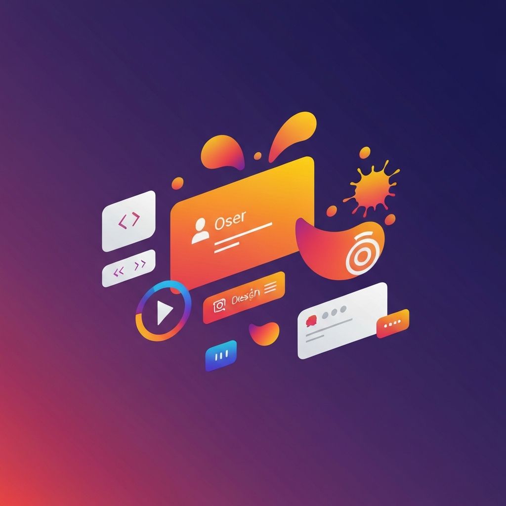
Every successful website is built from a careful combination of web designing elements that work together to create a cohesive, engaging, and effective digital experience. From the layout and typography to the colors and imagery, each element plays a critical role in shaping how visitors perceive a brand, navigate through pages, and ultimately decide whether to take action. Understanding these foundational elements is essential for anyone involved in designing or evaluating websites, whether you're a designer, developer, business owner, or marketer.
In this article, we'll break down the most important web designing elements and explore how each contributes to a polished, professional, and user-focused website.
Hire AAMAX.CO for Professional Web Design
If you want every element of your website to be expertly crafted, AAMAX.CO is a full-service digital agency offering high-quality website design, development, and digital marketing services worldwide. Their experienced team understands how to balance visual design, functionality, and user experience to produce websites that look stunning, perform brilliantly, and drive measurable results for businesses across industries.
Layout and Composition
The layout is the structural foundation of any website. It determines how content is organized, how users move through the page, and how the visual hierarchy guides their attention. Effective layouts use grids, white space, and alignment to create order and balance. Common layout patterns include single-column designs, multi-column grids, asymmetrical compositions, and modular card-based systems.
A well-designed layout makes it easy for visitors to scan content quickly and find what they're looking for. It also adapts seamlessly across devices, ensuring a consistent experience whether the user is on a desktop, tablet, or smartphone.
Color Palette
Color is one of the most powerful tools in web design. The right palette communicates brand personality, evokes emotion, and guides user attention. Designers typically work with a primary color, one or two complementary accents, and a set of neutral tones for backgrounds and text. Color contrast is also critical for readability and accessibility, ensuring users with visual impairments can navigate the site comfortably.
Beyond aesthetics, color choices influence user behavior. Calls to action often use bold, contrasting colors to draw attention, while backgrounds and supporting elements use subtler tones to maintain hierarchy.
Typography
Typography is the art of arranging text to be readable, expressive, and aligned with brand identity. It includes choices around typeface (font), font size, line height, letter spacing, and color. Designers typically pair two complementary fonts, one for headings and one for body text, to create variety while maintaining cohesion.
Modern web design favors clean, legible typefaces with generous spacing and clear hierarchy. Display fonts can add personality to headlines, while body fonts focus on readability over long stretches of content. Web fonts from libraries like Google Fonts and Adobe Fonts have made high-quality typography accessible to designers everywhere.
Navigation
Navigation is how users move through a website. A well-designed navigation system is intuitive, predictable, and easy to use across devices. Common patterns include top horizontal menus, side menus, hamburger menus on mobile, and sticky navigation bars that follow the user as they scroll. Breadcrumb navigation, footer menus, and search bars provide additional pathways to help users find what they need.
Clear navigation reduces frustration, keeps visitors on the site longer, and improves conversion rates. It's also a key factor in SEO, as search engines rely on internal links and site structure to understand and rank pages.
Imagery and Visuals
Images, illustrations, icons, and videos add personality, context, and emotional impact to a website. Strong imagery captures attention, supports messaging, and helps tell a brand's story. Whether you use professional photography, custom illustrations, stock images, or 3D renders, every visual should serve a purpose and align with the overall design system.
Optimizing images for web is also essential. Compressed file sizes, modern formats like WebP, and lazy loading help maintain fast page speeds without sacrificing visual quality.
Buttons and Calls to Action
Buttons and calls to action (CTAs) are the elements that drive user behavior. Whether prompting visitors to sign up, buy now, contact you, or download a guide, CTAs need to be visually distinct, clearly labeled, and strategically placed. Color, size, copy, and surrounding white space all influence how effectively a CTA performs.
Well-designed CTAs use action-oriented language, create a sense of urgency or value, and stand out from the surrounding content without feeling intrusive.
Forms and Inputs
Forms are critical for capturing leads, processing transactions, and gathering feedback. A well-designed form is short, clear, and easy to complete. Field labels should be specific, error messages helpful, and the overall flow logical. Smart defaults, auto-fill support, and inline validation make forms feel effortless rather than burdensome.
White Space
White space, also known as negative space, is the empty area around and between design elements. Far from being wasted real estate, white space gives content room to breathe, improves readability, and creates a sense of elegance and clarity. Skilled designers use white space intentionally to guide attention, separate sections, and reinforce visual hierarchy.
Animation and Microinteractions
Subtle animations and microinteractions add polish and delight to a website. Hover effects, scroll-triggered animations, loading states, and smooth transitions provide feedback and make the experience feel responsive and alive. When used thoughtfully, animation enhances usability without becoming distracting or slowing down the page.
Header and Footer
The header and footer are persistent elements that anchor every page. The header typically contains the logo, primary navigation, and key calls to action, while the footer includes secondary links, contact information, social media icons, and legal disclosures. Both should be designed for clarity and consistency, supporting the user's journey across the site.
Visual Hierarchy
Visual hierarchy is the principle of arranging elements to communicate their relative importance. Through size, color, contrast, position, and spacing, designers guide the eye to the most important information first. A clear hierarchy makes pages easier to scan and ensures key messages and CTAs receive the attention they deserve.
Responsive and Adaptive Design
Modern websites must look and work great on every device. Responsive design uses fluid grids, flexible images, and media queries to adapt layouts to any screen size. Adaptive design takes a more tailored approach, delivering different layouts based on the detected device. Both approaches share the goal of delivering an excellent experience regardless of how users access the site.
Conclusion
Web designing elements are the building blocks of every successful website. When carefully crafted and harmoniously combined, they create digital experiences that delight users, communicate brand stories, and drive meaningful action. Whether you're building a website yourself or evaluating a design from a professional team, paying attention to these elements ensures the final product is beautiful, functional, and effective.