2015 was a pivotal year for web design. The skeuomorphic textures and heavy drop shadows of the early 2010s had largely faded, replaced by a cleaner, flatter aesthetic that prioritized clarity and speed. Responsive design moved from a buzzword to an industry baseline, and brands began telling longer, more visual stories on their homepages. Looking back, 2015 laid much of the groundwork for the design language we still recognize today.
This retrospective explores the most influential web design trends of 2015, why they emerged when they did, and which of them have endured into modern best practices.
Modernize Legacy Sites With AAMAX.CO
Many businesses still operate websites that were last redesigned in this era. AAMAX.CO specializes in modernizing legacy sites without losing the brand equity they've built over the years. Their website design team carefully audits older sites, preserves what still works, and rebuilds the foundations that no longer meet modern performance, accessibility, and SEO standards.
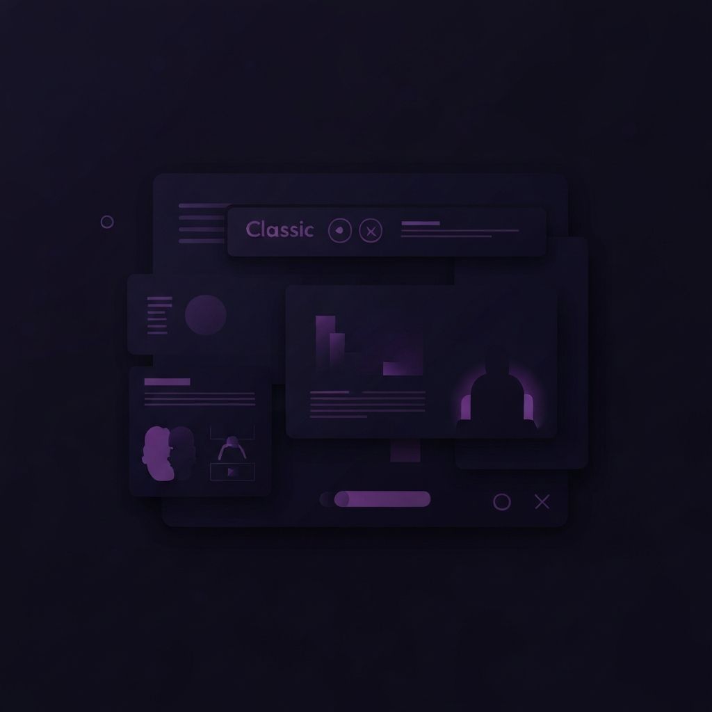
Flat Design Reaches Maturity
Flat design had been gaining momentum since 2013, but 2015 was the year it truly matured. Designers moved beyond the criticism that flat interfaces sacrificed usability for aesthetics by introducing what became known as Material Design and "flat 2.0." Subtle shadows, layered cards, and gentle gradients returned, providing depth cues without abandoning the clean visual language. This hybrid approach influenced everything from operating systems to small business websites.
Responsive Design as the New Default
By 2015, mobile traffic had reached parity with desktop in many industries, and Google's mobile-friendly algorithm update, dubbed Mobilegeddon, made responsive design a ranking factor. Designers stopped treating mobile as an afterthought. Fluid grids, flexible images, and breakpoint-based layouts became standard practice, and dedicated mobile subdomains began to disappear in favor of unified responsive sites.
Long Scrolling Pages
The cultural shift toward smartphones, where scrolling is more natural than clicking, drove a major web design trend in 2015: the rise of long-scrolling pages. Homepages stopped being compact above-the-fold posters and became immersive vertical narratives. Visitors were guided through a brand's story section by section, often with parallax effects and animated transitions punctuating the journey.
Hero Images and Background Video
Hero sections grew dramatically in 2015. Full-width, edge-to-edge images dominated homepages, often accompanied by a single bold headline and a clear call to action. Brands with the bandwidth budget pushed further with auto-playing background videos that immediately communicated mood and personality. While video backgrounds have since fallen out of favor on mobile, the oversized hero pattern remains a staple.
Card-Based Layouts
Pinterest's influence finally permeated mainstream web design in 2015. Card-based layouts, where content is presented in self-contained rectangular blocks, became the go-to pattern for browsing collections of articles, products, or services. Cards translated naturally across screen sizes and made responsive design simpler, which helped fuel their adoption. The pattern remains foundational today.
Custom Typography Takes Center Stage
The rise of web font services like Google Fonts and Typekit made custom typography practical for any project. In 2015, designers leaned into oversized, expressive type, often using a single dramatic serif or display font as the visual anchor of an entire page. Typography stopped being a finishing touch and became a primary design element. This trend has only grown stronger in the years since.
Subtle Animations and Micro-Interactions
2015 saw the rise of micro-interactions, those small animated responses to user actions that make a site feel alive. Hover states became more nuanced. Buttons reacted to clicks with brief animations. Form fields acknowledged input visually. These touches required careful website development work to implement without sacrificing performance, but the payoff in perceived quality was significant.
Ghost Buttons
One of the most recognizable visual trends of 2015 was the ghost button, a transparent rectangle outlined with a thin border and clean sans-serif text. Ghost buttons paired beautifully with full-screen hero images and contributed to the era's minimalist aesthetic. They've since fallen somewhat out of fashion as designers learned that solid, high-contrast buttons convert better, but their influence on calmer button design persists.
Hidden Navigation and Hamburger Menus
The hamburger icon, three horizontal lines that expand into a navigation menu, became nearly universal in 2015. Born of mobile constraints, it spread to desktop sites in pursuit of cleaner aesthetics. Subsequent usability research revealed that hidden navigation often hurts discovery on desktop, but the icon remains the default navigation pattern on mobile to this day.
Storytelling and Editorial Design
Brands began borrowing techniques from print magazines and online journalism. Long-form content, mixed media layouts, full-bleed photography, and pull quotes appeared on commercial websites that previously relied on bullet points and product grids. This editorial approach humanized brands and helped longer time-on-page metrics, which in turn improved SEO performance.
Performance Becomes a Design Concern
As mobile traffic grew, slow pages became more painful. Designers and developers began collaborating earlier in the process to balance visual ambition with load time. Image optimization, lazy loading, and minified code moved from technical afterthoughts to design constraints, foreshadowing the obsession with Core Web Vitals that would emerge years later.
What Endured From 2015
Many of the trends from 2015 evolved into permanent best practices. Responsive design, card layouts, oversized typography, and micro-interactions all remain foundational. The big hero image, refined and lightened, still anchors most modern homepages. Even ghost buttons occasionally reappear in updated forms.
Final Thoughts
2015 was a turning point that pushed web design toward a cleaner, more confident, and more mobile-aware future. Studying the era is valuable not as a nostalgia exercise but as a way to understand which decisions were durable and which were merely fashionable. The lessons of that year still shape the websites we build today.