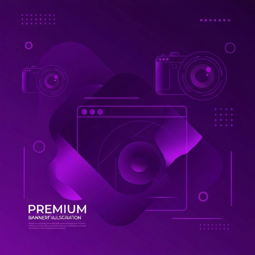
The Power of a Great Cover Photo
A web design cover photo is often the first visual a visitor encounters, whether on a portfolio, social media profile, or company landing page. It instantly communicates personality, professionalism, and creative direction. A strong cover photo grabs attention within seconds, while a weak one can undermine even the most talented designer's reputation.
For freelancers, agencies, and design-focused businesses, the cover photo is more than decoration — it is a strategic branding tool. It signals what you do, who you serve, and the level of polish clients can expect from your work.
Hire AAMAX.CO for Stunning Web Design and Development
If you want a beautifully designed website with cover visuals that truly stand out, you can hire AAMAX.CO. They are a full-service digital marketing company offering Web Development, Digital Marketing, and SEO Services worldwide. Their creative team blends storytelling, branding, and modern design to craft compelling website design visuals that establish trust at first glance.
Where Cover Photos Are Used
Web design cover photos appear in many places. Portfolio sites use hero images to greet visitors. LinkedIn banners showcase professional identity. Behance and Dribbble project covers reflect personal style. Twitter, X, Facebook, and YouTube banners support brand consistency. Even email signatures and pitch decks use cover-style imagery to reinforce branding.
Each platform has its own dimensions and tone, so understanding context is critical before designing. A LinkedIn banner should feel professional, while a Dribbble cover can be more playful and experimental.
Key Design Principles for Cover Photos
Effective cover photos follow timeless design principles. Focal hierarchy guides the viewer's eye to the most important element. Negative space gives the composition room to breathe and reduces visual clutter. Strong typography, when used, balances readability with style. Color harmony reinforces brand identity, while contrast ensures legibility across devices.
Avoid overcrowding the canvas. The best cover photos communicate one message clearly rather than trying to showcase everything at once. Remember that mobile viewers may see only a portion of the image, so the most important content should sit near the center.
Choosing the Right Visual Style
The visual style you choose should reflect your niche. Minimalist designers often use white space, simple sans-serif type, and a single bold accent color. Branding-focused designers might use more illustrative or photographic styles. UX-focused professionals frequently feature wireframes, dashboards, or product screenshots to highlight functional thinking.
Consistency is critical. Your cover photo should match the rest of your portfolio, website, and social presence. If your work is bold and colorful, a muted cover photo creates dissonance. If your work is clean and corporate, an over-the-top cover undermines credibility.
Recommended Tools for Designing Cover Photos
Figma is the most popular tool for cover photo design due to its versatility, design system support, and collaborative features. Adobe Photoshop and Illustrator remain industry favorites for advanced photo manipulation and vector work. Canva offers fast templates for non-designers or quick social banners.
For motion-based covers, tools like After Effects, Lottie, and Rive enable lightweight animations. Video covers can be created in Premiere Pro or DaVinci Resolve. Always export optimized formats for the platform — JPG or WebP for static images, MP4 or Lottie JSON for animation.
Dimensions and Specifications
Common dimensions include 1500 x 500 px for X (Twitter), 1584 x 396 px for LinkedIn personal banners, 1128 x 191 px for LinkedIn company pages, and 820 x 312 px for Facebook covers. For website hero sections, 1920 x 1080 px is a safe full-width starting point. Always design at 2x resolution to ensure sharpness on retina displays, then export optimized versions.
For print or print-style scenarios, 300 DPI is necessary. For web, 72 DPI is the standard. Compress files using tools like TinyPNG or Squoosh to keep load times fast without sacrificing visual quality.
Examples of Strong Cover Photo Concepts
A minimalist designer might use a soft beige background with a single line of bold serif type and a small portrait. A branding agency could feature an abstract gradient with their logo subtly placed. A UX designer's portfolio might display a layered mockup of mobile and desktop interfaces. Studios often blend product screenshots with stylized typography to communicate their range.
For agencies offering website development services, cover photos can showcase real client work in elegant device mockups, balancing aesthetics with credibility. Always test how the design appears on both desktop and mobile to ensure responsiveness.
Common Mistakes to Avoid
Many designers fall into traps that weaken their cover photos. Overusing stock photography reduces uniqueness. Cluttered text makes the image hard to read. Inconsistent branding confuses viewers. Low-resolution exports make designs look unprofessional. Bad cropping cuts off important elements on mobile.
Another common mistake is ignoring accessibility. Use sufficient contrast between text and background, and avoid relying solely on color to convey meaning. A clear, accessible design appeals to a wider audience and reflects professional standards.
Updating Your Cover Photo Regularly
Refresh your cover photo every few months to keep your brand visually current. Update it whenever you launch a new service, win a major project, or shift your positioning. Seasonal updates, campaign launches, and product releases are great opportunities to refresh your visual identity without overhauling your entire site.
Conclusion
A strong web design cover photo communicates professionalism, creativity, and clarity within seconds. By focusing on hierarchy, branding, and platform-specific dimensions, designers and businesses can create cover visuals that elevate their entire online presence. Treat your cover photo as a strategic asset — it deserves the same care and intentionality as the rest of your design work.