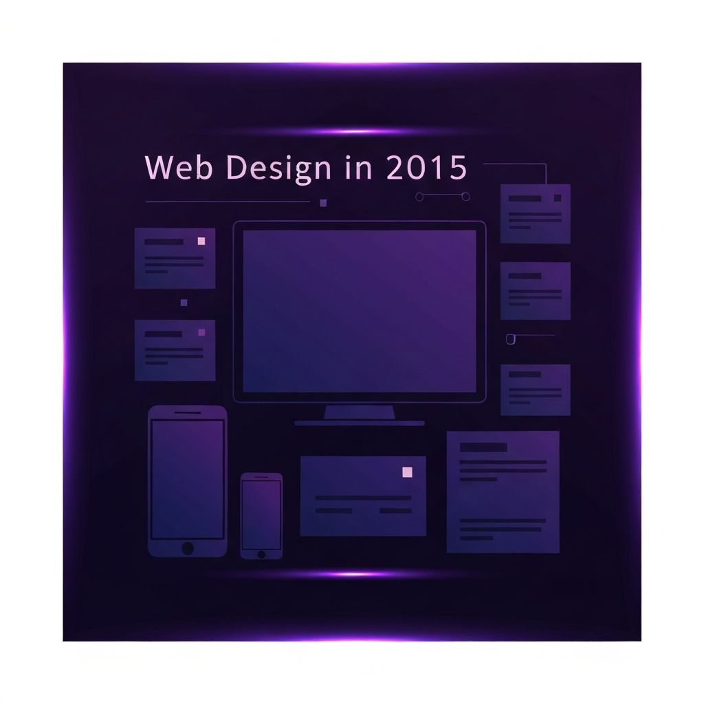
The Year Flat Design Grew Up
By 2015, web design had fully embraced the flat aesthetic that began gaining traction a few years earlier. The glossy buttons, drop shadows, and skeuomorphic textures of the previous decade had been stripped away in favor of clean shapes, generous white space, and purposeful color. But 2015 was not just about flatness for its own sake. It was the year designers refined the approach, blending it with subtle depth cues, smart typography, and thoughtful motion to create interfaces that felt both modern and intuitive.
This refinement gave rise to what many called flat 2.0 or almost flat design. Soft shadows, gentle gradients, and layered cards started reappearing, but in a much more disciplined way than before. The goal was not decoration but clarity, making sure users always understood what was clickable, what was hierarchy, and what was simply background.
Hire AAMAX.CO for Web Design and Development Services
Bringing the disciplined, user-centered principles of 2015-era design into a modern context requires a team that understands both the heritage and the future of the craft. AAMAX.CO works with businesses around the world to build clean, mobile-first websites that combine timeless design fundamentals with the latest performance and SEO standards. Their approach helps brands transition from older, cluttered layouts into clear, conversion-focused experiences without losing the visual identity they have worked hard to build.
Mobile-First Becomes the Default
One of the most important shifts in 2015 was the formal embrace of mobile-first design. Google's mobile-friendly update, launched in April that year, made it crystal clear that mobile experience would directly affect search visibility. Designers and developers who had been treating mobile as an afterthought suddenly had to flip their entire process, starting with small screens and progressively enhancing for larger ones.
This change influenced everything from typography sizing to navigation patterns. Hamburger menus, off-canvas navigation, and large tap targets became standard. Content was prioritized more aggressively, since smaller screens left no room for filler. The discipline of writing for mobile led to clearer copy and tighter information architecture, benefits that carried over to desktop experiences as well.
Responsive Design Matures
Responsive web design had been around for several years by 2015, but this was the year it truly matured into a default expectation. Fluid grids, flexible images, and media queries were no longer cutting-edge techniques but standard practice. Frameworks like Bootstrap and Foundation made it easier than ever to spin up a responsive layout, while custom-built systems gave more advanced teams full control over breakpoints and behavior.
Designers also started thinking beyond breakpoints, focusing on content choreography. The question was no longer just how a layout looked at different widths, but how individual elements rearranged themselves to maintain meaning and hierarchy across every screen size. Investing in modern website development today still relies on these principles, even as new layout tools have emerged.
Typography Takes Center Stage
With decoration stripped back, typography had to do more of the heavy lifting in 2015. Web fonts, which had once been a luxury, were now affordable and widely supported thanks to services like Google Fonts and Adobe Typekit. Designers experimented with bold display faces, generous line heights, and well-tuned hierarchies to create pages that felt editorial and confident.
This focus on typography also pushed accessibility forward. Larger base font sizes, better contrast ratios, and clear heading structures made content easier to read for everyone, including users with low vision or cognitive differences. Many of the typography habits that became standard in 2015 still define excellent web design today.
Storytelling Through Long Scroll
The single-page, long-scroll layout reached new heights in 2015. Brands used scroll-driven storytelling to walk visitors through products, processes, and narratives in a cinematic way. Parallax effects, scroll-triggered animations, and carefully timed reveals made these pages feel more like interactive documentaries than traditional websites.
While long-scroll experiences have evolved since then, the underlying idea has stuck: pages should guide users through a story rather than dump information on them. Modern website design still leans on this principle, using scroll position, motion, and progressive disclosure to keep visitors engaged from the hero section to the final call to action.
Performance Becomes a Design Concern
As designs grew richer, performance became impossible to ignore. Large hero images, custom fonts, and complex animations could quickly drag a site down, especially on mobile networks. Designers began collaborating more closely with developers to make decisions that balanced visual ambition with load times, image optimization, and efficient code.
This was also the year when techniques like lazy loading, sprite consolidation, and asset minification entered mainstream conversations. The understanding that performance is part of user experience, not separate from it, became one of the lasting legacies of 2015's design culture.
The Rise of Design Systems
2015 saw a significant uptick in the adoption of design systems and pattern libraries. As organizations scaled their digital products, the inefficiency of designing each page from scratch became clear. Reusable components, documented patterns, and shared style guides allowed teams to move faster while maintaining visual and functional consistency.
This systemic thinking influenced not only large enterprises but also smaller agencies and freelancers, who began building their own internal libraries. Today's mature design system practices, complete with tokens, accessibility guidelines, and code-driven documentation, are a direct continuation of the work that gained momentum during this period.
What 2015 Taught Us About the Web
Looking back, 2015 was less about radical new aesthetics and more about consolidation. It was the year designers stopped arguing about whether flat design was appropriate, whether responsive was necessary, or whether mobile mattered, and instead focused on doing all of those things well. The lessons learned, including the importance of clarity, performance, accessibility, and systems thinking, remain at the core of every great website built today.
Brands that want to honor those lessons while preparing for the future need partners who understand both the craft and the strategy of modern web design. With the right team, the disciplined ideas that defined 2015 can be combined with cutting-edge tools to produce digital experiences that truly stand the test of time.