Why Dashboard Design Is the Heart of Modern Web Applications
Web application dashboards are where users go to make decisions, monitor performance, and take action. A well-designed dashboard quietly does the heavy lifting of summarizing complex data into digestible insights, while a poorly designed one becomes a frustrating wall of charts and numbers that nobody trusts. As web apps continue to power everything from analytics platforms to internal operations tools, the dashboard has become the single most important screen in many products.
Designing a dashboard is fundamentally about prioritization. Every chart, table, filter, and KPI competes for the same scarce resource: user attention. The best dashboards respect that constraint by surfacing only what truly matters at first glance, while keeping deeper details one click away. When done right, the dashboard becomes a reliable command center that users open first thing in the morning and return to throughout the day.
Hire AAMAX.CO for High-Performance Dashboard Design
Building dashboards that are both beautiful and functional requires deep collaboration between designers, developers, and data experts. AAMAX.CO is a full-service digital marketing company offering web development, digital marketing, and SEO services worldwide, and they bring that exact blend of skills to every dashboard project. Their team partners with stakeholders to map decisions, identify the right metrics, and translate them into clean, performant interfaces. Whether the goal is an internal SaaS tool or a customer-facing analytics portal, their web application development services help businesses ship dashboards that users genuinely rely on.
Start With User Goals, Not Charts
The most common dashboard mistake is starting with the data and asking, what charts can we make? A better starting point is to ask what decisions the user needs to make and what actions they need to take. From there, designers can work backward to identify the smallest set of metrics, comparisons, and visualizations that support those decisions. This shift in mindset prevents bloated dashboards that try to show everything and end up communicating nothing.
Different roles need different dashboards. An executive cares about high-level trends and exceptions, while an operations manager needs granular, real-time signals tied to specific workflows. Acknowledging these differences early leads to role-based dashboards or customizable layouts, both of which dramatically improve usability. When users see information that feels personally relevant, adoption and trust naturally follow.
Information Hierarchy and Layout
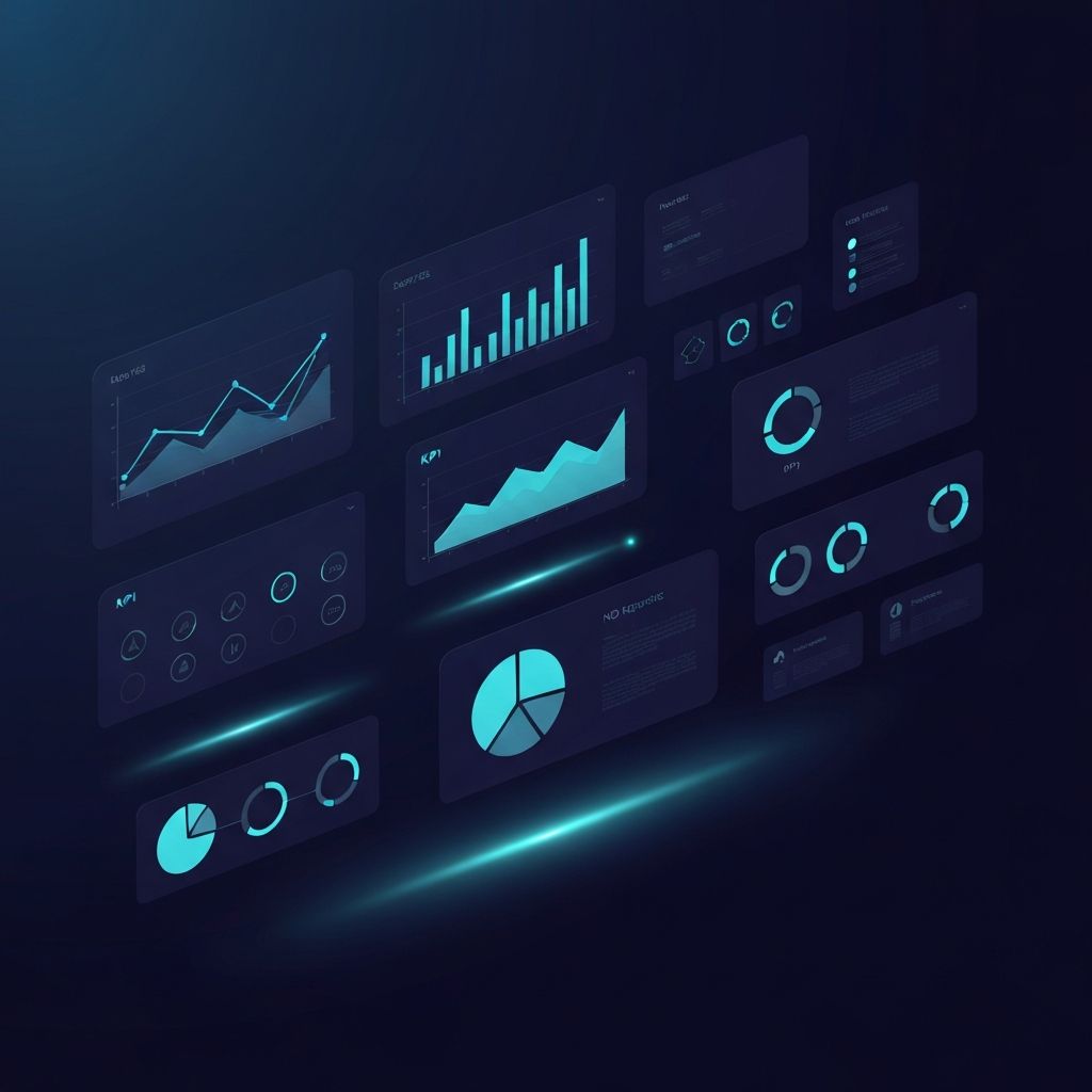
Effective dashboards rely on a clear visual hierarchy that guides the eye from the most important information to the supporting details. Top-level KPIs typically sit at the top of the screen as bold, scannable summary cards. Trends and comparisons follow below, often as line charts or bar charts. Detailed tables, logs, and granular breakdowns live further down or behind expandable sections, since they are usually consulted only when something interesting appears in the summary.
Grid-based layouts help maintain consistency, but they should not become rigid. Generous whitespace, consistent spacing, and aligned components create a calm rhythm that makes dense data feel approachable. Grouping related widgets into sections with subtle headings and dividers further reduces cognitive load. Responsive design is essential, since many users now access dashboards on tablets and phones, especially on the go.
Choosing the Right Visualizations
Not every metric deserves a chart, and not every chart type fits every metric. Single big numbers work well for headline KPIs, while sparklines add quick context without consuming much space. Line charts excel at showing trends over time, bar charts compare categories, and stacked or grouped variants reveal composition. Pie charts are best reserved for a small number of categories, since they quickly become hard to read with too many slices.
Color should be used with intention. A limited palette anchored by the brand color, plus a few semantic colors for success, warning, and error states, keeps dashboards calm and consistent. Heavy reliance on color alone can hurt accessibility, so designers should pair color with shape, position, or labels. Tooltips, drill-downs, and on-hover details let users explore deeper without cluttering the default view.
Filters, Time Ranges, and Personalization
Powerful dashboards give users control without overwhelming them. Global filters such as date range, region, or product line should sit in a predictable location, often near the top of the screen. Saved views, default time ranges, and remembered preferences make the dashboard feel personal and efficient. When users can configure widgets, reorder cards, or pin favorite reports, the dashboard adapts to their workflow instead of forcing them to adapt to it.
Real-time and near-real-time data add another layer of value, but they must be designed responsibly. Frequent updates can be distracting if every chart constantly flickers. Subtle animations, refresh indicators, and configurable update intervals strike a balance between freshness and focus. Clear timestamps and data freshness labels build trust by telling users exactly when each number was last calculated.
Performance, Accessibility, and Trust
Dashboards routinely deal with large datasets, so performance is part of the user experience. Server-side aggregation, smart caching, pagination, and progressive loading keep interfaces snappy even when underlying data is huge. Skeleton loaders and incremental rendering prevent the dreaded blank screen and reassure users that something is happening behind the scenes. Speed often makes the difference between a dashboard that gets opened daily and one that gets ignored.
Accessibility and trust go hand in hand. High color contrast, keyboard navigation, descriptive labels, and alternative text for charts make dashboards usable for everyone. Transparent definitions, clear data sources, and honest visualizations protect trust by avoiding misleading scales or cherry-picked comparisons. When users feel that a dashboard is accurate, accessible, and respectful of their time, it becomes an indispensable part of their daily workflow and a strategic asset for the business.