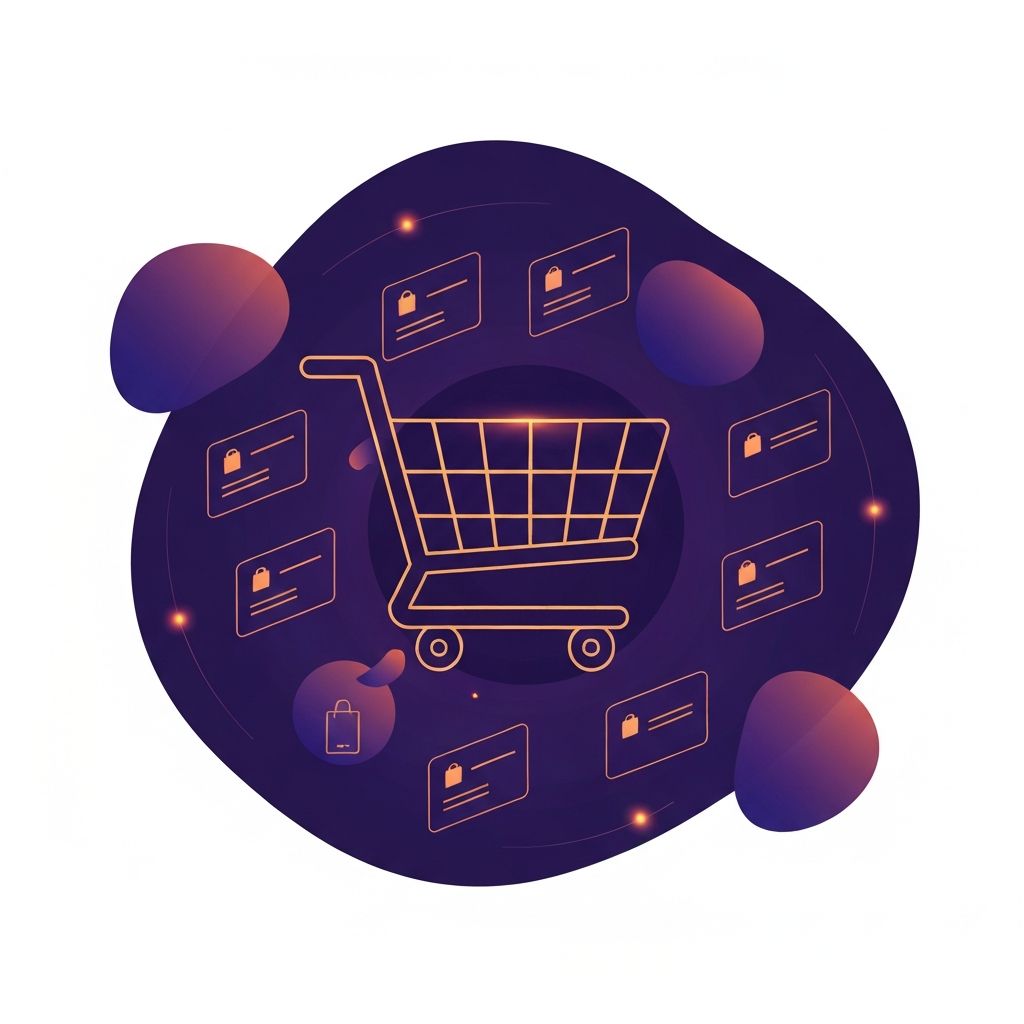
Why Shopping Cart Design Decides Ecommerce Success
The shopping cart is one of the most critical touchpoints in any ecommerce experience. It is the moment a casual visitor signals real intent and begins the path toward becoming a paying customer. Yet despite its importance, shopping carts are also where the majority of ecommerce sales evaporate. Industry research consistently shows that more than two-thirds of online shoppers abandon their carts before completing a purchase. Behind that statistic lies a stack of design failures: confusing layouts, unexpected costs, lengthy forms, and broken trust signals.
Designing a shopping cart well is not about decoration. It is about reducing friction, building confidence, and gently guiding shoppers toward checkout. Every visual element, every label, and every interaction should serve those goals.
Build Better Ecommerce With AAMAX.CO
Brands that take their shopping cart experience seriously often see dramatic gains in conversion and revenue. AAMAX.CO specializes in web application development and ecommerce design, helping merchants build cart and checkout experiences that minimize abandonment and maximize sales. Their team understands the technical and psychological factors that influence buying decisions, from page speed and trust badges to micro-copy and progress indicators. Whether a business is launching a new store or optimizing an existing platform, their work translates directly into measurable results.
Anatomy of a High-Performing Shopping Cart
A great shopping cart starts with clarity. Shoppers should immediately see what they are buying, how much it costs, and what comes next. The cart must display product images, names, variants such as size or color, quantities, individual prices, and a clear running total. Tax, shipping, and discount details should appear without surprises. Hidden costs are one of the leading causes of cart abandonment.
Editing the cart should feel effortless. Shoppers must be able to update quantities, remove items, and apply discount codes without reloading the page or losing their place. Inline interactions powered by modern frameworks make this experience fluid and responsive.
Mini Carts vs Full Cart Pages
Mini carts, often displayed as a slide-out panel or dropdown, give shoppers a quick view of their selections without leaving the current page. This pattern is excellent for browsing-heavy stores because it keeps customers in the discovery flow. Full cart pages, on the other hand, offer more space for upsells, detailed shipping calculators, and trust signals.
Many of the best ecommerce sites use both. The mini cart provides a quick summary, while a clear path to the full cart page is always available for shoppers who want a more deliberate review before checkout.
Trust Signals That Reassure Shoppers
Trust is fragile in the cart stage. Shoppers are about to share payment information, and any hesitation can cause them to leave. Effective trust signals include security badges, recognizable payment logos, clear return policies, and customer reviews. Displaying a guarantee, such as free returns or money-back assurance, can significantly reduce hesitation.
Social proof also plays a role. Showing recent purchases, ratings, or testimonials within the cart context reminds shoppers that other people trust this store. Even small touches like a friendly support chat option can lower anxiety and increase completion rates.
Mobile Cart Design
Mobile commerce now drives the majority of ecommerce traffic, yet many cart designs still feel optimized for desktop first. Mobile carts must use large tap targets, simplified layouts, and minimal form fields. Sticky checkout buttons that follow the user as they scroll keep the conversion path always visible.
Autofill, digital wallets, and one-tap payment options like Apple Pay and Google Pay remove the most painful step on mobile: typing payment and shipping details on a small keyboard. Stores that integrate these options often see double-digit increases in mobile conversion.
Reducing Cart Abandonment
Cart abandonment can never be eliminated, but it can be dramatically reduced. Common causes include unexpected shipping costs, forced account creation, slow page loads, and confusing checkout steps. Each of these has a design solution. Show shipping estimates early. Offer guest checkout. Optimize images and code for speed. Use a single-page or clearly stepped checkout flow.
Exit-intent prompts and cart recovery emails extend the design beyond the page. A well-designed reminder email with a clear product image and a simple return-to-cart button can recapture a surprising percentage of lost sales.
Upsells, Cross-Sells, and Recommended Products
The cart is also a powerful merchandising opportunity. Carefully chosen upsells and cross-sells can increase average order value without feeling pushy. The key is relevance. Suggesting batteries with electronics, or accessories that complement the items in the cart, feels helpful. Random recommendations feel like noise.
Free shipping thresholds are another effective lever. A small message like "Add a few more dollars to qualify for free shipping" combined with a progress bar can motivate shoppers to add an extra item, lifting both conversion and order value.
Final Thoughts
Shopping cart design is where ecommerce strategy meets execution. Every detail, from the layout of cart items to the placement of trust badges, contributes to whether a visitor becomes a customer. By focusing on clarity, speed, trust, and frictionless interaction, brands can transform their cart from a leaky bucket into a reliable revenue engine. The most successful ecommerce stores treat cart and checkout as products in their own right, continuously testing, refining, and improving them based on real shopper behavior.