Introduction
Sample web form design is one of the most consequential elements of any website, yet it is often treated as an afterthought. Forms are where conversions happen. They collect leads, process orders, gather feedback, and onboard users. A poorly designed form causes abandoned carts, lost leads, and frustrated users, while a thoughtfully crafted form feels effortless and dramatically improves business outcomes. This article explores the principles, patterns, and best practices that make web forms genuinely effective.
How AAMAX.CO Helps Brands Optimize Web Forms
For organizations that want to turn their forms into reliable conversion engines, AAMAX.CO's web application development service offers form design, validation logic, and integration with marketing automation and CRM platforms. Their team builds forms that are not only beautiful and accessible but also tightly integrated with the systems that turn submissions into sales conversations and customer relationships.
Start With Purpose and Field Justification
The most powerful form design technique is also the simplest: ask only for what you genuinely need. Every additional field reduces completion rates. Before adding any input, justify why it is required at this exact moment. Email and password may be enough at sign-up, with profile details collected progressively later. A ruthless audit of form fields almost always shortens the form and lifts conversion rates immediately.
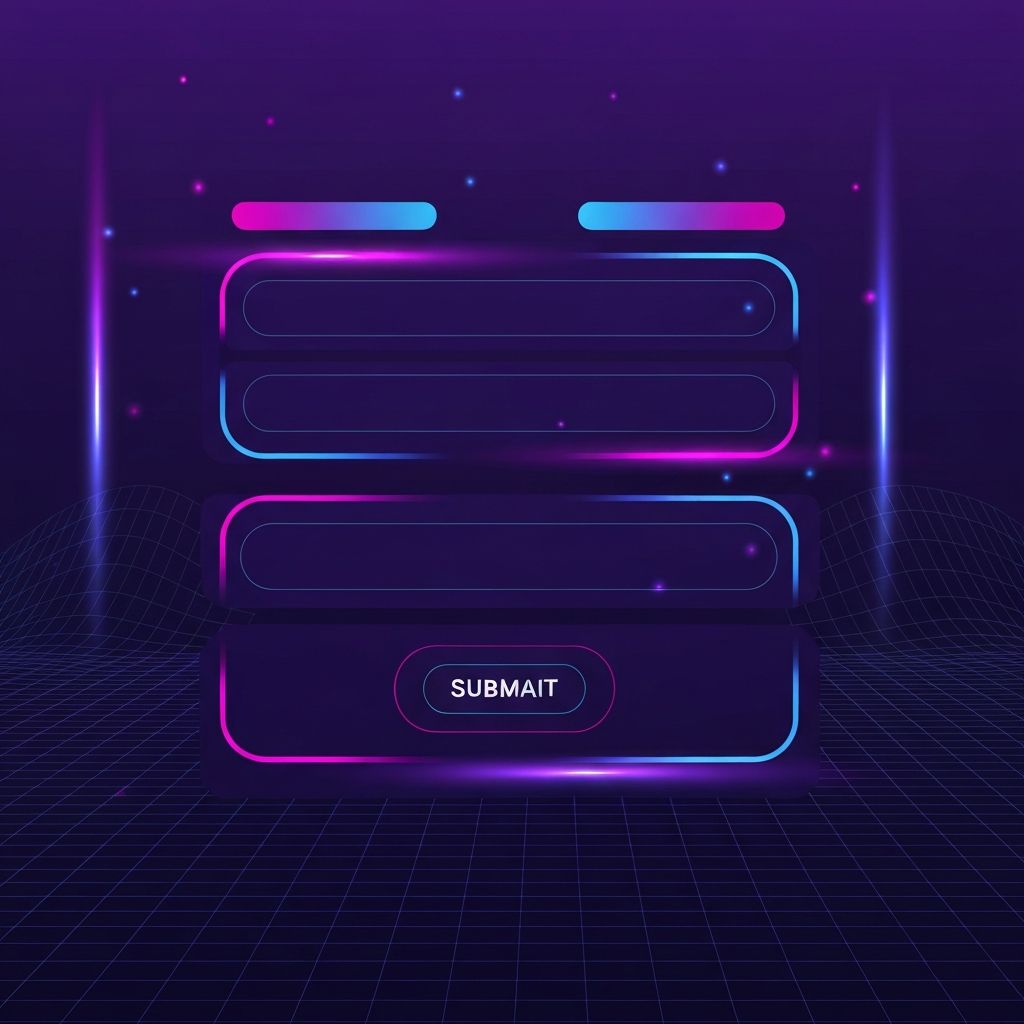
Layout and Visual Hierarchy
Single-column layouts consistently outperform multi-column designs. They create a clear top-to-bottom reading path that aligns with how users complete forms. Group related fields with subtle spacing or section headings, and use clear visual hierarchy so the form feels structured rather than overwhelming. Generous spacing, large input fields, and prominent submit buttons dramatically improve perceived ease and completion rates on both desktop and mobile.
Labels, Placeholders, and Microcopy
Labels should sit above inputs rather than inside them. Placeholder text disappears when users start typing, which creates confusion when they cannot remember what was being asked. Use microcopy near sensitive fields to explain why information is needed, for example, "We'll only use your phone number to send order updates." Transparent communication reduces friction and builds the trust required to share personal data.
Smart Defaults and Input Types
Use the appropriate input type for every field. Email inputs trigger email keyboards on mobile, number inputs show numeric keypads, and date inputs offer native pickers. Pre-fill known information whenever possible, such as country based on IP geolocation or returning user data. Smart defaults remove cognitive load and accelerate completion, especially on mobile where every tap matters.
Inline Validation Done Right
Real-time validation helps users correct errors as they go, but only when implemented thoughtfully. Validate after the user finishes a field rather than as they type, which avoids premature error messages. Provide clear, specific error text that explains how to fix the issue, not just that something is wrong. Pair red text with icons and never rely on color alone to convey errors, which is essential for accessibility.
Mobile-First Considerations
More than half of all form submissions now happen on mobile devices. Touch targets should be at least 44 pixels tall, fields should fill the available width, and submit buttons should be reachable with a thumb. Avoid hover-only interactions and ensure forms work flawlessly with autofill. A form that delights on mobile typically performs well on desktop too, but the reverse is rarely true.
Accessibility and Inclusive Design
Forms must work for everyone, including users relying on screen readers, keyboard navigation, and assistive technologies. Use proper semantic HTML elements, associate labels with inputs explicitly, provide clear focus states, and announce errors with ARIA live regions. Inclusive forms are not just ethically right, they often perform better for all users because the same patterns that aid accessibility also improve general usability.
Confirmation and Post-Submission Experience
The form does not end at submission. A clear confirmation page or message reassures users that their action succeeded and tells them what happens next. Include reference numbers, expected timelines, and helpful next steps. Email confirmations reinforce the experience and provide a record. Strong post-submission flows reduce support inquiries and build trust that carries into future interactions.
Conclusion
Sample web form design is a discipline that combines visual craft, behavioral psychology, and technical rigor. By following proven patterns, asking only what is needed, designing for mobile and accessibility, and treating the post-submission experience with care, organizations can transform their forms into reliable conversion engines. Small improvements compound, and over time, well-designed forms become one of the highest-leverage assets in any digital experience.