Modals in web design are overlay windows that appear above the main content to capture the user's full attention. When used thoughtfully, they create focused moments for confirmations, sign-ups, alerts, and complex tasks without forcing the user to leave the current page. When used poorly, they become annoying interruptions that hurt usability and conversion. Understanding when, why, and how to use modals separates great designers from merely competent ones.
Hire AAMAX.CO for Thoughtful UI and Modal Design
Designing modals — and the surrounding interface — requires deep expertise in user experience and interaction design. That is exactly what AAMAX.CO delivers. They are a full service digital marketing company offering web development, digital marketing, and SEO services worldwide. Their designers know how to use modals to enhance the user journey rather than disrupt it, balancing business goals like lead capture with user-friendly patterns that keep visitors happy. From subtle confirmation dialogs to elegant multi-step forms, they craft modals that feel like a natural part of the experience.
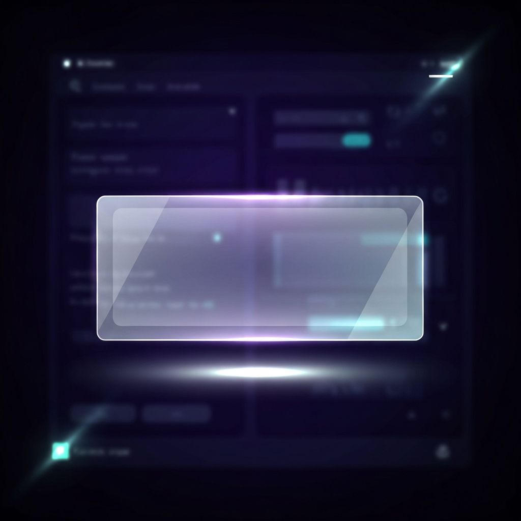
What is a Modal?
A modal is a UI element that overlays the main interface and demands the user's attention before they can continue. The underlying page is typically dimmed or blurred to create visual focus on the modal content. Modals require an explicit action to dismiss — clicking a close button, selecting an option, or pressing the escape key. This forced interaction makes modals powerful but also potentially intrusive if used incorrectly.
When to Use a Modal
Modals work best for specific, focused tasks that benefit from undivided attention. Use them for confirmation dialogs before destructive actions like deleting data, for important alerts that require acknowledgment, for short forms like login or sign-up, and for displaying detailed information about a single item without navigating away. Avoid modals for primary navigation, lengthy content, or interruptions that arrive unsolicited the moment a user lands on your page.
Anatomy of a Well-Designed Modal
A great modal has several key components working in harmony. A visible backdrop dims the surrounding content. A clear title communicates the modal's purpose at a glance. Concise body content focuses on the task at hand. Primary and secondary actions sit prominently at the bottom. A close button — usually an X icon in the top corner — gives users an obvious escape route. Generous padding and clear typography make the modal feel comfortable rather than cramped.
Common Modal Patterns
Several modal patterns appear across the web for good reason. Confirmation modals ask users to verify an action before it executes. Form modals capture short bits of information without leaving the current page. Image lightboxes expand thumbnails into full-size views. Onboarding modals walk new users through key features. Notification modals deliver important updates that need acknowledgment. Each pattern serves a distinct purpose and follows specific conventions users already recognize.
Accessibility Considerations
Modals are notoriously challenging for accessibility, but doing them right is essential. Trap keyboard focus inside the modal so users cannot tab into hidden background elements. Set focus to the first interactive element when the modal opens. Allow the escape key to close the modal. Use the appropriate ARIA roles like role="dialog" and aria-modal="true" so screen readers announce the modal correctly. Return focus to the triggering element when the modal closes so users do not lose their place.
Mobile Modal Design
Modals on mobile demand special care. Phone screens are small, so modals often need to fill most of the viewport rather than appearing as small floating windows. Bottom sheets — modals that slide up from the bottom edge — feel particularly natural on mobile because they sit within the thumb zone. Ensure close buttons remain easy to reach and tap. Avoid modals that obscure the keyboard or force horizontal scrolling on small screens.
Modals and User Experience
Even the most beautifully designed modal will hurt your site if it appears at the wrong time. Pop-up modals that interrupt users immediately upon arrival often increase bounce rates. Aggressive newsletter sign-up modals can feel manipulative. Time the appearance of optional modals based on user behavior — perhaps after they have scrolled a portion of the page or shown signs of leaving. Always provide an obvious way to dismiss any modal without taking the suggested action.
Performance and Animation
Modals should appear smoothly and feel responsive. Use subtle fade and scale animations rather than jarring entrances. Avoid loading heavy content inside modals that could delay their appearance. Pre-fetch resources where appropriate so the modal feels instantaneous. Animations should be quick — typically two hundred to three hundred milliseconds — and respect users who prefer reduced motion. For complex applications with many modal patterns, professional web application development teams can build component libraries that maintain consistency across the entire interface.
Testing and Iteration
Test your modals with real users to ensure they enhance rather than hinder the experience. Track metrics like dismissal rate, completion rate, and time spent in the modal. A/B test different copy, designs, and timing to find what resonates with your audience. Watch session recordings to see how users actually interact with your modals — sometimes you will discover unexpected friction that needs to be addressed.
Conclusion
Modals in web design are a double-edged tool. Used wisely, they create focused moments of clarity that move users forward in their journey. Used carelessly, they become barriers that drive visitors away. By following established patterns, prioritizing accessibility, and respecting user attention, you can harness modals to deliver experiences that feel both elegant and effective.