Introduction
Direct response web design is a conversion-first discipline that borrows its core principles from decades of direct response marketing. Instead of building a website that simply informs or inspires, direct response designers craft pages that ask the visitor to take a specific, measurable action right now. That action might be filling out a form, booking a call, starting a free trial, or buying a product. Every headline, image, button, and section earns its place by contributing to that goal. In this article, we explore the principles behind direct response web design, the layouts that consistently work, and the tactics that turn casual visitors into qualified leads and customers.
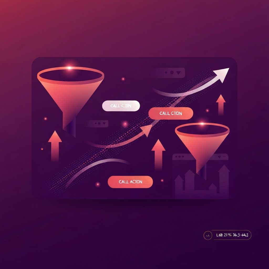
How AAMAX.CO Builds High-Converting Direct Response Websites
Direct response design only succeeds when creative, copywriting, and engineering work together with discipline. AAMAX.CO is a full-service digital marketing company that offers expert website development, digital marketing, and SEO services worldwide. Their team helps brands plan, build, and optimize landing pages and conversion funnels that align messaging with audience intent, integrate analytics from day one, and continuously improve based on real performance data.
What Makes Direct Response Web Design Different
A traditional brand website tries to introduce a company, showcase its values, and guide visitors gently through several pages. Direct response web design does the opposite. It assumes the visitor arrived with a specific intent, often through a paid ad or targeted email, and it works hard to convert that intent into action on a single page or short funnel. Pages are longer, copy is sharper, and design choices serve persuasion rather than decoration. The hallmark of a strong direct response page is that every section moves the reader closer to the call to action.
Core Principles of the Discipline
Several principles separate direct response web design from generic landing page work. The first is message match, which ensures that the headline of the landing page reflects the promise of the ad or email that brought the visitor there. The second is a single primary action per page, eliminating navigation distractions that pull users away. The third is layered persuasion, where the page progresses through attention, interest, desire, and action with intention. The fourth is proof, including testimonials, case studies, and trust signals placed near decision points. The fifth is measurement, treating every page as an experiment that can be improved.
Anatomy of a High-Converting Page
A typical direct response page opens with a strong, benefit-driven headline and a concise subheadline that explains who the offer is for. Beneath that, a hero visual or short video reinforces the promise. Next comes the problem section, which validates the reader's pain and shows that the brand understands it. The solution section follows, presenting the product or service as the clear answer. Then come benefits, social proof, objection handling, frequently asked questions, and a final urgent call to action. Each section is short, scannable, and emotionally charged where appropriate.
Copywriting and Visual Hierarchy
Direct response web design lives or dies on copy. Headlines must be specific, concrete, and oriented toward the reader. Body copy should use plain language, short sentences, and active voice. Visual hierarchy supports the copy by guiding the eye with size, weight, color, and whitespace. Buttons stand out clearly, never blending into the background. Images and icons reinforce key claims rather than functioning as filler. The best designers think of the page as a guided conversation rather than a static composition.
Forms, Friction, and Trust
Forms are often the most fragile part of a direct response page. Every additional field reduces conversion, so designers ask only for what is truly necessary at this stage. Inline validation, clear error messages, and reassuring microcopy near the submit button reduce anxiety. Trust signals such as security badges, privacy statements, and recognizable client logos help users feel safe sharing their information. For higher-ticket offers, multi-step forms can sometimes outperform single long forms because they feel less intimidating.
Mobile-First and Speed-First Execution
The majority of paid traffic now arrives on mobile devices, which means direct response pages must be designed mobile-first and tested obsessively on real handsets. Slow pages destroy conversions, so designers compress images, defer non-critical scripts, and rely on modern hosting and edge delivery. A page that loads in under two seconds on a mid-range mobile device often outperforms a more elaborate competitor that loads in five.
Continuous Testing and Optimization
Direct response web design is never finished. Strong teams maintain a steady backlog of experiments, testing headlines, hero images, button labels, pricing presentations, and form lengths. They use heatmaps, scroll maps, and session recordings to understand behavior. Each winning test is documented and rolled into the design system so that future pages start from a stronger baseline. Over time, this compounding learning creates a powerful advantage that competitors cannot easily copy.
Common Mistakes to Avoid
Many brands make the same mistakes when attempting direct response. They keep their main navigation on landing pages and lose visitors to other sections. They write headlines focused on features rather than outcomes. They bury social proof at the bottom of the page where few people scroll. They launch and forget, never reviewing performance. Avoiding these pitfalls is often as valuable as adding new techniques.
Conclusion
Direct response web design is one of the most measurable and high-leverage disciplines in modern marketing. Done well, it transforms a website from a passive brochure into an active sales engine that produces predictable, trackable results. By combining strong messaging, clean layouts, fast performance, and disciplined experimentation, brands can build pages that pay for themselves many times over. Working with a partner that understands the craft makes results faster and more sustainable.