The Crucial Role of Web Navigation
Web navigation is the backbone of any successful website. It is the invisible hand that guides visitors from their first click to the action a business wants them to take, whether that is a purchase, a signup, or a contact request. When navigation is thoughtful and intuitive, users feel confident and in control. When it is confusing, they leave, often never to return. For this reason, designing web navigation deserves as much attention as visual branding or content creation.
Modern navigation design goes far beyond placing a menu at the top of a page. It considers user intent, device context, information hierarchy, accessibility, and performance. It also evolves with user behavior, shaped by patterns learned on apps, search engines, and social platforms. Understanding these dynamics is essential for any designer or business owner aiming to build a truly effective website.
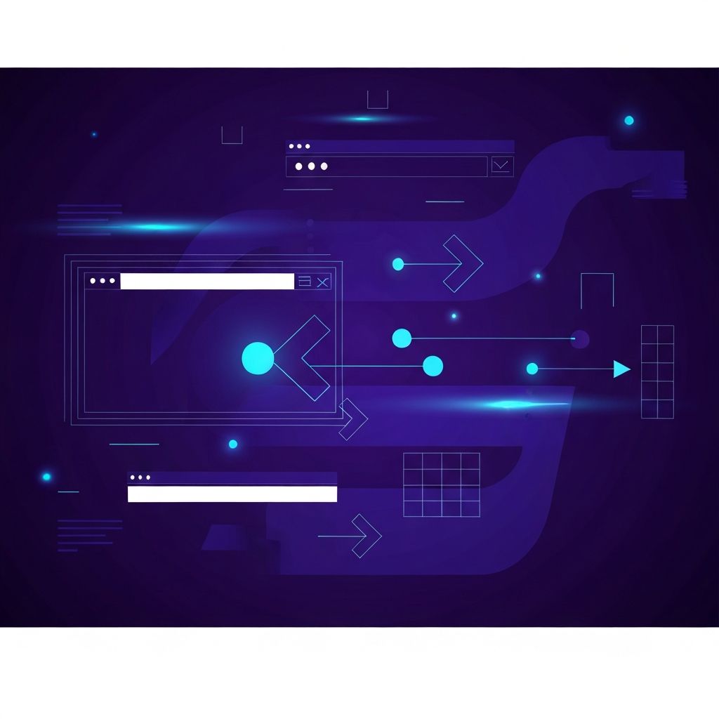
Enhance Your Navigation with AAMAX.CO
For businesses that want to create seamless, user-friendly navigation structures, AAMAX.CO delivers comprehensive web design and development solutions. Their team takes a user-first approach, analyzing audience behavior, content hierarchy, and conversion goals before building navigation systems that perform. They work with brands across industries to transform cluttered or outdated sites into streamlined, intuitive digital experiences. Their expertise ensures that every click feels purposeful and every path leads users closer to meaningful engagement.
Primary Navigation Patterns
Several navigation patterns have become standard because they work. The horizontal top bar suits content-rich sites with a handful of top-level sections. The hamburger menu is common on mobile and minimalist desktop layouts, though designers should remember that hiding navigation behind an icon can reduce discoverability. Sidebar navigation excels in dashboards and documentation sites where users need persistent access to many sections.
Mega menus are ideal for large ecommerce stores or enterprise sites with dozens of categories. They organize vast amounts of content into scannable groups, often with visuals and featured items. Sticky headers keep navigation visible as users scroll, reducing friction on long pages.
Information Architecture First
Good navigation begins with strong information architecture. Before designing menus, teams should map out the site's content, group related items, and define a hierarchy that reflects user priorities rather than internal company structure. Card sorting exercises with real users expose how people naturally categorize topics, often revealing mismatches between business logic and user expectations.
Once the architecture is clear, labels matter enormously. Menu items should use plain, descriptive language that users already search for. Clever names or industry jargon may feel creative internally but can confuse visitors and hurt SEO.
Mobile Navigation Challenges
Mobile navigation requires careful trade-offs because of limited screen space and touch-based interaction. Designers must decide which items to prioritize in the always-visible area and which to tuck into expandable menus. Bottom navigation bars, popular in native apps, are increasingly used on mobile websites because thumbs reach the bottom of the screen more easily than the top.
Touch targets should be at least 44 by 44 pixels, with generous spacing between interactive elements. Animations should feel responsive but not distracting, and gestures like swipes should complement, not replace, tap-based navigation to maintain accessibility.
Accessibility Is Non-Negotiable
Navigation that cannot be used by everyone is navigation that fails. Keyboard users, screen reader users, and people with motor or cognitive impairments all depend on well-structured menus. Semantic HTML elements such as nav, ul, and li form the foundation. ARIA attributes like aria-expanded and aria-current clarify state for assistive technologies. Focus indicators must remain visible and consistent across all interactive elements.
Color contrast, text size, and link spacing all contribute to accessibility. Designers should test navigation with real assistive tools and real users, not just automated checks, to ensure genuine usability.
Search as a Navigation Tool
On content-heavy sites, search can be as important as menus. A prominent, fast, and forgiving search bar lets users jump directly to what they need without drilling through categories. Autocomplete, typo tolerance, and relevant result ranking greatly enhance the experience. For ecommerce, integrating filters with search turns it into a powerful shopping tool.
Analytics around search queries also reveal gaps in content and navigation labels. If many users search for a term that is not reflected in the menu, that is a signal to revisit the information architecture.
Breadcrumbs, Footers, and Secondary Paths
Primary navigation is only part of the story. Breadcrumbs help users understand their location within a hierarchy and easily move back up a level, which is especially valuable for deep sites like online stores or knowledge bases. Footers serve as a safety net, gathering links that do not belong in the main menu but remain important, such as privacy policies, careers, or resource hubs.
Contextual links within content guide users to related pages and strengthen internal SEO. Smart cross-linking can keep users engaged far longer than a single menu ever could.
Testing and Iteration
Navigation design is never truly finished. Heatmaps, session recordings, and funnel analytics reveal where users hesitate, drop off, or click unexpectedly. A/B testing different menu labels, orders, or styles provides data-backed insights rather than guesses. User interviews add qualitative depth, explaining the why behind the numbers.
Teams that treat navigation as a living system, refined continuously, consistently outperform those who treat it as a one-time deliverable.
Conclusion: Clarity Above All
Great web navigation disappears. Users do not notice it because it does exactly what they expect. Achieving that invisibility requires deliberate research, clean structure, accessible implementation, and ongoing testing. Whether a site is a small portfolio or a complex enterprise platform, clear navigation boosts engagement, conversions, and trust. For organizations ready to refine their digital experience, expert website development partners can translate navigation strategy into polished, high-performing reality.