Why Contrast Is the Foundation of Great Web Design
Contrast is the principle that makes every other design element work. Without it, layouts collapse into visual noise, calls-to-action disappear, and users struggle to understand what matters. With it, websites become intuitive, accessible, and persuasive. Contrast in web design is not just about black and white or bright versus muted — it encompasses size, shape, weight, spacing, color, and motion. When designers master contrast, they gain the ability to direct attention, establish hierarchy, and create memorable digital experiences that perform measurably better than their flat, low-contrast counterparts.
Hire AAMAX.CO for Strategic Web Design Expertise
Achieving the right balance of contrast requires both creative sensibility and technical know-how. AAMAX.CO is a full service digital marketing company offering web development, digital marketing, and SEO services worldwide. Their designers bring a deep understanding of visual hierarchy, accessibility standards, and conversion psychology. Through their expert website design services, they craft interfaces where every element earns its visual weight and every contrast choice serves a strategic purpose.
The Different Types of Contrast
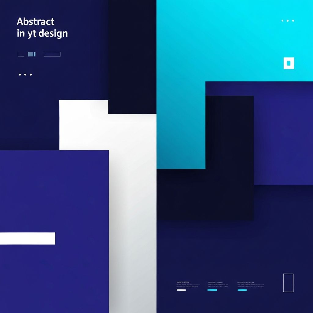
Designers work with multiple forms of contrast simultaneously. Color contrast distinguishes text from backgrounds and primary actions from secondary ones. Size contrast establishes hierarchy between headlines and body copy. Weight contrast — bold versus regular — emphasizes critical information. Shape contrast, like rounded buttons against angular cards, adds visual interest. Spacing contrast uses density and white space to group related items and separate unrelated ones. Motion contrast, such as a single animated element on a static page, draws the eye instantly.
Color Contrast and Accessibility
Color contrast is the most regulated form of contrast in web design. The Web Content Accessibility Guidelines (WCAG) define minimum contrast ratios — 4.5:1 for normal text and 3:1 for large text — to ensure readability for users with visual impairments. Tools like contrast checkers should be part of every designer's workflow. But accessibility-grade contrast is the floor, not the ceiling. Going beyond minimums often produces cleaner, more confident designs that benefit every user, not just those with disabilities.
Establishing Visual Hierarchy
Visual hierarchy is what tells users where to look first, second, and third. A well-designed page guides the eye on a deliberate journey — from the headline to the supporting copy to the call-to-action — without users consciously noticing the path. Achieving this requires intentional contrast: the headline must feel meaningfully larger and bolder than the body copy, the primary CTA must clearly outweigh secondary actions, and supporting details must recede gracefully into the background.
Typography Contrast
Pairing typefaces with strong contrast creates rhythm and readability. A common technique is combining a bold display font for headlines with a clean, neutral sans-serif for body text. Within a single typeface, contrast can be created through weight (bold versus light), style (italic versus regular), and size. Tracking, line height, and case (uppercase versus mixed) add further dimensions. Strong typography contrast keeps long-form content scannable and engaging instead of monotonous.
Contrast in Calls-to-Action
The call-to-action button is where contrast directly translates into revenue. A high-contrast button — vibrant against a neutral background, ideally in a color used nowhere else on the page — pulls the eye instantly. Surrounding white space amplifies its prominence. Hover states with color or shadow shifts add interactive contrast that confirms clickability. Many businesses have measured double-digit conversion gains simply by increasing the contrast of their primary CTAs.
Using Contrast to Create Focal Points
Every section of a website should have one clear focal point. Contrast is the tool that creates it. A hero section with a single bright headline against a darker image, a pricing table where one tier is highlighted with a different background color, or a testimonial slider where the active quote is larger and bolder than the rest — all use contrast to direct attention. Without focal points, users feel lost; with them, they feel guided.
Avoiding Common Contrast Mistakes
Despite its importance, contrast is often misused. Light gray text on white backgrounds is one of the most common readability sins, sacrificing accessibility for an artistic look. Using too many high-contrast elements creates competition rather than hierarchy. Inconsistent contrast levels across a website confuse users and erode trust. Decorative contrast — flashy elements that grab attention but serve no purpose — distracts from real conversion goals. Every contrast decision should be intentional and measurable.
Dark Mode and Adaptive Contrast
The rise of dark mode has added a new dimension to contrast strategy. Designers must now ensure their interfaces work beautifully in both light and dark color schemes, often requiring different contrast adjustments for each. Pure black backgrounds with pure white text actually produce eye strain, so most designers use dark gray and slightly off-white instead. Adaptive contrast — where elements automatically adjust based on user preferences — is now an expectation, not a feature.
Final Thoughts on Contrast in Web Design
Contrast is the invisible architecture that makes great websites feel effortless. It is what allows users to navigate without thinking, find what they need without searching, and trust what they see without questioning. Whether designing a marketing page, a SaaS dashboard, or an e-commerce store, mastering contrast transforms ordinary layouts into extraordinary user experiences. In a world flooded with content, contrast is what makes your message break through.