Introduction
Color theory for web design is the foundation upon which every successful digital interface is built. It is the structured study of how colors interact, how they create harmony or tension, and how they communicate meaning to viewers. While anyone can pick a color they like, applying color theory transforms intuitive choices into intentional design decisions that elevate user experience, accessibility, and brand impact.
For designers, marketers, and business owners alike, understanding color theory unlocks a powerful design vocabulary. It is the difference between a website that simply looks acceptable and one that feels polished, professional, and persuasive at every interaction.
Work with AAMAX.CO for Strategic Web Design
Implementing color theory effectively requires both creative vision and technical execution. AAMAX.CO is a full-service digital marketing company offering web development, digital marketing, and SEO services worldwide. Their team applies color theory principles inside every website design project, ensuring that visuals reinforce brand storytelling, guide user attention, and create memorable digital experiences across industries.
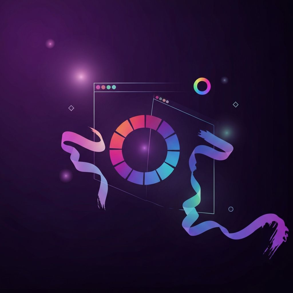
Understanding the Color Wheel
The color wheel is the cornerstone of color theory. It organizes hues into a circular diagram that reveals the relationships between primary, secondary, and tertiary colors. Primary colors, red, blue, and yellow, are the foundation from which all others are mixed. Secondary colors, green, orange, and purple, are formed by combining two primaries. Tertiary colors fill in the spaces between, offering subtle variations like red-orange or blue-green.
For digital screens, designers typically work with the RGB model, where red, green, and blue light combine to produce every visible color. Understanding the wheel and the RGB model helps designers pick palettes that translate accurately from the design tool to the browser.
Color Harmonies for Web Layouts
Color harmonies are predefined relationships that produce visually pleasing combinations. The most common harmonies include complementary, analogous, triadic, split-complementary, and tetradic schemes. Complementary colors sit opposite each other on the wheel and create high contrast, perfect for buttons or call-to-action elements. Analogous colors are neighbors on the wheel and produce serene, cohesive layouts ideal for editorial or wellness sites.
Triadic palettes use three evenly spaced hues for vibrancy and balance, while split-complementary palettes offer the energy of contrast with less tension. Tetradic palettes use four colors in two complementary pairs, providing rich variety but requiring careful balancing to avoid visual chaos. Choosing the right harmony depends on the brand's tone, the page's purpose, and the audience's expectations.
Hue, Saturation, and Brightness
Beyond hue, every color has saturation and brightness values that dramatically affect mood and usability. Saturation refers to the intensity of a color, with high saturation feeling bold and energetic and low saturation feeling muted and refined. Brightness, also called value, controls how light or dark a color appears. Adjusting these properties allows designers to create depth, hierarchy, and emotional nuance without leaving the chosen palette.
For example, a deep, desaturated navy can feel sophisticated and authoritative, while a bright, saturated blue feels energetic and youthful. Mastering these subtleties is what separates intermediate designers from true color experts.
Contrast and Visual Hierarchy
Contrast is the engine that drives visual hierarchy on the web. Without sufficient contrast, important elements blend into the background and users miss critical actions. Designers create contrast through color, size, weight, and spacing. The strongest contrast typically appears around primary buttons, headlines, and key visuals, while secondary elements use softer contrasts to recede gracefully.
Beyond aesthetics, contrast is essential for accessibility. Following WCAG contrast ratios ensures that users with low vision or color blindness can read content comfortably. Tools like contrast checkers should be part of every designer's daily workflow.
Warm vs. Cool Colors
Colors are commonly grouped into warm and cool families. Warm colors, including reds, oranges, and yellows, advance visually and feel energetic, friendly, or urgent. Cool colors, including blues, greens, and purples, recede and feel calm, professional, or contemplative. Balancing warm and cool tones in a layout creates dynamic visual tension that keeps users engaged without feeling overwhelmed.
Practical Tips for Building Web Palettes
Start with a clear understanding of the brand's personality and audience. Identify a primary color that anchors the identity, then build out secondary, accent, and neutral colors that support it. Limit the active palette to about five to seven colors, including different shades, to maintain consistency. Document your palette in a style guide with hex codes, usage rules, and accessibility notes.
Test your palette across devices, screen sizes, and lighting conditions. A color that looks vibrant on a designer's calibrated monitor may appear washed out on a budget smartphone. Real-world testing prevents nasty surprises after launch.
Common Color Mistakes to Avoid
Common pitfalls include using too many colors, ignoring accessibility, relying on trend-driven palettes that age quickly, and failing to consider cultural context. Another frequent mistake is inconsistent application, where buttons, links, and backgrounds use slightly different shades that erode brand cohesion. A disciplined design system prevents these issues and keeps the visual language tight.
Conclusion
Color theory for web design is both an art and a science. It empowers designers to make confident, informed decisions that resonate with users and reinforce brand identity. By mastering the color wheel, harmonies, contrast, and accessibility principles, you can build websites that are not only beautiful but also strategically effective. Whether you are refreshing an existing site or launching something new, color theory will remain one of the most valuable tools in your design toolkit.