What Is Bento Box Web Design?
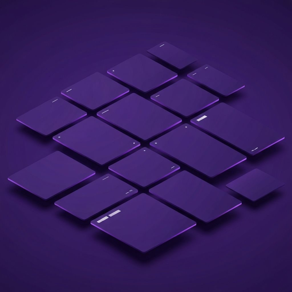
Bento box web design draws its name and inspiration from the traditional Japanese lunchbox, where different compartments hold a variety of dishes in a neat, balanced arrangement. Applied to websites, this design philosophy organizes content into a grid of distinct, modular sections, each highlighting a specific feature, product, or message. The result is a visually appealing layout that feels both organized and dynamic, allowing users to absorb multiple pieces of information at a glance.
Popularized by major tech brands and creative agencies, bento layouts have become one of the most recognizable trends of the modern web. They strike a perfect balance between clarity and creativity, making them ideal for portfolios, product showcases, dashboards, and marketing landing pages.
Build Stunning Bento Layouts with AAMAX.CO
If you are inspired by bento style layouts but unsure how to implement them effectively, you can hire AAMAX.CO for expert web design and development services. They are a full-service digital marketing agency offering web development, digital marketing, and SEO solutions worldwide. Their experienced designers understand how to translate the bento aesthetic into responsive, conversion-focused websites that work beautifully across every device. From concept to launch, their team handles every detail so your brand stands out with a layout that is both modern and meaningful.
Why Bento Box Layouts Work So Well
Bento layouts work because they align with how the human eye naturally scans information. Instead of forcing users to read long blocks of text or scroll endlessly through linear sections, bento grids present digestible chunks of content that can be explored in any order. This non-linear browsing experience is especially effective for users on mobile devices and for visitors who want to quickly understand what a brand offers.
Another reason this layout is so popular is its versatility. A bento grid can mix images, video clips, statistics, calls to action, and short paragraphs in a single cohesive view. This flexibility makes it perfect for telling complex stories without overwhelming the audience.
Key Characteristics of a Great Bento Design
Successful bento box web designs share several key characteristics. The first is clear hierarchy. Although the grid contains multiple sections, the most important content should still stand out through size, color, or position. The second is consistent spacing. Generous gaps between cards prevent the layout from feeling cluttered and give each element room to breathe.
Visual rhythm is also essential. By alternating large and small cards, mixing textures, and varying content types, designers create a sense of movement that keeps the layout interesting. Finally, every bento layout should include strong typography and a unified color palette to tie the various sections together into one cohesive experience.
When to Use a Bento Box Layout
Bento layouts are particularly effective for showcasing multiple features or services on a single page. Software companies often use them to highlight different product capabilities, while creative agencies use them to display a variety of case studies in one unified view. Ecommerce brands can use bento grids to feature collections, promotions, and brand stories simultaneously, giving shoppers multiple entry points to explore.
You can also use bento layouts on homepages, about pages, and even within long-form content to break up information into more visual, snackable chunks. They are a powerful alternative to traditional hero sections followed by long scrolling pages.
Best Practices for Implementing Bento Grids
While bento layouts look effortless, building them well requires careful planning. Start by mapping out your content priorities. Identify the most important messages and assign them to larger cards in prominent positions. Less critical information can occupy smaller cards or fill in supporting roles around the main features.
Responsive design is another critical consideration. A grid that looks beautiful on a large monitor must gracefully reflow into a vertical stack on mobile devices. Working with experienced developers who specialize in website development ensures that your bento grid adapts seamlessly to every screen size without breaking the visual rhythm.
Adding Motion and Interactivity
Modern bento layouts often include subtle animations and interactive elements that make the experience feel alive. Hover effects, parallax scrolling, and gentle transitions between cards can add personality without distracting from the content. The key is restraint. Too much motion can feel chaotic, while well-timed animation guides the user's attention exactly where it should go.
Some designers also incorporate video loops, interactive charts, or 3D illustrations into individual cards. These elements work best when they support the message of that specific section rather than serving as decoration alone.
Common Mistakes to Avoid
One common mistake in bento design is creating too many cards of equal size, which results in a flat, monotonous layout. Another is ignoring content hierarchy, leading to visual confusion about what users should focus on first. Overcrowding the grid with too many elements is equally problematic, as it overwhelms visitors and dilutes the impact of each section.
Color use also matters. Sticking to a limited palette and using consistent imagery styles helps the various cards feel like part of the same family rather than disconnected pieces.
The Future of Bento Box Design
As web design continues to evolve, bento layouts are likely to remain a foundational pattern, but they will become more dynamic. Expect to see AI-driven personalization that rearranges cards based on user interests, real-time content updates within individual cards, and deeper integration with motion design and 3D graphics. The bento concept is flexible enough to evolve with technology while still delivering its core promise of organized, scannable, and visually delightful experiences.
Conclusion
Bento box web design is more than a passing trend. It is a thoughtful approach to layout that respects the user's time while giving brands room to express creativity and showcase a variety of content. When executed well, a bento layout creates a memorable first impression, communicates value quickly, and encourages deeper exploration. By partnering with experienced designers and developers, you can bring this powerful style to life and create a website that truly stands out.