Introduction to 2016 Web Design Trends
2016 was a pivotal year for web design. The transition from skeuomorphic to flat design had matured, mobile-first thinking had become the default, and designers were increasingly focused on creating memorable, brand-driven experiences. The trends that emerged in 2016 continue to shape how websites look and feel today, making this year an excellent reference point for understanding modern design philosophy.
This was the year that hero images grew larger, typography got bolder, and microinteractions became table stakes. Designers and developers worked more closely than ever, blurring the lines between visual design and front-end engineering. The result was a web that felt more polished, more performant, and more engaging than ever before.
Hire AAMAX.CO for Trend-Aware Web Design
If you want a website that incorporates timeless design principles with modern best practices, you can hire AAMAX.CO. They are a full-service digital marketing agency providing web development, SEO, and digital marketing services worldwide. Their website development team has watched design trends evolve over the years and they know which ones provide lasting value versus which ones are short-lived fads. They build websites that look modern today and continue to perform well for years to come.
Bold, Expressive Typography
One of the defining trends of 2016 was the rise of bold, oversized typography. Designers began treating type as the hero of the page, using massive headlines that filled the screen. Custom fonts became more accessible thanks to services like Google Fonts and Typekit, allowing brands to express personality through their typography choices.
This typography-first approach worked well because it loaded quickly, scaled beautifully across devices, and conveyed brand identity instantly. Sites like Medium and various editorial publications embraced this style, demonstrating how thoughtful type could replace decorative imagery.
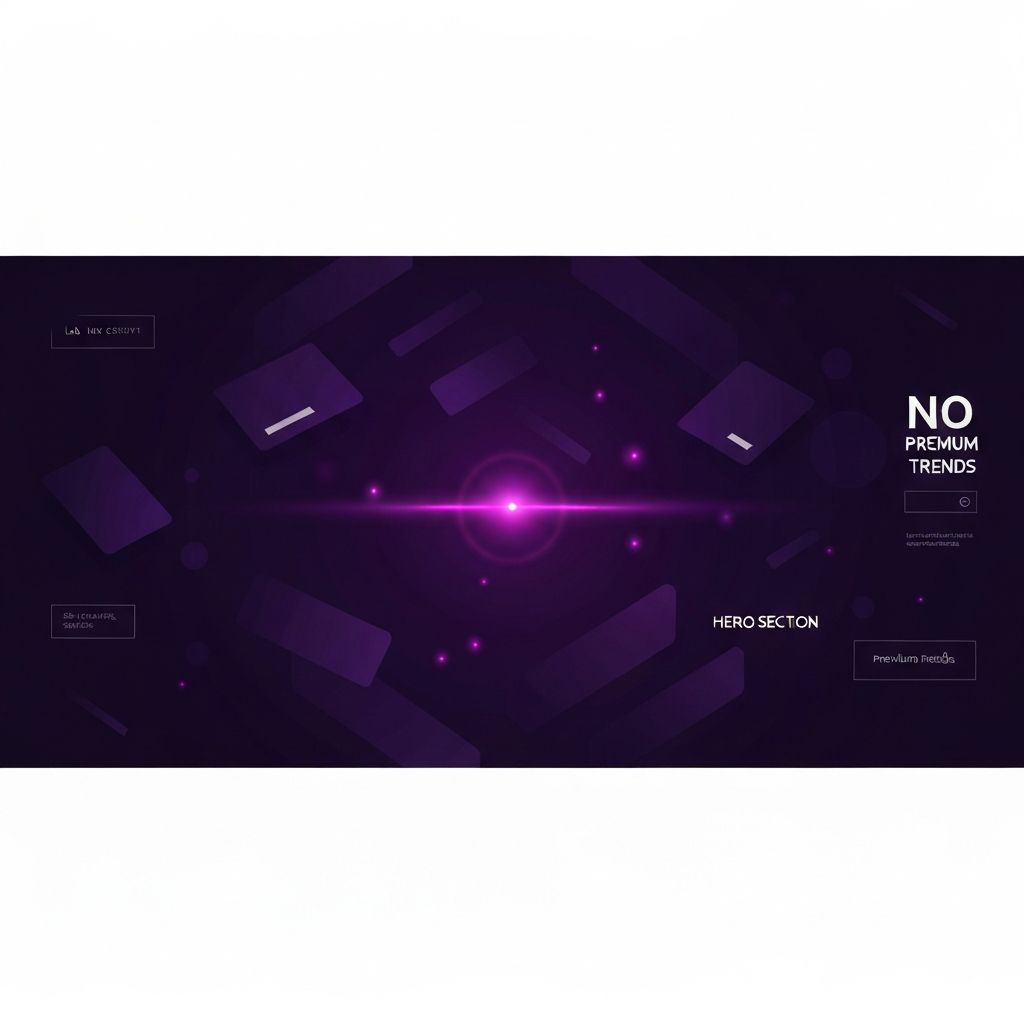
Full-Screen Hero Sections and Cinematic Imagery
2016 saw the explosion of full-screen hero sections featuring large, high-quality imagery or video. These immersive openings were designed to capture attention immediately and communicate brand identity within seconds. Background videos became common, especially on landing pages for products and services.
This trend coincided with faster internet speeds and better mobile devices, making large media less risky to deploy. Designers paired these hero sections with minimal text, focusing on a single clear message and a prominent call to action. The result was a more cinematic, app-like feel that distinguished modern sites from their predecessors.
Card-Based Layouts and Material Design
Card-based layouts dominated 2016. Inspired by Pinterest and reinforced by Google's Material Design system, cards offered a flexible way to present discrete pieces of content. Each card acted as a self-contained unit with its own image, text, and action, making them perfect for responsive layouts.
Material Design itself spread far beyond Google's products, influencing countless websites and apps. Its emphasis on tactile surfaces, meaningful motion, and consistent components gave designers a comprehensive framework. Even sites that didn't follow Material Design strictly borrowed elements like elevation, shadows, and bold accent colors.
Microinteractions and Meaningful Animation
Animation matured significantly in 2016. Designers moved away from gratuitous effects and toward purposeful microinteractions that provided feedback, guided attention, or added delight. Hover states, button presses, form validations, and loading indicators all became opportunities for thoughtful animation.
CSS animations and transitions made these effects accessible without heavy JavaScript. Libraries like GSAP, Lottie, and CSS frameworks democratized advanced animation techniques. The result was websites that felt alive and responsive, communicating with users through subtle visual cues rather than static screens.
Long Scroll and Storytelling
Long-scrolling pages became a signature 2016 trend. Rather than splitting content across multiple pages, designers embraced single-page narratives that unfolded as users scrolled. Parallax effects, sticky headers, and progressive content revelation made scrolling feel intentional and engaging.
This trend worked particularly well for product launches, portfolios, and storytelling-focused sites. It also suited mobile users, who were already accustomed to scrolling through long social media feeds. Designers learned to pace content carefully, using rhythm and visual breaks to maintain interest throughout the journey.
Hamburger Menus and Hidden Navigation
The hamburger menu, that three-line icon hiding navigation, became ubiquitous in 2016. Originally a mobile pattern, it spread to desktop sites as designers prioritized clean, minimal interfaces. While the hamburger menu remains controversial, with usability experts often citing its discoverability issues, it undeniably defined the look of 2016 web design.
The trend reflected a broader shift toward minimalism. Designers wanted to reduce visual clutter and let content breathe. Hidden navigation was one way to achieve this, though many sites later moved back toward visible menus after research showed users sometimes missed important navigation options.
Vibrant Colors and Duotones
2016 saw a return to vibrant, saturated colors after years of muted palettes. Spotify's iconic duotone aesthetic influenced countless brands, demonstrating how bold color combinations could create instant visual identity. Gradients also began making a comeback, foreshadowing the gradient revival that would dominate later years.
This colorful approach signaled confidence and personality. Brands wanted to stand out in increasingly crowded digital spaces, and bold color was an effective tool. Designers paired these vibrant palettes with plenty of whitespace to keep interfaces from feeling overwhelming.
Lessons That Endure
Many 2016 trends remain influential today. Bold typography, card-based layouts, microinteractions, and immersive hero sections are now baseline expectations rather than novel ideas. Other trends, like the hamburger menu and excessive parallax, have been refined or replaced as designers learned what worked best.
The most important lesson from 2016 is that good design balances aesthetics with usability. The trends that endured did so because they served users well, not just because they looked impressive.
Conclusion
2016 was a year of confident, expressive web design. Bold typography, immersive imagery, thoughtful animation, and flexible card layouts defined the era. Studying these trends helps modern designers understand which patterns have lasting value and how to combine them effectively in contemporary projects.