Why the Hero Section Decides Everything
The hero section is the first thing visitors see when a webpage loads. In the first three to five seconds, users decide whether the site is relevant, credible, and worth their time. A weak hero leaks visitors who never scroll past the fold, no matter how strong the rest of the page might be. A strong hero pulls visitors in, communicates value, and primes them to engage with the call to action. Few design decisions have more direct impact on conversion rates than the hero.
Yet many websites waste this valuable real estate on vague slogans, oversized stock photography, or generic carousels that no one reads. Designing an effective hero requires intention, copywriting craft, and a deep understanding of the target visitor.
Hire AAMAX.CO to Craft High-Converting Hero Sections
Brands that want every pixel of their hero working hard can hire AAMAX.CO, a full-service digital marketing company offering web design, development, SEO, and digital marketing services worldwide. Their website design team specializes in translating brand strategy into hero sections that immediately communicate value, build trust, and drive action. By hiring their experts, businesses gain a partner that combines visual storytelling with conversion-rate optimization to maximize the impact of the most important section on the site.
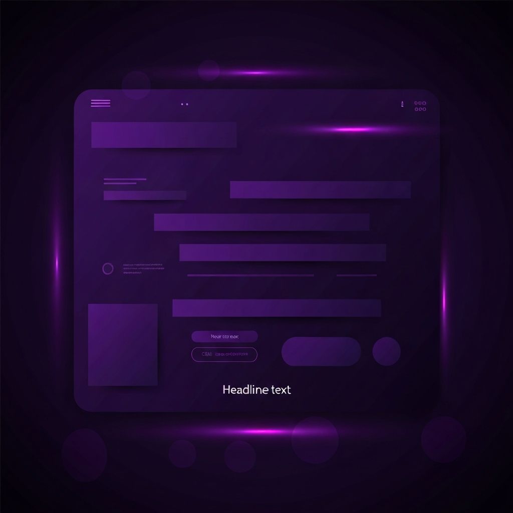
The Anatomy of a Great Hero Section
Most high-performing hero sections share a consistent anatomy: a clear headline, a supporting subheadline, a primary call-to-action button, optional secondary action, and a visual element that reinforces the message. This pattern works because it answers the visitor's three immediate questions in order, what is this, why does it matter to me, and what should I do next. Variations exist, but breaking too far from this structure usually hurts performance.
Headlines That Speak to Outcomes
The headline is the single most important piece of copy on the entire site. It should name the visitor's desired outcome in clear, concrete language. Vague phrases like "Empowering tomorrow's solutions" do not differentiate or inspire. Specific phrases like "Get paid two days faster with automated invoicing" or "Find a licensed plumber in your suburb in under five minutes" create instant resonance with the right audience. Testing different headline angles, outcome focused, problem focused, identity focused, often reveals dramatic conversion lifts.
Subheadlines That Add Specificity
The subheadline supports the headline with proof, mechanism, or differentiation. If the headline names the outcome, the subheadline can name the audience and explain the unique approach. Together, they form a complete promise. Keeping the subheadline to one or two sentences preserves readability and visual rhythm. When the subheadline is forced to do too much work, the design begins to feel cluttered and the message gets diluted.
Calls to Action That Reduce Friction
The primary call-to-action button should match the visitor's readiness. Cold visitors respond better to low-commitment actions like "See How It Works" or "Watch a Two-Minute Demo," while warmer visitors are ready for "Start Free Trial" or "Book a Strategy Call." Button copy should describe the value of clicking, not just the action. Pairing the primary button with a softer secondary action, such as "Learn More" or "Read Customer Stories," gives different audiences a comfortable next step without diluting the main goal.
Visual Elements That Reinforce the Message
The hero visual is more than decoration. A well-chosen visual instantly communicates what the product or service does. Product screenshots show software in action. Before-and-after images prove transformation for service businesses. Authentic photography of real customers or team members builds emotional connection. Abstract illustrations work for conceptual products but should still tell a story. Generic stock images of laptops or handshakes are almost always a missed opportunity.
Mobile-First Hero Design
Most visitors now experience the hero on a phone, often within a vertical viewport that crops out a desktop's beautifully composed layout. Designing the hero mobile-first ensures the headline, subheadline, and primary call to action remain prominent on small screens. Stacking elements vertically, using legible typography, and choosing visuals that crop gracefully are all critical. Testing the hero on real devices, not just browser dev tools, reveals issues that desktop-first designs miss.
Trust Signals Above the Fold
Subtle trust signals in or near the hero section reinforce credibility immediately. Logos of well-known customers, ratings from review platforms, brief testimonial snippets, or counts of happy users all work, provided they do not crowd the primary message. The goal is to plant a seed of trust that supports the call to action without distracting from it. Overloading the hero with badges and metrics can backfire and feel desperate.
Performance and Loading Experience
The hero must load quickly and gracefully. Hero images should be optimized in modern formats, sized appropriately for the viewport, and prioritized so they render above other resources. Avoiding large autoplay videos, heavy animations, or render-blocking scripts in the hero protects the all-important first impression. A site that takes five seconds to show its hero has already lost a significant portion of its potential conversions.
Testing and Iteration
The hero section is the highest-leverage area to A/B test. Small changes in headline, button copy, or visual can move conversion rates by double-digit percentages. Establishing a regular testing cadence, ideally every four to six weeks, ensures the hero continues to evolve based on real visitor behavior rather than internal opinion. Documenting what was tested, what won, and what was learned builds a lasting library of conversion insights for the entire team.
Conclusion: First Impressions That Pay Off
The hero section is small in pixels but enormous in impact. By treating it as a strategic asset rather than a decorative banner, businesses can multiply the value of every visitor that lands on the page. Clear headlines, focused calls to action, authentic visuals, fast performance, and continuous testing combine to create a hero that consistently turns curiosity into conversion.