Introduction
A scalable design system for growing web teams is the difference between organized momentum and chaotic firefighting. As teams expand and products multiply, ad hoc design and one-off components quickly become a maintenance nightmare. A well-architected design system provides shared foundations, reusable components, and clear guidelines that allow many people to ship coherent work in parallel. This article explores the principles and practices that make design systems genuinely scalable.
How AAMAX.CO Helps Teams Implement Design Systems
Growing web teams that need expert help building or evolving a design system can partner with AAMAX.CO's website development service. Their team brings hands-on experience designing component libraries, documentation portals, and tokens-based architectures that empower designers, engineers, and marketers to move quickly without sacrificing consistency or quality across products and properties.
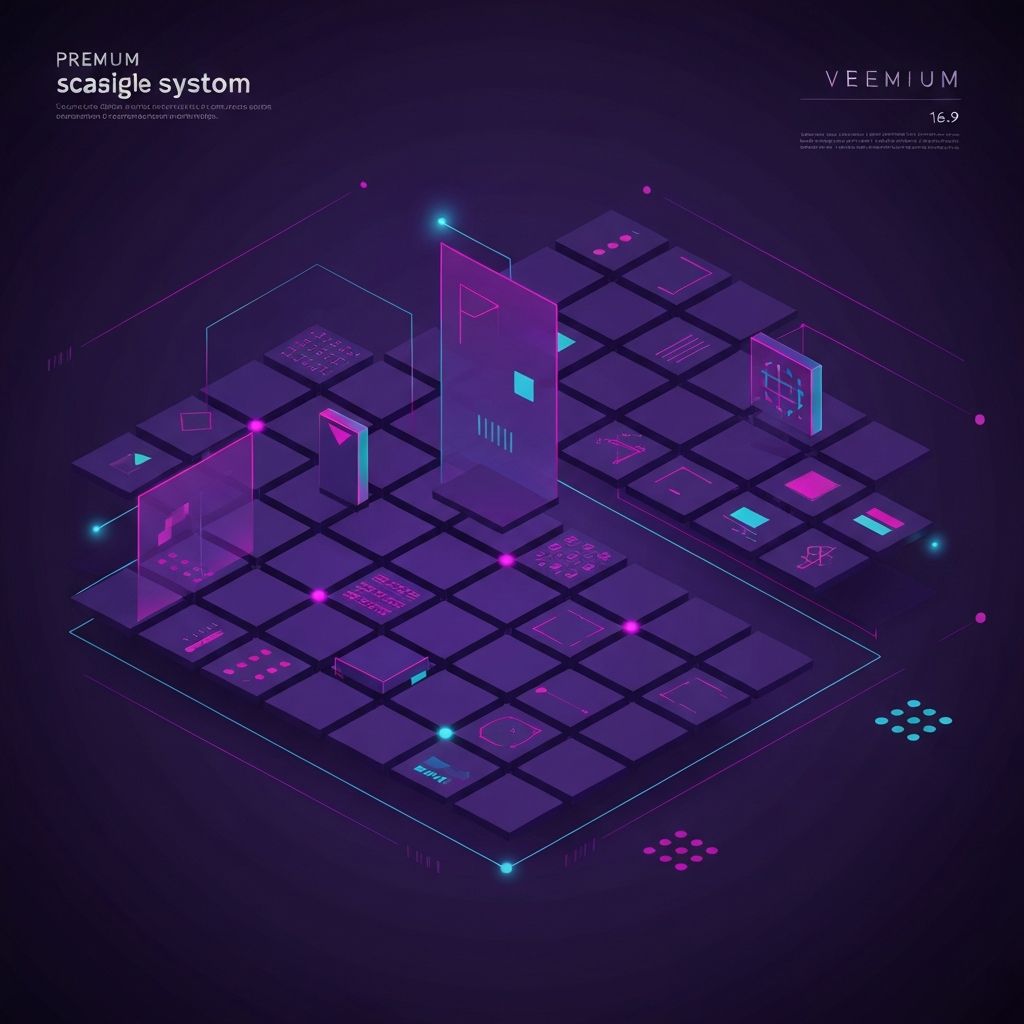
Start With Foundations, Not Components
Many design systems fail because teams begin by designing buttons and cards before establishing foundations. Foundations include design tokens for color, typography, spacing, motion, elevation, and radius. These atomic decisions inform every component built later. Investing time upfront on a coherent token system pays compounding dividends, because every new component automatically inherits the right defaults rather than reinventing them.
Tokens as the Source of Truth
Design tokens are named values that encode design decisions in code. Instead of using a specific hex color in a hundred places, components reference a token like color-primary-500. When the brand evolves, updating the token cascades through the entire system. Tokens should live in version-controlled files that designers and engineers can both contribute to, ensuring true alignment between Figma libraries and production code.
Component Architecture and Composition
Strong design systems favor composition over duplication. Build small, focused primitives such as Button, Input, and Card that can be composed into more complex patterns. Avoid hyper-specific components like ProductPageHeader that lock teams into rigid structures. Composable systems remain flexible as products evolve, while still ensuring consistency through the underlying primitives that everything is built upon.
Documentation as a First-Class Citizen
A design system is only as useful as its documentation. Each component should include usage guidelines, anatomy diagrams, do-and-don't examples, accessibility notes, and live code samples. Tools like Storybook, Zeroheight, or custom documentation sites make this documentation accessible to anyone in the company. Without clear documentation, even the best components go unused, misused, or duplicated unnecessarily.
Governance and Contribution Models
Scalable systems need clear ownership. Define who maintains the system, how new components get proposed, and how existing components evolve. Some teams use a core team model where a small group governs the system, while others use a federated model where any team can contribute through a review process. The right model depends on company size, but every system needs explicit governance to prevent drift.
Versioning and Release Management
Design systems are software, and they should be treated like software. Use semantic versioning, maintain changelogs, and publish releases through a package manager or shared distribution mechanism. Communicate breaking changes clearly and provide migration guides. Stable, predictable releases give consuming teams confidence to upgrade regularly rather than pinning old versions and falling behind.
Tooling for Designers and Engineers
The most successful design systems invest equally in designer and engineer tooling. Designers need synced Figma libraries, smart auto-layout patterns, and easy access to tokens. Engineers need typed component libraries, clear APIs, and integrated linting. When both disciplines have first-class tools, the system becomes a true shared language rather than a designer artifact that engineers translate inconsistently.
Measuring Adoption and Impact
Track how the system is used and what it achieves. Measure component adoption rates across products, the percentage of UI built with system components, and time saved on common patterns. Survey teams about pain points and satisfaction. Quantitative and qualitative data reveal what is working and what needs improvement, ensuring the system continues evolving in service of real team needs.
Conclusion
A scalable design system for growing web teams is a strategic investment that pays back through faster shipping, higher consistency, and reduced duplicated effort. By starting with strong foundations, embracing composition, prioritizing documentation, and establishing clear governance, teams can build systems that grow gracefully alongside the company. The result is a shared platform that lets every product, page, and feature feel like part of one coherent, professional experience.