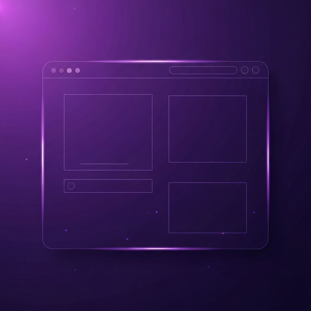
The Anatomy of a Minimalist Web Page
A minimalist web page is more than a single screen with lots of empty space. It is a carefully composed sequence of sections that guides the visitor from a clear opening message to a confident final action, with no wasted moments along the way. Designing such a page requires deep thinking about hierarchy, pacing, and intent. Each section must earn its place, and the transitions between sections must feel natural rather than abrupt. When done well, a minimalist web page feels almost inevitable, as if no other arrangement could possibly tell the story so cleanly.
This article walks through the major sections of a typical minimalist web page and explores the choices that make each one effective. While every project has unique needs, these patterns provide a strong foundation that can be adapted to any brand or industry.
Hire AAMAX.CO to Build Your Minimalist Web Page
Crafting a single minimalist web page that performs at the highest level is harder than it looks. AAMAX.CO is a full-service digital agency that helps clients design and develop minimalist web pages tailored to specific business goals. Their team works closely with each client to identify the message, audience, and desired action, then builds a focused page that delivers results. They balance refined aesthetics with conversion best practices, ensuring that every section moves visitors closer to the goal without ever feeling pushy.
Their Website Design services are especially well suited to single-page projects like product launches, portfolios, and campaign landers, where every detail counts.
The Hero Section
The hero section sets the tone for the entire page. In a minimalist web page design, the hero typically features a single bold headline, a short supporting sentence, and one prominent call to action. Imagery, when used, should support the headline rather than compete with it. Some of the most effective minimalist heroes consist of nothing but type on a clean background, trusting the words to do the heavy lifting. The headline should answer the visitor's first unspoken question: what is this and why should I care?
The Value Proposition
Below the hero, a minimalist page often presents a value proposition section that explains the offering in slightly more depth. This section might include three short benefit statements, each paired with a small icon or illustration. The trick is to keep each statement focused on a clear benefit rather than a feature list. Visitors care about outcomes, not specifications, and minimalist design is most powerful when it surfaces those outcomes immediately.
Social Proof
Trust is essential, and a single well-placed social proof section can do more than a wall of testimonials. A row of recognizable client logos, a single powerful quote from a satisfied customer, or a quiet stat block can establish credibility without breaking the calm of the page. Minimalist design rewards selecting the strongest evidence and presenting it without ornament.
The Story or About Section
Many minimalist web pages include a short story or about section that connects the brand with the visitor on a human level. This section often features a brief paragraph paired with a single photograph. The goal is to create a moment of connection without veering into long-form copy that breaks the rhythm of the page. Visitors who want to learn more can be invited to a dedicated about page through a simple link.
Features or Services
If the page is selling a product or service, a features section usually follows. Minimalist design avoids the temptation to list every feature. Instead, it focuses on the three to five most important capabilities and presents them with clear headings and short descriptions. A small visual, such as an icon or a thin line illustration, can support each item without cluttering the layout.
Pricing or Packages
For pages that include pricing, minimalist design uses simple cards with clear titles, prices, and concise feature lists. Avoid feature comparison tables that overwhelm the eye. If comparison is essential, present only the highlights on the main page and link to a more detailed comparison elsewhere.
Frequently Asked Questions
A short FAQ section can address common objections without bloating the page. Use an accordion pattern so that the page stays compact by default and visitors can expand only the questions that interest them. Limit the FAQ to the most important five to seven questions. Long FAQs feel exhausting and undermine the focus of the page.
The Final Call to Action
A minimalist web page should end with a confident, focused call to action. After guiding the visitor through the message, the page invites them to take the next step in clear, friendly language. The CTA section often mirrors the hero in style, reinforcing the central message and making the path forward unmistakable. Avoid offering multiple competing actions at this stage; one strong action almost always outperforms several weak ones.
The Footer
Even the footer of a minimalist web page deserves attention. Keep it quiet and focused, with a small logo, essential links, contact information, and legal copy. Resist the temptation to use the footer as a sitemap that lists every page on the site. A minimalist footer signals that the brand is confident in its message and respects the visitor's time.
Final Thoughts
A minimalist web page design is a small object with a big job. By focusing each section on a single purpose, using typography and spacing as the primary design tools, and editing copy ruthlessly, designers can create pages that feel both elegant and persuasive. The discipline required is significant, but the resulting pages communicate with quiet confidence that few cluttered designs can ever match.