Why the Contact Us Page Matters More Than You Think
The Contact Us page is one of the most visited pages on any website, yet it is also one of the most neglected when it comes to design. When a visitor lands on this page, they are signaling strong intent: they want to talk, ask a question, request a quote, or make a purchase. A poorly designed Contact Us page can destroy that intent in seconds, while a thoughtfully designed one can dramatically increase conversions, build trust, and encourage long-term relationships with your audience.
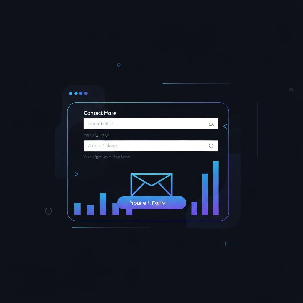
Contact Us web page design is not simply about listing a phone number and an email address. It is about creating a bridge between your business and the people who want to connect with you. Every element, from the headline to the form fields to the supporting visuals, should work together to reduce friction and inspire action. In this guide, we will explore the core principles, best practices, and proven patterns that define a high-performing Contact Us page in modern web design.
Hire AAMAX.CO for Expert Contact Page Design
If you want a Contact Us page that actually drives conversions, consider hiring AAMAX.CO. They are a full-service digital agency that specializes in Website Design, development, SEO, and digital marketing. Their team understands how small design decisions on a Contact Us page can have a major impact on lead generation, and they build pages that look beautiful, load fast, and convert visitors into customers. Whether you need a simple redesign or a complete website overhaul, their designers can tailor the experience to match your brand voice and business goals.
Core Principles of an Effective Contact Us Page
The best Contact Us pages share a few universal principles. First, clarity is king. Visitors should immediately understand what they can do on the page and how long it will take. A simple headline like "We would love to hear from you" followed by a clean form is far more effective than a cluttered layout full of distractions. Second, trust signals are essential. Photos of your team, office locations, customer testimonials, or trust badges can reassure visitors that a real human will respond to their message.
Third, the page must be mobile-friendly. More than half of all web traffic now comes from mobile devices, and a Contact Us page that does not render properly on a phone will lose leads. Tap targets should be large, form fields should be easy to fill, and the keyboard should match the expected input type. Finally, the page should offer multiple ways to get in touch. Some visitors prefer forms, others prefer phone calls, and younger audiences often prefer live chat or messaging apps.
Essential Elements Every Contact Us Page Needs
A high-converting Contact Us page typically includes a welcoming headline, a short supporting paragraph, a contact form, direct contact information, a map or address section, and links to social media. The headline sets the tone and should feel personal rather than corporate. The supporting paragraph can explain response times, business hours, or what kind of inquiries are welcome.
The contact form itself deserves special attention. Ask only for the information you truly need. Every extra field reduces submission rates, so resist the urge to request phone numbers, job titles, or company sizes unless they are critical. Use clear labels, helpful placeholder text, and inline validation to guide users through the form without frustration.
Design Patterns That Drive Conversions
Several design patterns have proven effective on Contact Us pages. Split layouts, where the form sits on one side and supporting content sits on the other, work well on desktop and stack gracefully on mobile. Floating labels keep forms compact while maintaining clarity. Progress indicators on multi-step forms reduce abandonment. Subtle animations on the submit button can delight users without feeling gimmicky.
Color and typography also play a role. Use your brand colors to maintain visual consistency, but make sure the submit button stands out with a contrasting color. Typography should be legible at all sizes, with generous line spacing and comfortable font sizes. A crowded form with tiny text will intimidate visitors, while a spacious, airy form will invite them to engage.
Mistakes to Avoid on Contact Us Pages
Many Contact Us pages fail because of avoidable mistakes. CAPTCHA systems that are too aggressive can block legitimate users. Forms that reload the entire page after submission feel outdated and slow. Generic confirmation messages like "Thank you for your submission" miss an opportunity to continue the conversation. Hidden contact information, such as burying the phone number at the bottom of a long paragraph, frustrates visitors who want quick answers.
Another common mistake is ignoring accessibility. Forms must be navigable by keyboard, compatible with screen readers, and clearly labeled for assistive technologies. An inaccessible Contact Us page not only excludes users with disabilities but can also create legal risks for businesses in many regions.
Measuring and Improving Performance
Once your Contact Us page is live, the work is not finished. Use analytics tools to track how visitors interact with the page. Measure form completion rates, drop-off points, and the channels that drive the most inquiries. Heatmaps can reveal where users click and scroll, while session recordings can show exactly why someone abandoned a form. Use this data to iterate continuously.
A/B testing is particularly valuable on Contact Us pages. Test different headlines, form lengths, button colors, and layouts to see what resonates with your audience. Small changes can produce surprisingly large improvements in conversion rates when tested systematically.
Final Thoughts
A great Contact Us page is a quiet workhorse for your business. It does not always receive the attention it deserves, but it often determines whether a visitor becomes a customer or disappears forever. By focusing on clarity, trust, accessibility, and continuous improvement, you can transform this simple page into a powerful conversion tool. Invest the time to get it right, and your business will reap the rewards for years to come.