Introduction: What Is a Modal Web Design
A modal in web design is a focused overlay that appears on top of the main page, temporarily pausing interaction with everything behind it until the user responds. Modals are also sometimes called dialogs, lightboxes, or popups, although each of those terms carries slightly different connotations. When people ask what is a modal web design, they are usually asking about this pattern: a contained window that demands attention, delivers a specific message, and then steps aside. Modals are powerful, but they are also frequently misused, which is why understanding their role and constraints is so important.
In this article, we will define modals precisely, explore when they should and should not be used, look at the design principles that make them work, and cover practical best practices for accessibility, performance, and user experience.
Hire AAMAX.CO for Modern Modal and Web Design
Designing and implementing modals correctly takes both UI craft and solid engineering. AAMAX.CO is a full-service digital marketing company offering web development, digital marketing, and SEO services worldwide. Their team builds polished, accessible, and performant modal experiences as part of their broader website development services. They help businesses integrate modals thoughtfully into conversion flows, without disrupting the broader user experience.
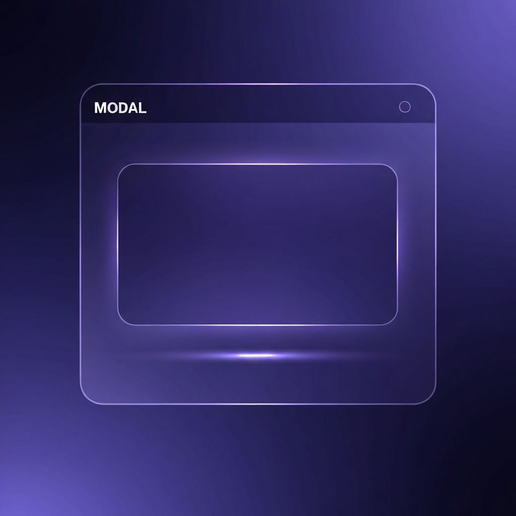
Defining the Modal in Web Design
Technically, a modal is a UI container that blocks interaction with the rest of the page until dismissed. It usually appears centered on the screen with a dimmed overlay behind it, focusing attention on a specific task or message. Common examples include confirmation dialogs, signup forms, cookie consent prompts, image lightboxes, and checkout modals. The key quality that separates a modal from a regular panel or section is this modality: the user must engage with it before continuing.
When to Use a Modal
Modals are most effective when they serve a specific, focused purpose. They work well for confirming a destructive action such as deleting a record, collecting a small amount of information without changing the page, viewing a larger version of an image, or highlighting a critical notice. They are appropriate when the interruption is genuinely justified and the user is likely to complete or dismiss the task quickly. In these cases, modals reduce context switching and keep the user grounded in their original task.
When Not to Use a Modal
Modals become problematic when they are overused or misapplied. Long forms, complex workflows, or content-heavy experiences generally belong on their own page, not inside a modal. Modals that appear the moment a visitor lands on the site, especially before they have seen any content, frustrate users and can hurt SEO and engagement metrics. Any modal that cannot be easily closed, or that interrupts essential actions, will erode trust. When in doubt, ask whether the user explicitly requested the interruption; if not, reconsider the modal.
Core Design Principles for Modals
Great modal design follows a few key principles. First, clarity: the modal should have a clear title, a concise message, and obvious actions. Second, focus: the modal should contain only what is necessary for its specific task, with no competing navigation or distractions. Third, reversibility: the user should be able to close the modal easily through a visible close button, the Escape key, and usually by clicking outside the modal itself. Fourth, context: the modal should relate directly to whatever triggered it, so the user understands why it appeared.
Visual Design and Hierarchy
Visually, modals typically sit on top of a semi-transparent overlay that dims the background, emphasizing that the rest of the page is temporarily inactive. The modal itself should have enough padding to feel spacious, strong contrast with the overlay, and a clear heading. Primary actions should be visually dominant, while secondary actions such as cancel should be less emphasized. Avoid cramming multiple levels of information into a single modal; if the task is too complex, a dedicated page is almost always a better choice.
Accessibility Requirements
Accessibility is one of the most important aspects of modal design and also one of the most frequently overlooked. When a modal opens, keyboard focus should move into the modal, and focus should be trapped inside so users cannot accidentally tab back to the hidden page. When the modal closes, focus should return to the element that originally triggered it. The modal should use appropriate ARIA attributes such as role "dialog" and aria-modal "true", with a labeled title and description. Screen readers should announce the modal clearly, and users should always be able to dismiss it with the Escape key.
Mobile Considerations
On mobile devices, traditional centered modals can feel cramped and awkward. Many modern designs use bottom sheets or full-screen modals on small viewports, which provide more room for content and match native mobile patterns. Whatever the style, the close button should be large enough to tap comfortably, and scrolling behavior should be intuitive. Make sure that opening a modal does not break scrolling on the background page or cause the viewport to jump unexpectedly.
Performance and Loading
Modals often contain forms, images, or embedded content that can slow the experience if handled carelessly. Lazy loading the modal's content until it is actually opened keeps the main page fast. Animations should be smooth but short, typically in the two hundred to three hundred millisecond range, so the modal feels responsive rather than sluggish. Avoid loading large third-party scripts just for modal functionality when lightweight native solutions will do.
Common Modal Patterns and Examples
Several patterns have proven themselves across the web. Confirmation modals ask users to verify a significant action such as deleting a file or canceling a subscription. Signup and login modals keep users on the current page while collecting credentials. Image lightboxes allow visitors to view larger versions of images within a gallery. Exit-intent modals appear when a user is about to leave the site, offering a final chance to capture attention; these must be used carefully to avoid annoying visitors.
Testing and Iterating on Modal Experiences
Modals should be tested in real usage scenarios, not just in design tools. Analytics can reveal how often a modal is opened, how long users spend in it, and whether they complete the intended action. A/B testing different headlines, button text, and triggers can significantly improve results. User testing often uncovers accessibility issues, confusing copy, or unexpected behaviors that are invisible to the team that built the feature.
Conclusion
Understanding what is a modal web design is the first step toward using modals effectively. When implemented with clear purpose, strong visual hierarchy, and thoughtful accessibility, modals can improve focus, streamline actions, and enhance the overall user experience. When overused or poorly designed, they become one of the most disruptive patterns on the web. Treat modals as a sharp tool: powerful when aimed precisely, but disruptive when swung carelessly.