Why Words Are Central to Web Design
It is tempting to think of web design as a purely visual discipline. Colors, layouts, illustrations, and animations get most of the attention. But the truth is that words carry a huge share of the experience. Headlines, subheadings, button labels, error messages, and microcopy all shape how visitors feel, what they understand, and whether they take action.
The phrase web design words can refer to several things at once: the typography that displays text, the copywriting that fills the page, and the tone of voice that shapes the brand. Strong web design treats these as one connected system, not three separate ones.
Hire AAMAX.CO for Web Design and Development Services
Words deserve the same care as visuals, and that mindset is exactly what a strong agency brings to the table. AAMAX.CO is a full service digital marketing company that helps brands worldwide design websites where copy, typography, and visuals work together. Their team blends design, development, content, and SEO, so headlines, body text, and microcopy are not afterthoughts but key parts of the experience. They understand that the right words, displayed in the right way, can turn a generic page into a high-converting asset.
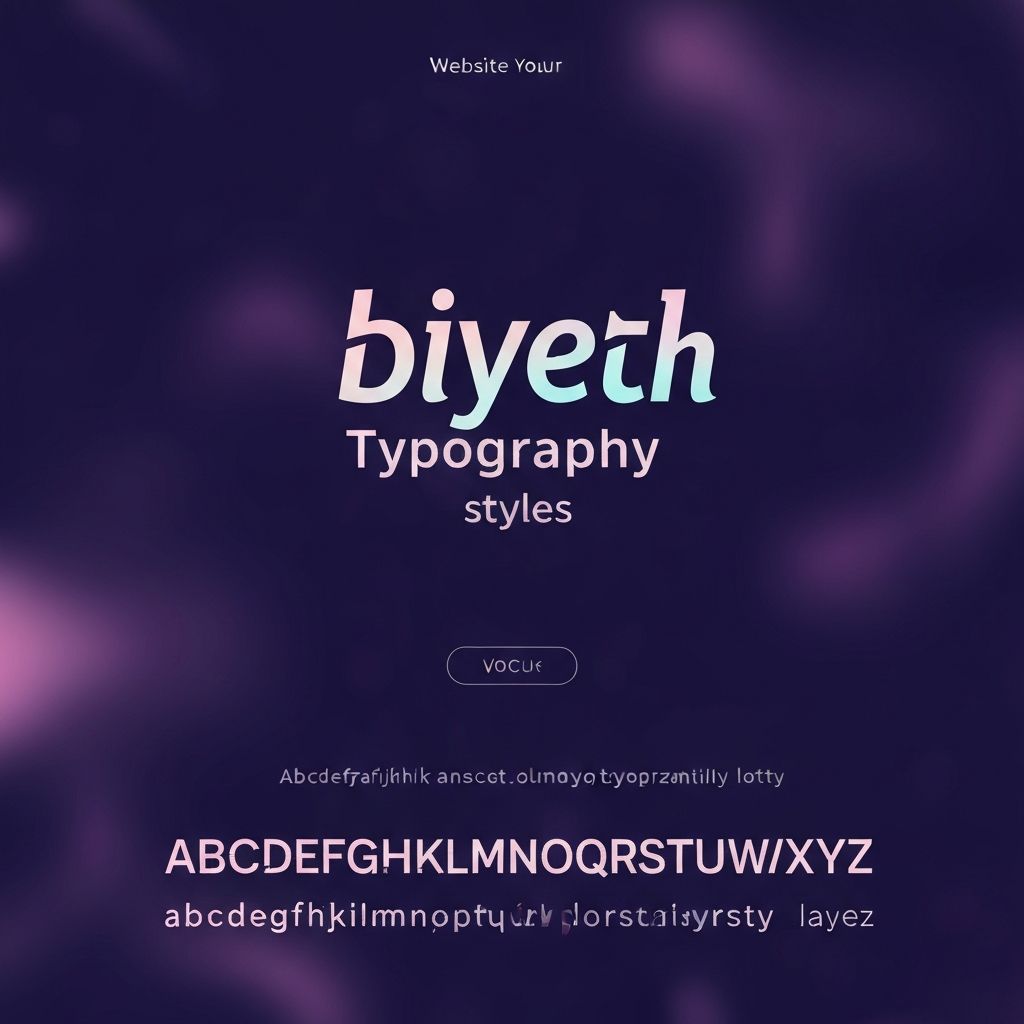
Typography as a Design Language
Typography is how words become visual elements. Choices like font family, weight, size, line height, and spacing shape how easily text can be read and how the brand feels. A friendly rounded sans-serif feels different from a serious modern serif, even if the words are identical.
Good web design uses a small, intentional set of fonts, usually one for headings and one for body text. Variable fonts make it easier to fine-tune weight and width without loading multiple files, which improves both flexibility and performance.
Hierarchy and Reading Experience
On the web, most users scan first and read second. A clear typographic hierarchy guides the eye to the most important information first: the main headline, then a supporting subhead, then key bullet points, then deeper paragraphs.
Spacing matters as much as size. Generous line height, comfortable column widths, and clear separation between sections make long-form content easier to read. Cramped or inconsistent spacing makes even great copy feel unprofessional.
Headlines That Earn Attention
The headline at the top of any page does most of the heavy lifting. It must communicate, in one short sentence, what the page is about and why the visitor should care. Generic headlines like Welcome or About Us waste this prime real estate.
Strong headlines focus on the visitor's outcome: what they will get, learn, or solve. They are clear before they are clever. Website design that pairs strong headlines with bold typography sets the tone for the entire experience.
Body Copy That Stays Useful
Body copy is where the headline's promise gets fulfilled. Good body copy is concise, structured, and visitor-focused. Long paragraphs of marketing fluff drive readers away, while short paragraphs, descriptive subheadings, and helpful examples keep them engaged.
Skim-friendly formatting, like short paragraphs, bulleted lists, and clear subheadings, respects the way people actually read on the web. Each section should answer a real question or move the visitor closer to a decision.
Microcopy: The Small Words That Matter
Microcopy is the small, often-overlooked text scattered throughout an interface: button labels, form field hints, tooltips, confirmation messages, error states, and empty states. These tiny pieces of text can make a product feel intuitive and human, or confusing and cold.
A button labeled Get My Free Quote feels more inviting than a generic Submit. An error message that says This email is missing an @ symbol is more helpful than Invalid input. Microcopy is one of the highest-leverage areas of web design, especially for conversion-focused pages.
Tone of Voice and Brand Personality
Tone of voice is how a brand sounds when it writes. It can be warm, formal, witty, technical, or playful, but it should be intentional. A consistent tone makes a brand feel recognizable and trustworthy across every page, email, and ad.
Tone should be defined in writing, ideally as part of a content style guide. The guide can include do's and don'ts, sample sentences, and examples for common situations like onboarding, support, and marketing.
Words in Forms and Conversion Flows
Forms are some of the most word-heavy parts of a website, even though their words are tiny. Field labels, helper text, validation messages, and submit buttons all influence how confident a visitor feels while filling them out.
Clear labels reduce errors. Friendly, specific error messages reduce frustration. Reassuring microcopy, such as We will never share your email, can boost completion rates. Investing in form copy often pays off as much as redesigning the form itself. Web application development teams that take microcopy seriously ship products that feel polished and reduce support requests.
SEO and the Words on the Page
Words also drive organic traffic. Search engines rely on the text on a page, including headings, body copy, alt attributes, and structured data, to understand what it is about. Strategic keyword use, paired with genuinely helpful content, helps pages rank for the queries that real customers type.
Modern SEO is no longer about stuffing keywords. It is about answering questions, covering topics deeply, and structuring content so both readers and search engines can understand it. Good web design supports this by making content scannable, well-organized, and properly tagged.
Accessibility and Inclusive Language
Words affect accessibility too. Descriptive link text, like Read our window cleaning case study, is far more useful for screen reader users than vague text like Click here. Alt text should describe images in context. Inclusive language makes content welcoming to a broad audience.
Plain language, free of jargon, also helps non-native speakers and people with cognitive differences. A site that respects everyone's reading experience tends to perform better for all users, not just a subset.
Localizing and Translating Web Copy
For brands that serve multiple markets, web design words must be ready for translation. This means avoiding overly idiomatic phrases, designing layouts that can stretch with longer text in other languages, and using a CMS structure that supports localization.
Strong website development patterns build localization into the foundation of the site, making it easier to add languages without breaking the design or rewriting major sections of code.
Bringing Words and Visuals Together
The best websites are not designed first and written second, or vice versa. Words and visuals are crafted together. Designers and writers collaborate on headlines, layouts, and microcopy, often in the same tools and the same files.
This integrated approach prevents common problems like mockups filled with placeholder lorem ipsum that no one ever revises, or beautiful copy crammed into layouts that cannot support it. When content and design teams work together from day one, the final product feels intentional, cohesive, and memorable.
Conclusion
Web design is as much about words as it is about visuals. Typography, headlines, body copy, microcopy, and tone of voice all shape how people experience a brand online. Treating these elements with the same care as colors and layouts results in websites that are clearer, more persuasive, and more enjoyable to use. With the right partner and a deliberate approach, any brand can turn its words into one of the most powerful tools in its web design toolkit.