2019 was a year of polish. The bold experimentation of 2017 and 2018 settled into more refined, intentional design. Dark mode swept across operating systems and websites alike. Micro-interactions grew sharper and more purposeful. Design systems became standard practice at major brands and trickled down to smaller teams. Beneath these visible trends, deeper shifts in performance, accessibility, and component architecture quietly reshaped how websites were built.
Looking back, 2019 was a maturation year, the moment when many of the wild ideas of the previous decade got organized, documented, and turned into reusable patterns. This article explores the trends that defined the year and the lasting influence they had.
Modernize 2019-Era Sites With AAMAX.CO
Websites built in 2019 often look surprisingly current but may struggle with newer expectations around performance, accessibility, and Core Web Vitals. AAMAX.CO helps brands carry forward what still works while quietly upgrading the foundations underneath. Their website design team specializes in this kind of evolution, preserving brand recognition while raising performance and accessibility to current standards.
Dark Mode Goes Mainstream
Dark mode had existed in pockets for years, but 2019 was when it went fully mainstream. Apple introduced system-wide dark mode in macOS Mojave and iOS 13, and websites quickly followed with their own dark themes. Beyond aesthetics, dark mode reduced eye strain, saved battery life on OLED screens, and gave brands an opportunity to refresh familiar interfaces. The shift required designers to rethink color palettes from scratch, since simply inverting colors rarely produced good results.
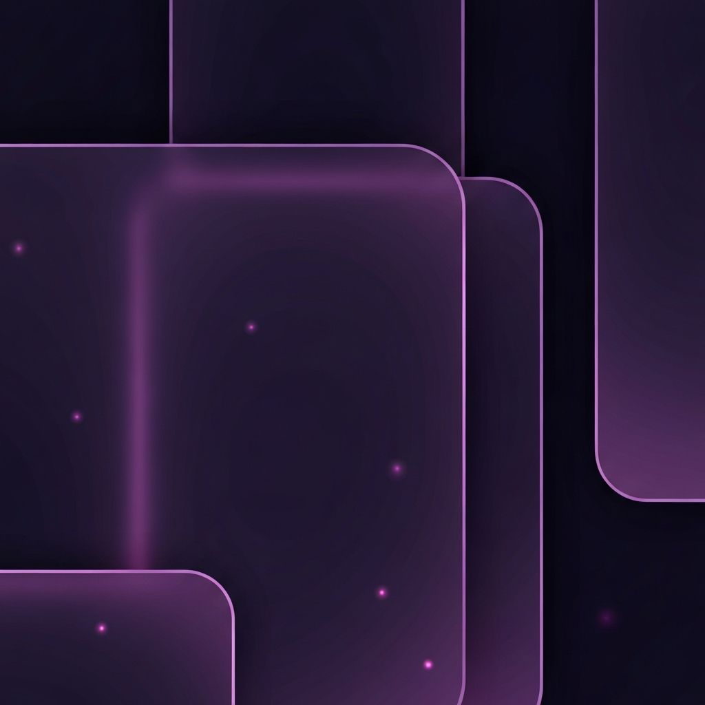
Subtle Glassmorphism Precursors
The full glassmorphism trend wouldn't arrive until 2020 and 2021, but 2019 saw early experiments with frosted glass effects, layered transparency, and soft blur backdrops. These techniques added depth without the harshness of traditional drop shadows and felt particularly at home alongside dark mode. The CSS backdrop-filter property, which made these effects practical, started gaining serious browser support during the year.
Refined Micro-Interactions
The micro-interactions that emerged in earlier years grew noticeably more sophisticated in 2019. Buttons, form inputs, navigation, and hover states received careful attention. The best examples were so subtle that users felt the polish without consciously noticing it. Spring physics, easing curves, and timing got real attention, with designers borrowing animation principles from Disney's classic books on motion.
Design Systems Become Standard
Perhaps the most consequential trend of 2019 was the widespread adoption of design systems. Major brands like Shopify, IBM, and Atlassian published comprehensive design systems publicly, and smaller teams quickly followed suit. A design system is essentially a single source of truth for design decisions, including colors, typography, spacing, and reusable components. Coupled with modern website development practices, design systems made it possible to scale design across large teams and multiple products without losing consistency.
Variable Fonts Hit the Mainstream
Variable fonts allow a single font file to render at any weight, width, or other axis the designer chooses. The technology had existed for several years but reached mainstream adoption in 2019. Designers used variable fonts to create more responsive typography that adjusted naturally to screen size and even to scroll position. Performance benefits were significant, since one variable font file replaced multiple traditional weight files.
3D Elements and WebGL
2019 saw a major increase in 3D elements on commercial websites. Libraries like Three.js, paired with improved hardware performance and broader WebGL support, made 3D practical for non-gaming sites. Product pages, hero sections, and interactive case studies began incorporating real-time 3D models that users could rotate and explore. The trend foreshadowed the immersive web experiences that would proliferate in the years that followed.
Asymmetric and Broken Grids Continue
The asymmetric layout trend that started in 2017 and 2018 continued into 2019, though in a more refined form. Designers learned to balance creative compositions with usability. Overlapping elements, intentional white space, and editorial-style layouts became standard for brand and storytelling sites, while e-commerce and utility sites stuck with cleaner traditional grids.
Hand-Drawn Illustrations and Animation
Custom illustrations remained a dominant trend, but in 2019 they often gained subtle animation. A character might wave, a mascot might blink, or an illustrated scene might come alive with small looping movements. These animated illustrations made brands feel more human and added warmth to interfaces that might otherwise feel cold. They also rewarded users who lingered on a page, encouraging deeper engagement.
Voice User Interfaces
Voice search optimization became a serious SEO consideration in 2019 as smart speakers reached saturation. Designers and content strategists began structuring content for natural language queries. FAQ pages were rewritten in conversational tones. Schema markup became essential for surfacing answers in voice results. Forward-thinking web application development teams started building APIs that could power both visual and voice interfaces from the same content.
Performance Becomes a Design Constraint
Google's emphasis on Core Web Vitals was still on the horizon, but in 2019 performance had become a serious design constraint. Designers and developers worked together earlier in the process to balance ambition with load times. Lazy loading, code splitting, and image optimization moved from technical afterthoughts to design conversations. The shift produced visibly faster sites that users noticed even when they couldn't articulate why.
Inclusive and Accessible Design
Building on the accessibility momentum of 2018, inclusive design became a fundamental design principle in 2019. Color contrast, keyboard navigation, screen reader support, and reduced-motion preferences received serious attention. The shift wasn't framed as compliance anymore; it was framed as good design. Inclusive sites simply worked better for everyone, including users without disabilities, and the data backing that claim grew stronger each year.
Microcopy Gets Serious
2019 was also the year microcopy received serious recognition. The tiny bits of text in buttons, error messages, and form labels got more thoughtful, more brand-aware, and often more playful. Brands realized that great microcopy could differentiate them as effectively as great visual design. Books and conferences dedicated entirely to UX writing started appearing.
What Endured From 2019
Many 2019 trends have become standard practice. Dark mode is now expected. Design systems are baseline at any serious organization. Variable fonts are mainstream. Refined micro-interactions are baseline. Inclusive design has only grown more central. The year may not have produced the loudest visual trends, but its quieter shifts shaped how the modern web is built.
Final Thoughts
2019 was the year web design grew up. The wild experimentation of earlier years became disciplined practice. Polish replaced novelty. The lessons of 2019, especially around design systems, accessibility, and performance, remain among the most valuable for any team building websites today.