2018 felt like the moment web design fully embraced personality. After years of clean minimalism, designers leaned hard into vibrant gradients, organic shapes, and unconventional layouts. The web grew more colorful, more expressive, and more confident. At the same time, accessibility emerged as a serious mainstream concern, and performance optimization became a baseline expectation rather than a nice-to-have. The result was a year of beautiful, ambitious websites that, at their best, also worked harder for users than ever before.
This article revisits the most significant web design trends of 2018, why they caught on, and how they shaped the design language that followed.
Refresh Outdated Sites With AAMAX.CO
Many websites built during 2018's gradient-and-glass era have aged into looking dated rather than retro-cool. AAMAX.CO helps brands identify which 2018 design choices still work, which have become liabilities, and how to refresh the rest without abandoning brand recognition. Their website design approach blends timeless fundamentals with selective modern updates, producing sites that feel both current and durable.
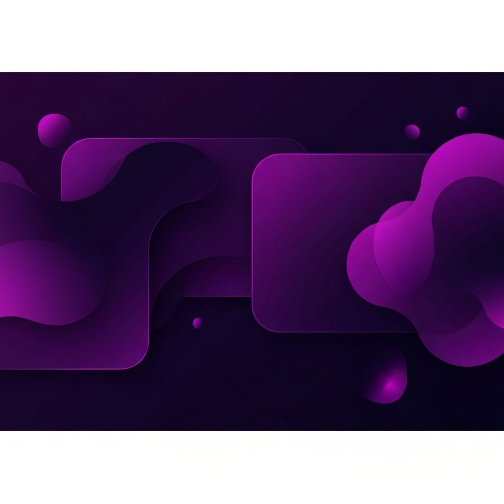
Bold, Vibrant Gradients
Apple's iOS 7 introduction of subtle gradients had paved the way, but 2018 was when gradients went full color. Saturated two-color and three-color gradients appeared on hero sections, buttons, illustrations, and even typography. Spotify, Stripe, and Instagram led the way, and smaller brands eagerly followed. The trend proved that color, used confidently, could differentiate a brand far more effectively than another minimalist white-on-white treatment.
Organic and Asymmetric Shapes
Rigid rectangles gave way to flowing organic shapes in 2018. Blob-like background elements, wavy section dividers, and irregular hero illustrations softened the geometric harshness of earlier trends. These organic forms made websites feel more human and approachable, particularly for brands targeting younger audiences. Modern website development tools and improved SVG support made implementing these shapes practical at scale.
Broken and Asymmetric Grids
The grid breaking that began in 2017 accelerated in 2018. Designers experimented with overlapping content, intentional misalignment, and unconventional reading paths. The best examples felt like editorial magazine spreads brought to the web. The worst examples confused users and hurt conversion. Either way, the trend forced designers to think more deeply about visual hierarchy and the order in which the eye should travel across a page.
Custom Illustrations Reach Mainstream
Custom illustrations had been gaining ground for several years, but in 2018 they fully replaced stock photography on many commercial sites. Brands invested in distinct illustration styles that became as recognizable as their logos. Mailchimp, Slack, and Dropbox set the tone, and countless smaller brands developed their own illustrated visual languages. The trend humanized brands and gave them visual ownership of their stories.
Big, Bold Typography Continues to Dominate
Building on 2017's typography revolution, 2018 saw even larger and more expressive type. Variable fonts, which allow a single font file to render at any weight or width, made dramatic typography practical without massive performance penalties. Designers used type to lead the eye, set the mood, and even replace traditional images on certain landing pages.
Mobile-First Becomes Non-Negotiable
Google's mobile-first indexing began rolling out in 2018, signaling that mobile experience was no longer a secondary consideration. Designers stopped sketching desktop layouts first and started with the mobile view. Touch targets grew more generous, navigation simplified further, and content was prioritized ruthlessly. Sites that couldn't make the transition saw real declines in search rankings.
Accessibility Goes Mainstream
2018 was the year accessibility moved from compliance checkbox to design principle. Designers began considering color contrast, keyboard navigation, screen reader compatibility, and motion sensitivity from the start of every project. The shift wasn't just ethical; it was practical. Accessible sites tend to perform better in search, convert more visitors, and reduce legal risk. The principles established that year remain foundational today.
Subtle Animation and Cinemagraphs
The micro-interactions that emerged in earlier years matured in 2018. Subtle scroll-triggered animations, hover effects, and loading states became standard. Cinemagraphs, those partially animated still images, continued to add atmosphere to hero sections. The best implementations enhanced storytelling without sacrificing performance, while the worst created distraction and accessibility issues for users sensitive to motion.
Particle Effects and 3D Elements
Advances in WebGL and JavaScript animation libraries brought particle effects and lightweight 3D elements to mainstream commercial sites. Apple's product pages set the standard with rotating product views and scroll-driven 3D animations. Smaller brands adopted simpler implementations, often using libraries like Three.js to add depth without overwhelming complexity.
Voice and Conversational UI Mature
The chatbot wave that started in 2017 matured in 2018 as natural language processing improved. Brands deployed more sophisticated bots for lead qualification, support triage, and product recommendations. Voice search optimization became a real SEO consideration as smart speakers found their way into millions of homes. Designers and developers began thinking about how their content might be served through entirely non-visual interfaces.
Video Backgrounds, Used More Carefully
Background video had been around for years, but in 2018 designers grew more disciplined about when to use it. Short, looping clips with no audio replaced longer videos. Mobile fallbacks became standard. Performance budgets dictated maximum file sizes. The result was a more restrained but more effective use of video as an atmospheric element.
Headless and API-Driven Sites Emerge
Beneath the visual trends, headless CMS and API-driven architectures gained serious traction in 2018. Separating content from presentation gave content teams more flexibility and made it easier to deliver the same content across websites, apps, and other surfaces. The shift demanded more sophisticated web application development capabilities but rewarded teams with much greater long-term agility.
What Endured From 2018
Several 2018 trends have aged into modern best practices. Vibrant gradients, custom illustrations, mobile-first design, and accessibility focus all remain central to good web design. Organic shapes have softened into subtler accents but still appear on countless sites. Broken grids have evolved into thoughtfully imbalanced compositions rather than chaotic layouts.
Final Thoughts
2018 was a year of confident self-expression in web design. The web grew more colorful, more illustrated, and more accessible all at once. Many of its trends have aged remarkably well, and the projects that combined visual ambition with strong fundamentals still hold up beautifully today.