Why Web Design Lingo Matters
If you have ever sat in a meeting where someone mentioned "above the fold" wireframes with a "hero" section and "sticky" navigation, you already know that web design has its own language. This vocabulary is shorthand that experienced designers use to communicate ideas quickly, but it can confuse clients, marketers, and newcomers who have not been steeped in the field.
Understanding the most common web design lingo helps everyone involved in a project participate more effectively. Designers can write clearer briefs, clients can give better feedback, and stakeholders can understand exactly what they are buying. Even a small investment in learning this vocabulary pays off in fewer misunderstandings and faster project timelines.
Hire AAMAX.CO for Web Design and Development Services
If you would rather skip the jargon and have experts handle your project, you can hire AAMAX.CO. They are a full-service digital marketing company providing website design, development, SEO, and digital marketing services worldwide. Their team translates technical lingo into plain language for clients, so business owners always understand what is happening at every step of their project without needing to memorize a glossary.
Layout and Visual Lingo
The hero section is the large area at the top of a page that combines a headline, supporting text, and often an image or video. The phrase "above the fold" refers to anything visible without scrolling, a term borrowed from newspaper layout. Below the fold is everything users discover when they scroll down.
White space, sometimes called negative space, is the empty area around design elements. It is not literally white, it is just unused space that gives the layout room to breathe. Hierarchy describes the order in which elements catch the eye, typically guided by size, color, and position.
Typography Lingo
Typography has its own dense vocabulary. A typeface is a family of related fonts, while a font is a specific weight and style within that family, such as Bold or Italic. Kerning is the spacing between individual letters, tracking is the spacing across an entire block of text, and leading is the spacing between lines.
Designers also talk about serif and sans-serif fonts, where serifs are the small decorative strokes at the ends of letters. Terms like cap height, x-height, and baseline describe specific anatomical features of letters that affect how they fit together on screen.
Layout Pattern Lingo
A wireframe is a low-detail blueprint of a page that shows where elements live without final design. A mockup is a higher-fidelity static visual that shows what a page will look like. A prototype is an interactive version that simulates clicks, transitions, and flows.
Sticky elements remain visible as users scroll, common for navigation bars or call-to-action buttons. Modal windows are small dialog boxes that appear on top of the main content, while tooltips are small information popups triggered by hovering or tapping an element.
Responsive and Device Lingo
Responsive design is the practice of building sites that adapt to any screen size. Breakpoints are specific screen widths at which the layout changes, often defined for mobile, tablet, and desktop. Mobile-first means starting the design from the smallest screen and adding complexity as the screen grows.
Viewport refers to the visible area of a web page on a given device. The phrase "pixel perfect" describes designs that match a target layout exactly to the pixel, a goal that is more flexible in modern fluid layouts but still relevant in some contexts.
Color and Branding Lingo
A color palette is the set of approved colors for a brand. Primary colors carry most of the visual weight, while secondary and accent colors highlight specific elements. Color tokens are named variables that map to specific values, allowing teams to update entire products by changing a single token.
Contrast describes how distinguishable two colors are from each other, which is especially important for accessibility. WCAG, the Web Content Accessibility Guidelines, defines contrast ratios that designers should meet to ensure text is readable for users with low vision.
UX and Research Lingo
A user persona is a fictional character that represents a real user segment, used to keep design decisions focused on actual people. A user journey traces the steps a person takes to complete a goal, often visualized as a flowchart. Pain points are the moments where users get frustrated, and these are prime targets for design improvements.
Heuristic evaluation is a structured review of an interface against established usability principles. A/B testing compares two versions of a design with real users to see which performs better. These methods help teams base decisions on evidence rather than opinion.
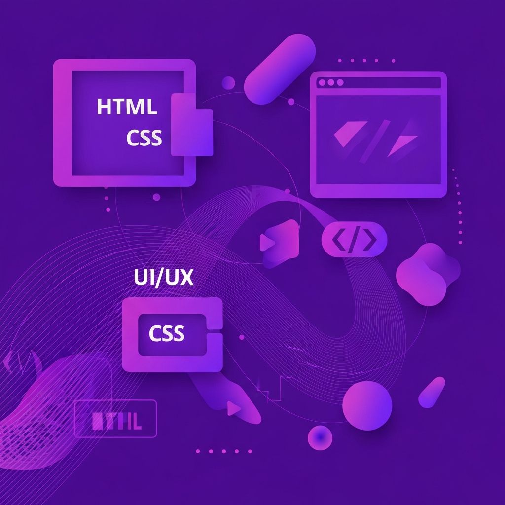
Development-Adjacent Lingo
HTML, CSS, and JavaScript are the three core technologies of the web. A CMS, or content management system, allows non-technical users to update content without touching code. A design system is a library of shared components, patterns, and guidelines that ensures consistency across products.
Front end refers to everything the user sees and interacts with, while back end refers to the servers and databases that power the site behind the scenes. Full stack describes someone who works comfortably across both domains.
Final Thoughts
Web design lingo can feel overwhelming at first, but most of it is just shorthand for ideas you already understand. Learning the vocabulary makes meetings faster, briefs clearer, and feedback more useful. As the field continues to evolve, new terms will emerge, but the core ideas remain stable. Once you internalize the basics, picking up new terms becomes much easier, and you can participate fluently in conversations with designers, developers, and stakeholders.