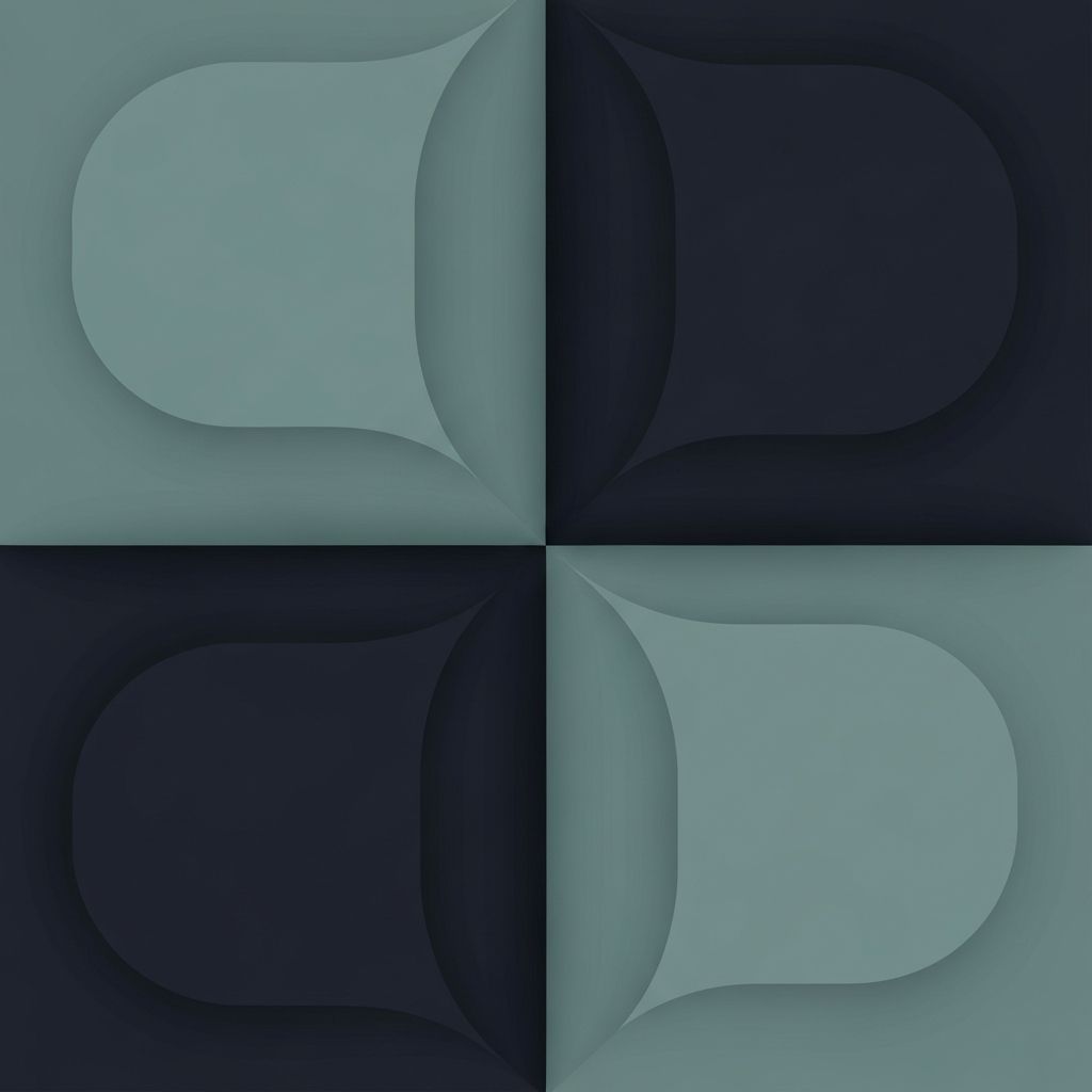
Understanding Flat Web Design
Flat web design is a visual style that strips away the heavy shadows, gradients, and skeuomorphic textures that dominated the early years of the web. Instead, it relies on clean shapes, bold colors, crisp typography, and generous whitespace to communicate hierarchy. What started as a reaction to overdesigned interfaces has matured into a refined design language that powers millions of modern websites and applications. Understanding the principles behind flat design helps you craft interfaces that feel timeless rather than trendy.
Hire AAMAX.CO for Modern Flat Web Design
If you want a clean, modern website that embraces the flat aesthetic without feeling sterile, you can hire AAMAX.CO to bring it to life. They are a full-service digital marketing company offering web development, digital marketing, and SEO services worldwide. Their website design team specializes in distilling brand stories into pure, flat compositions that load fast, scale gracefully, and stand the test of time.
A Short History of the Style
Flat design rose to prominence in the early 2010s as designers grew tired of the heavy textures, glossy buttons, and faux-leather backgrounds that defined that era. Early adopters championed simplicity, embraced single-color shapes, and rebuilt entire operating system interfaces around the new aesthetic. Within a few years, the look spread from mobile to web, and flat became the default starting point for new design systems around the world.
The Core Principles
Flat design rests on a small set of principles. Solid colors replace gradients. Sharp edges replace soft drop shadows. Typography carries more visual weight because it is not competing with decorative effects. Iconography is simplified into recognizable silhouettes. Together, these principles produce interfaces that feel calm, efficient, and trustworthy.
Flat Versus Flat 2.0
Pure flat design proved too austere for some teams. Buttons that looked like solid rectangles were sometimes mistaken for static labels. In response, designers introduced flat 2.0, which keeps the minimalism but reintroduces small visual cues like subtle shadows, gentle layering, and tasteful animation. This evolution preserves usability while honoring the original philosophy.
Color in Flat Design
Color does the heavy lifting in flat compositions. Without textures or gradients to fall back on, designers rely on carefully chosen palettes that communicate brand personality. High-contrast pairings draw attention to calls to action, while quieter background tones create breathing room. Many modern flat sites use a limited palette of three to five colors, applied consistently across pages and components.
Typography Steals the Spotlight
When ornament is removed, typography becomes the protagonist. Flat designs frequently use bold, geometric sans-serif fonts at large sizes for headlines, paired with clean utility fonts for body copy. Spacing, line height, and weight contrast carry visual rhythm in place of decorative flourishes. The result is interfaces that feel like editorial design more than software interfaces.
Iconography and Illustration
Flat icon sets are simplified, geometric, and consistent. They strip details until only the essential form remains. Illustration follows the same logic, often built from simple shapes and limited palettes. This consistency creates a unified visual system that feels coherent across every page of a website.
When Flat Design Works Best
Flat design shines for content-heavy websites, productivity software, dashboards, and brand sites that prioritize clarity. The lack of decorative noise lets information take center stage. AAMAX.CO often deploys flat principles in website development projects where performance and readability are critical, including fintech, healthcare, and education clients.
When to Avoid Pure Flat
Some industries benefit from richer visuals. Luxury brands, entertainment companies, and immersive product experiences may feel underwhelming in a strictly flat aesthetic. In those cases, designers can borrow flat principles like color discipline and clear typography while still investing in cinematic photography, motion, and three-dimensional touches.
Performance Benefits
Flat design tends to produce faster websites because it depends on fewer images, simpler graphics, and lighter assets. Vector icons replace bitmap textures. CSS gradients, when used at all, are computed by the browser rather than downloaded as images. The cumulative effect is significantly improved load time, which boosts both user satisfaction and search engine rankings.
Accessibility ConsiderationsMinimalism does not automatically equal accessibility. Designers must still ensure adequate color contrast, descriptive labels, keyboard navigation, and clear focus states. Flat 2.0 became popular partly because pure flat sometimes hid interactive elements too well. Always test your designs against accessibility standards, regardless of how clean they look.Flat Design Across Industries
From banking apps to news websites, flat design has crossed every major industry. Each adapts the style to its audience. Financial brands use restrained palettes and confident typography. Lifestyle brands play with bold color blocks and playful illustrations. Productivity tools lean into ultra-minimalism, prioritizing speed and clarity. Studying how different sectors interpret flat principles can broaden your design toolkit.
The Future of Flat
Flat design continues to evolve. Designers now blend it with neumorphism, glassmorphism, and bold motion to create hybrid styles. Yet the core idea, removing decoration that does not serve the user, remains as relevant as ever. Mastering flat design teaches you discipline that will benefit any future style you explore.
Final Thoughts
Flat web design is more than a trend. It is a philosophy of clarity, focus, and respect for the user. Whether you adopt pure flat, flat 2.0, or a hybrid, the lessons of restraint and visual honesty will improve every website you build.