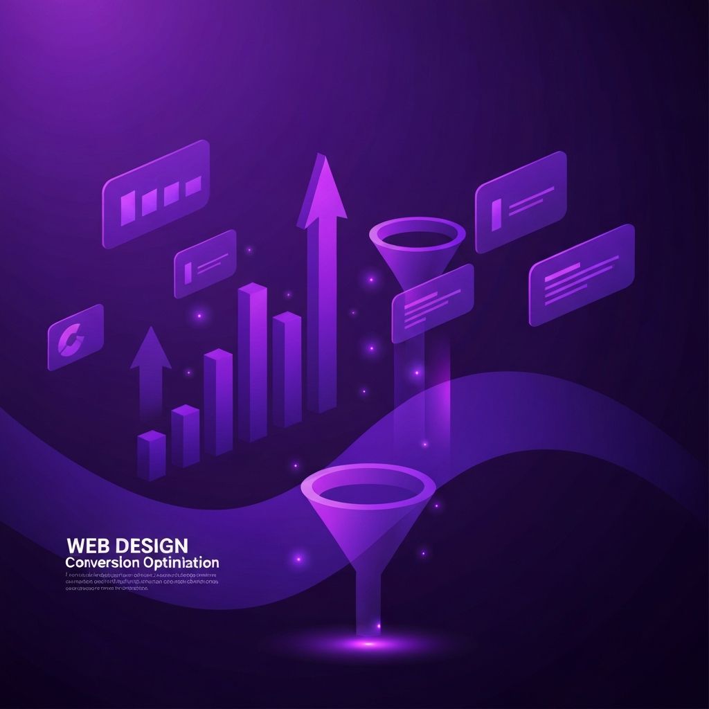
What Web Design Conversion Really Means
Web design conversion is the practice of shaping every aspect of a website, from layout and copy to forms and performance, so that more visitors take the action you want them to take. Those actions vary by business: a software company wants free trials, an ecommerce store wants purchases, a service provider wants qualified inquiries, and a media site wants newsletter sign-ups or paid subscriptions. The principles behind effective conversion design, however, are remarkably consistent.
Great conversion design is not about manipulation. It is about removing friction, building trust, and presenting the right offer to the right person at the right moment.
Hire AAMAX.CO for Web Design and Development
If you want to combine conversion-focused design with the technical and marketing infrastructure to support it, you can hire AAMAX.CO. They are a full-service digital marketing company offering web development, digital marketing, and SEO services worldwide. Their team approaches every website design project as a conversion engine, integrating analytics, SEO, ad campaigns, and content strategy so that improvements compound over time. Instead of treating design as decoration, they treat it as a measurable lever for revenue and growth.
Start with a Clear Conversion Goal
Every page should have one primary conversion goal and, optionally, one or two secondary goals. The home page might prioritize sign-ups with a secondary goal of feature exploration. A pricing page prioritizes purchase or contact. A blog post prioritizes newsletter sign-up or related-content engagement. When pages try to do everything, they usually do nothing well.
Once goals are defined, every design decision can be evaluated against them: does this element move people toward the goal, or does it distract from it?
Above-the-Fold Clarity
The area visible without scrolling, often called above the fold, is where most visitors decide whether to stay or leave. It must answer three questions almost instantly: what is this, who is it for, and why should I care? A focused headline, a supporting subheadline, a clear primary call to action, and a relevant visual usually do this best.
Avoid vague headlines, jargon, and generic stock imagery. Specificity, benefits, and authentic visuals consistently outperform clever but unclear messaging.
Visual Hierarchy and Eye Flow
Conversion design relies on guiding the eye through content in a deliberate sequence. Use size, contrast, color, spacing, and alignment to create a clear hierarchy. The most important element on the page, usually the primary call to action, should be the most visually prominent. Supporting elements should reinforce, not compete.
Pay attention to natural reading patterns such as F and Z shapes on text-heavy pages and central focus on landing pages. Place key messages and calls to action where eyes naturally land.
Trust Signals and Social Proof
Visitors rarely convert without some level of trust. Trust signals include customer logos, testimonials, case studies, ratings, certifications, security badges, media mentions, and transparent information about your team and policies. Place these signals near decision points: above the fold, near pricing, near forms, and on checkout pages.
Authentic, specific proof outperforms generic praise. A short quote with a real name, photo, and concrete result is more persuasive than a long, vague endorsement.
Forms, Buttons, and Microcopy
Forms and buttons are where conversion either happens or breaks down. Keep forms short, use clear labels, and validate input gently. Use action-oriented button copy that describes the outcome, such as "Start My Free Trial" or "Get My Custom Quote," instead of generic words like "Submit."
Microcopy around forms and buttons reduces hesitation. Short reassurances such as "No credit card required," "Cancel anytime," or "We respond within one business day" can lift conversion rates significantly with minimal effort.
Speed, Mobile, and Accessibility
Performance is a conversion factor, not just a technical metric. Slow pages lose visitors before they ever see your offer. Optimize images, minimize scripts, use modern formats, and rely on a fast hosting setup. Test real-world performance on mid-range mobile devices and on slower networks.
Mobile experience is equally critical. Most traffic now comes from phones, and mobile conversion rates are sensitive to layout, tap targets, form usability, and load times. Accessibility further expands your reach: clear focus states, sufficient contrast, semantic markup, and screen reader support help every visitor and often improve overall usability.
Testing, Analytics, and Iteration
Conversion design is never finished. Set up analytics to track conversion events, funnels, and drop-off points. Use heatmaps and session recordings to understand how visitors actually behave. Run controlled experiments, often called A/B tests, on headlines, layouts, calls to action, and offers.
Be disciplined about sample sizes and statistical significance. Small lifts on high-traffic pages compound into meaningful revenue, but only if they are real and not statistical noise.
Aligning Design with Marketing
The highest-performing sites align design with marketing channels. Landing pages match the message of the ads or emails that drive traffic to them. Calls to action match the visitor's stage in the buying journey. Content depth matches the keyword intent that brought them from search engines.
When design, copy, and marketing speak the same language, visitors feel understood and convert more easily.
Final Thoughts
Web design conversion is the disciplined craft of removing friction and amplifying clarity at every step of the visitor's journey. By defining clear goals, designing with intention, building trust, optimizing performance, and iterating based on data, you turn your website into a reliable engine for growth rather than a static brochure.