Why Web App Dashboard Design Matters
Dashboards are the cockpit of modern software. They are where users make decisions, track progress, and take action. A great dashboard transforms complex data into clarity, surfaces what matters, and makes every interaction feel effortless. A poor dashboard buries insights, overwhelms users, and turns powerful tools into sources of frustration. The difference between the two is not raw data volume. It is design.
Web app dashboard design is a specialized discipline that combines information architecture, data visualization, interaction design, and engineering. Whether the dashboard powers a SaaS product, an internal tool, or an analytics platform, the same fundamental principles separate the products users love from the ones they tolerate.
Hire AAMAX.CO for Dashboard Design and Development
Building a dashboard that genuinely serves users is harder than it looks. The team at AAMAX.CO partners with SaaS companies, internal IT teams, and product organizations to design and build dashboards that turn data into decisions. As a full-service digital agency offering web application development, design, and SEO services worldwide, they bring together user research, visual design, and full-stack engineering. Their team understands how to balance dense information with clean aesthetics so that dashboards feel powerful and approachable at the same time.
Start With User Goals, Not Data
The most common dashboard mistake is starting with data and ending with charts. A great dashboard begins with user goals. What decisions does the user need to make? What actions do they need to take? What questions do they need to answer? Every component on the page should map to one of these jobs.
User research is the foundation. Interview real users, observe their workflows, and identify the metrics that drive their work. Then design a dashboard that puts those metrics front and center while pushing secondary data into deeper views or detail pages. This discipline produces dashboards that feel essential rather than overwhelming.
Information Hierarchy and Layout
A strong information hierarchy guides the eye to the most important data first. Use size, position, and contrast to signal priority. Headline metrics belong at the top, often as large numbers with clear labels and trend indicators. Supporting charts come next, followed by detailed tables and filters.
Layout patterns vary by use case. A single-purpose dashboard for a specific workflow might use a focused, top-to-bottom flow. A multi-purpose analytics dashboard might use a grid of cards that users can rearrange or customize. The right pattern depends on the user, not the designer's preference.
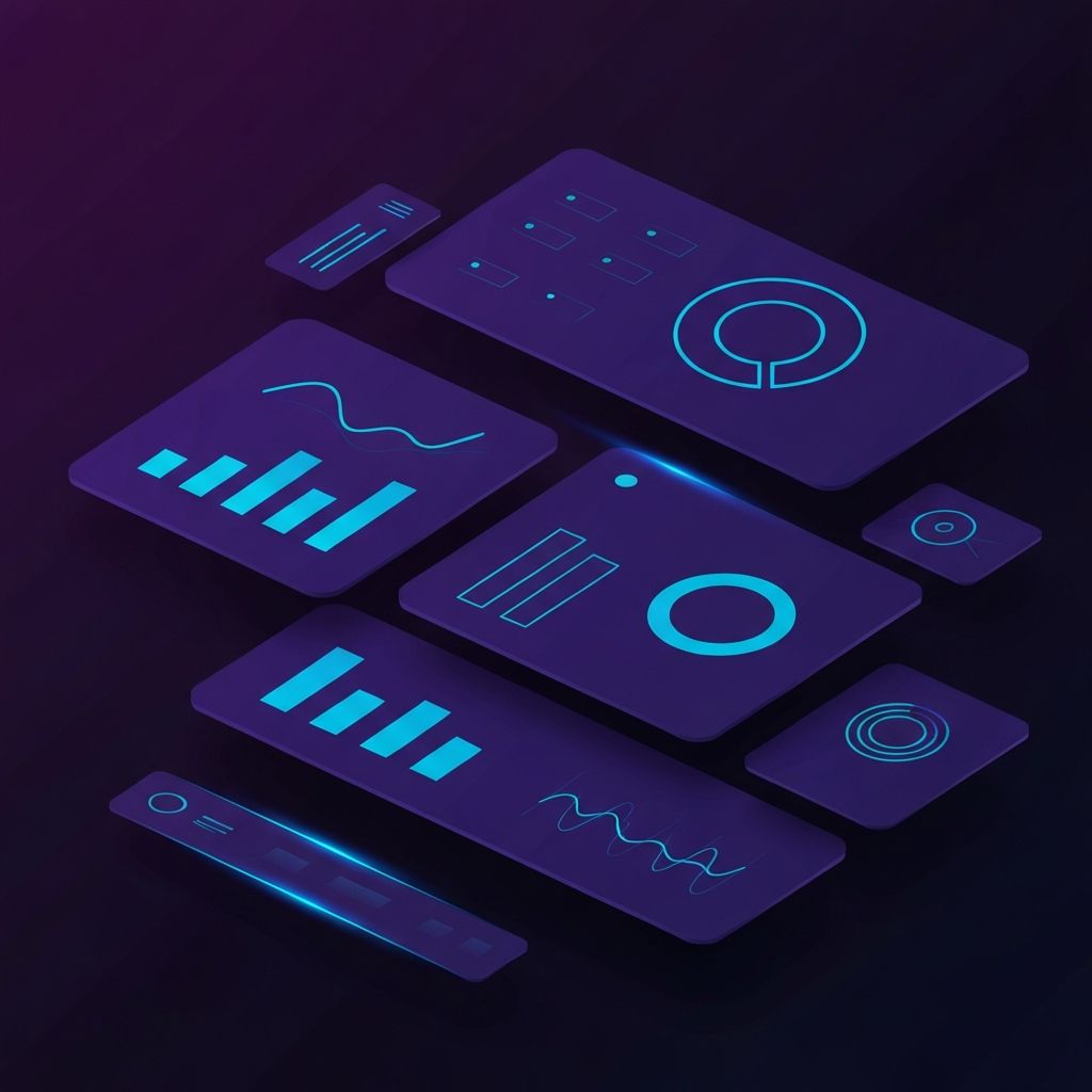
Choosing the Right Visualizations
Data visualization is a craft. Each chart type has strengths and weaknesses, and choosing the wrong one obscures rather than reveals. Line charts excel at showing trends over time. Bar charts compare categories. Pie charts work for showing parts of a whole, but only with a small number of slices. Heatmaps reveal patterns across two dimensions. Scatter plots highlight correlations.
Avoid 3D effects, unnecessary animations, and gratuitous color. The goal is clarity, not decoration. Every visualization should answer a specific question that the user actually has, with axis labels, units, and context that make the answer obvious.
Color, Typography, and Spacing
Dashboard aesthetics affect both usability and trust. A restrained color palette anchored in neutrals lets data colors stand out. Use accent colors purposefully, often to indicate status such as success, warning, and error. Avoid using more than five or six colors across the entire dashboard.
Typography should prioritize legibility. Use a clear, modern sans-serif at appropriate sizes. Numbers benefit from tabular figures so that columns align cleanly. Generous spacing between cards and rows reduces cognitive load and makes dense data feel manageable.
Interactivity and Filtering
Modern dashboards are interactive. Users expect to filter by date range, segment, region, or any other dimension that matters to them. Filters should be prominent, persistent across sessions, and reflected in URLs so that views can be shared and bookmarked.
Drill-downs let users move from summary to detail without losing context. A click on a metric opens a detail view. A hover on a chart reveals a tooltip with exact values. A keyboard shortcut applies a filter. Each interaction should feel quick, predictable, and reversible.
Performance and Real-Time Data
Performance is a feature. Dashboards often pull data from multiple APIs, run heavy aggregations, and render dozens of charts. Without careful engineering, they slow to a crawl. Strategies such as server-side aggregation, caching, lazy loading, and virtualization keep dashboards responsive even at scale.
For real-time use cases such as monitoring or trading, websockets and event streams keep data fresh without forcing users to refresh. Skilled website development teams use modern frameworks and infrastructure to deliver smooth performance even under heavy load.
Customization and Personalization
Different users care about different metrics. Customization allows users to tailor the dashboard to their role and workflow. Common patterns include rearranging cards via drag and drop, saving custom views, choosing default filters, and switching between predefined layouts for executives, analysts, and operators.
Personalization should default to a strong starting point. Most users will never customize, so the out-of-the-box experience must work well for the majority. Customization rewards power users without punishing newcomers.
Accessibility and Responsiveness
Accessibility is non-negotiable. Color contrast, keyboard navigation, screen reader support, and respect for reduced motion preferences expand the audience and meet legal requirements. Charts should include text alternatives or accessible data tables for users who cannot perceive visual graphics.
Responsiveness matters too. Dashboards are increasingly accessed from tablets and phones, especially by executives and field teams. A mobile-friendly version that surfaces the most important metrics, even if it does not include every advanced feature, broadens the dashboard's reach and value.
Final Thoughts on Dashboard Design
Web app dashboard design is part data science, part user experience, and part visual craft. The best dashboards begin with user goals, embrace clarity over density, choose the right visualizations, and remain fast at scale. Investing in dashboard design is investing in decisions, because every chart, table, and filter ultimately exists to help someone choose what to do next.