Introduction
Swiss web design is one of the most influential and quietly enduring movements in the history of visual communication. Rooted in the International Typographic Style that emerged in Switzerland during the 1950s, it emphasizes grids, neutral typography, generous whitespace, objective photography, and a relentless focus on clarity. While trends in web design come and go, the Swiss approach keeps reappearing because it works: sites built on these principles are easier to read, faster to navigate, and significantly more durable across redesigns and devices. This article unpacks what Swiss web design really is, how it translates from print to the screen, and how to apply its principles to modern websites without making them feel cold or generic.
Why Hire AAMAX.CO for Swiss-Inspired Web Design
Swiss-inspired projects demand discipline: tight grids, precise typography, and a refusal to clutter. AAMAX.CO is a full-service digital marketing company offering web development, digital marketing, and SEO services worldwide, and their designers are comfortable working in this restrained, structured aesthetic. They help brands strip away visual noise, build robust grid systems, and choose typography that performs well on every device, while still injecting the personality and conversion-focused thinking modern websites require to succeed in competitive markets.
The Roots of Swiss Design
Swiss design grew out of mid-twentieth-century European modernism, with figures like Josef Müller-Brockmann, Armin Hofmann, Max Bill, and the type designers behind Helvetica and Univers shaping its DNA. The movement prioritized objective communication over expressive ornamentation. Grids were not decorative; they were a method of organizing information so the reader could grasp it quickly. Typography was sans-serif, set with mathematical precision. Photography replaced illustration whenever possible because it represented reality more directly. The result was a visual language that felt rational, calm, and trustworthy.
From Print to Pixels
Translating Swiss design from posters and editorial layouts to interactive websites requires a few important adaptations. Web layouts must respond to countless screen sizes, not the fixed dimensions of a poster. Type rendering varies across operating systems and browsers. Users scroll, click, and tap rather than turning pages. Modern Swiss web design embraces these realities while preserving the underlying principles: rigorous structure, strong typography, restraint in color, and respect for the reader’s attention.
Grids as the Foundation
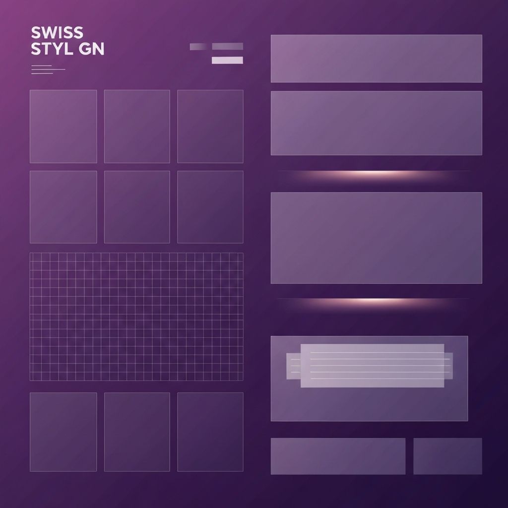
Grids are the heart of Swiss web design. A well-defined grid — typically a 12-column or modular system with consistent gutters and a clear baseline rhythm — provides an invisible scaffold for every page. Headlines, body text, images, and components snap into place with mathematical precision. Visitors may not consciously notice the grid, but they feel its calmness through aligned edges, predictable spacing, and a sense that everything belongs exactly where it is. CSS frameworks and modern layout tools like CSS Grid and Flexbox make implementing these systems easier than ever.
Typography as Content, Not Decoration
In Swiss web design, typography is not chosen to be flashy; it is chosen to disappear into the act of reading. Sans-serif faces like Helvetica, Inter, Suisse, Söhne, or Neue Haas Grotesk are common choices, often paired with a complementary serif for editorial passages. Hierarchy is built through size, weight, and spacing rather than color or decorative effects. Long-form content gets generous line height, comfortable measure, and careful kerning. Headlines are set with intent, often in tightly tracked, large-format type that anchors entire sections of the page.
Whitespace and Restraint
Whitespace is the most misunderstood element of Swiss design. Beginners see empty space and want to fill it. Swiss designers see empty space as the medium that lets content breathe. Generous margins, padded sections, and uncluttered pages communicate confidence: the brand has nothing to prove and trusts the visitor’s attention. On the web, this restraint translates to reduced cognitive load, faster comprehension, and pages that feel premium without resorting to heavy effects or expensive imagery.
Color: Neutrals With a Single Accent
Classic Swiss palettes lean heavily on neutrals — white, off-white, deep grays, black — with a single bold accent color used sparingly for emphasis and calls to action. On the web, this approach has practical benefits beyond aesthetics. Limited palettes make accessibility easier, ensure that interactive elements stand out clearly, and keep visual hierarchy stable across devices and lighting conditions. When applied to ecommerce or marketing sites, this restraint also makes products and offers more visible because the surrounding interface stays out of the way.
Photography and Imagery
Swiss design favors objective, well-composed photography over illustration or stock-style art direction. Images are cropped purposefully, aligned to the grid, and used at meaningful scale rather than scattered as decoration. Black-and-white treatments, duotones, or carefully calibrated color photography all fit comfortably in this language. On the web, attention to image quality, modern formats like AVIF and WebP, and disciplined art direction across pages preserves the clarity Swiss design demands. This care is part of what distinguishes professional website design from quickly assembled templates.
Swiss Principles and Conversion
Some critics assume that Swiss design is too austere for conversion-focused sites. In practice, the opposite is often true. Visitors arriving at a clean, well-organized page can find what they need quickly, feel reassured by the apparent professionalism, and act with confidence. Calls to action, when placed within a Swiss grid, feel deliberate rather than desperate. Marketing pages built on Swiss principles often outperform busier alternatives because they respect the reader’s time and attention.
Common Pitfalls When Applying Swiss Design to the Web
Three pitfalls show up repeatedly. The first is mistaking minimalism for emptiness, producing sites that lack personality, content, or warmth. The second is rigidly copying classic posters without adapting the grid for responsive realities, leading to layouts that look stunning on desktop and break awkwardly on phones. The third is treating Swiss design as a style applied at the end rather than a discipline guiding the whole project, which results in superficial restraint over a fundamentally cluttered structure.
Modernizing Swiss Design Without Diluting It
The most successful contemporary Swiss-inspired websites layer modern techniques onto the classic foundation. Subtle motion brings sections to life without distracting from content. Variable fonts allow refined typographic control across viewports. Dark modes, carefully crafted, preserve hierarchy while giving the eyes a different experience. Custom illustrations or expressive type moments appear sparingly to add personality, always anchored to the grid. The trick is to evolve the language while keeping its commitment to clarity intact.
When Swiss Design Fits and When It Does Not
Swiss design fits naturally with publications, financial services, technology platforms, design studios, architecture firms, premium consumer brands, and any context where clarity and credibility matter. It is less appropriate for brands whose value rests on exuberance, maximalism, or overt playfulness, although elements of Swiss thinking — disciplined grids, strong typography, considered hierarchy — can still strengthen even the most expressive design systems. The principles are universal, even when the specific aesthetic is not.
Conclusion
Swiss web design endures because it solves problems that never go away: how to organize information clearly, how to make typography sing on a small screen, how to look serious without looking dull. By embracing grids, typography, restraint, and disciplined imagery, modern websites built in this tradition feel calm, capable, and confident. Whether you adopt the full Swiss aesthetic or simply borrow its structural rigor, the result is almost always a website that respects its visitors and rewards them with clarity in a world full of digital noise.