Sleek web design is more than an aesthetic choice. It is a strategic approach that uses simplicity, clarity, and refined craftsmanship to elevate how a brand is perceived online. When done well, a sleek website feels effortless to use, premium to look at, and confident in its message. Visitors trust it almost instantly, which translates directly into stronger engagement and higher conversion rates.
This article unpacks what makes a website truly sleek, the core principles behind this style, and the practical techniques designers use to achieve it without sacrificing usability or business performance.
Hire AAMAX.CO for Sleek, High-Performing Web Design
Achieving a polished, sleek aesthetic requires both creative talent and technical precision. AAMAX.CO is a full-service digital marketing company that helps brands launch refined, modern websites built around clear business goals. Their team blends elegant website design with strong development practices and SEO strategy, ensuring that every project not only looks sophisticated but also performs in search and across devices.
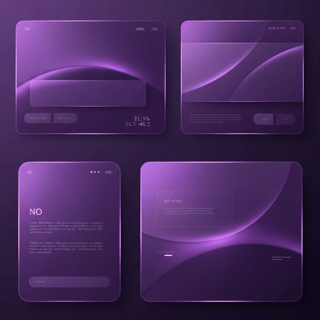
Less Is More, On Purpose
Minimalism sits at the heart of sleek design, but minimalism is not emptiness. It is intentional reduction. Sleek designers strip away decoration that does not serve the user, leaving only what is essential to communicate the message. Generous white space, simple navigation, and a clear visual focal point per section help users absorb information without feeling overwhelmed. The discipline lies in choosing what to remove, not just what to add.
Refined Typography
Typography often does the heaviest lifting in sleek websites. Carefully selected fonts, balanced sizing scales, and thoughtful line spacing transform plain text into a confident voice. Designers usually limit themselves to one or two typefaces, ensuring consistency across pages. Subtle contrasts in weight and size create hierarchy without resorting to loud colors or heavy graphics. Beautiful typography alone can make a website feel premium.
Calm and Cohesive Color Palettes
Sleek websites avoid color overload. Instead, they rely on a small, harmonious palette built around a single primary tone, supportive neutrals, and a precise accent for emphasis. Restraint here pays off: when nearly everything is calm, the few colored elements that remain command attention. Calls-to-action, key highlights, and important data points stand out naturally because the surrounding design stays quiet.
High-Quality Imagery and Iconography
Generic stock imagery instantly undermines a sleek aesthetic. Premium websites invest in custom photography, illustrations, or carefully curated visuals that reinforce the brand. Icons follow a unified style, weight, and corner radius. Every visual element looks like it belongs to the same family. This level of consistency signals craftsmanship and attention to detail, both of which build trust quickly.
Subtle Motion and Microinteractions
Animation can either elevate or ruin a sleek interface. Used sparingly, microinteractions like soft hover effects, gentle scroll reveals, and smooth transitions add a sense of polish and responsiveness. Used excessively, they create distraction and slow down the experience. The goal is motion that confirms, guides, or delights without ever calling attention to itself. When done right, users feel the experience more than they see the animation.
Generous White Space
White space, or negative space, is one of the most underrated tools in sleek design. It gives content room to breathe, separates ideas clearly, and creates a feeling of luxury. Cluttered layouts feel cheap, no matter how good the individual components are. Designers who embrace white space allow each element to feel deliberate and important, which in turn makes the overall design feel calm and confident.
Performance Matters
A sleek-looking website that loads slowly instantly loses its premium feel. Performance must match aesthetics. Optimized images, efficient code, lazy-loaded media, and modern formats keep the experience snappy. Speed is part of the perception of quality. Visitors may not consciously notice fast pages, but they feel them. A truly sleek site is fast everywhere, on every device.
Mobile Sleekness
Sleek design must translate beautifully to mobile. That means generous tap targets, readable typography without zooming, simplified navigation, and respectful use of motion. On smaller screens, every pixel counts, so prioritization becomes even more important. The same calm, confident, premium feeling that defines the desktop version must carry through seamlessly when users browse on the go.
Clear Calls-to-Action
Sleek does not mean shy. The most elegant websites still know how to ask for the sale, the signup, or the inquiry. The trick is to make calls-to-action prominent through contrast and placement rather than visual noise. A single accent color, a confident button label, and surrounding white space can drive significantly more clicks than a busier alternative full of competing elements.
Long-Term Brand Consistency
Sleek design ages well, but only if the brand commits to it across every touchpoint. Social media, email campaigns, presentations, and product UI should all share the same restrained, premium feeling. Designers who think about systems rather than one-off pages create a brand identity that stays cohesive as the company grows and the website evolves over time.
Final Thoughts
Sleek web design is the result of disciplined choices: clear typography, restrained color, intentional white space, subtle motion, and rock-solid performance. When these elements come together, the website transcends decoration and becomes a quiet but powerful tool for communication and conversion. Brands that embrace this approach, alone or with a skilled agency partner, position themselves as premium, trustworthy, and undeniably modern.