The Quiet Power of Shadows in Web Design
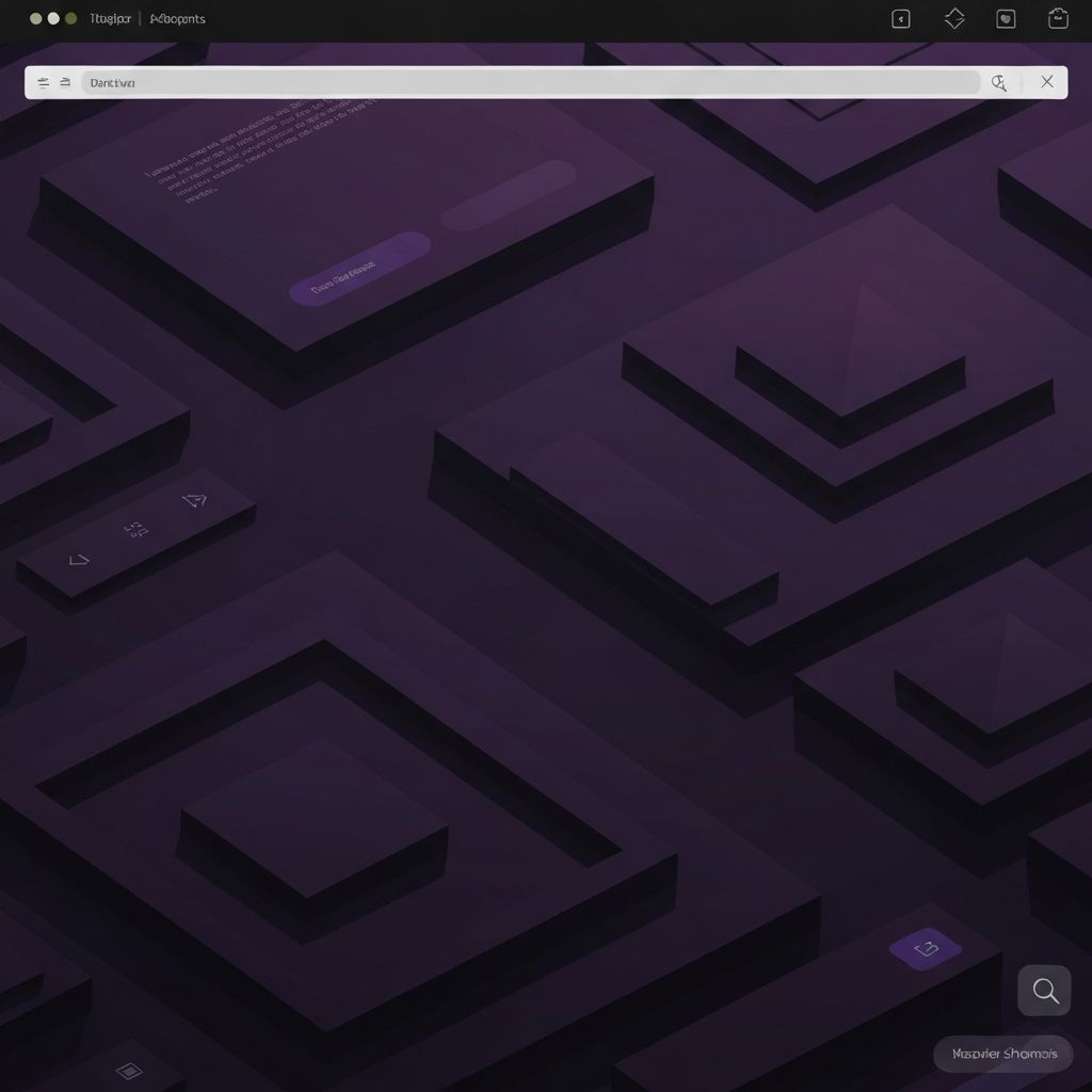
Shadows often go unnoticed by the average user, yet they shape the entire feel of a digital interface. They guide the eye, communicate hierarchy, and bring flat screens to life with a sense of depth and dimension. From subtle drop shadows beneath buttons to dramatic layered effects on cards and modals, shadows are a fundamental ingredient in modern web design. When used well, they make interfaces feel intuitive and tactile. When used poorly, they make pages look dated, heavy, or chaotic.
The history of shadows in design has shifted dramatically over the past two decades. Skeuomorphism in the early 2000s relied on heavy, photorealistic shadows to mimic physical objects. Flat design in the 2010s rejected them entirely. Today, the trend is somewhere in between, often called soft UI or neumorphism, which uses subtle, layered shadows to create gentle depth without overwhelming the design.
Hire AAMAX.CO for Modern Web Design and Development
Mastering the subtle art of shadows is just one piece of crafting a beautiful, functional website. AAMAX.CO brings deep expertise in website development and design, helping brands build interfaces that feel polished, modern, and intuitive. Their designers understand how small details like elevation, lighting, and contrast contribute to a cohesive user experience. Whether a project requires a minimal flat aesthetic or a richly layered interface, their team brings the technical skill and design sensibility needed to execute it beautifully.
Why Shadows Matter for User Experience
Shadows are not just decorative. They communicate critical information about how an interface works. A button with a soft drop shadow signals that it is interactive and clickable. A modal with a strong shadow tells users it is floating above the rest of the content and demands attention. A card with a slight shadow appears separate from the background, making it easier to identify as a discrete unit.
This visual language is rooted in real-world physics. Humans have spent their entire lives interpreting depth and elevation through light and shadow. When digital interfaces respect those instincts, they feel natural. When they ignore them, users have to think harder, which increases friction.
Types of Shadows and When to Use Them
There are several distinct shadow styles, each with its own use case. Drop shadows are the most common, casting a soft offset behind elements to suggest elevation. Inner shadows sit inside an element, often used for inputs or pressed states to imply depression or recess. Long shadows extend dramatically in one direction and were popular in flat 2.0 design. Layered shadows combine multiple shadows of different blurs and opacities to create more realistic depth.
Choosing the right type depends on the goal. Hover and click states benefit from elevated drop shadows that change with interaction. Cards, modals, and dropdowns rely on consistent shadow scales to communicate stacking order. Inputs and toggles often use inner shadows to suggest tactile interaction.
Building a Shadow System
Professional design systems treat shadows like typography or color. They define a consistent scale, often with names like elevation 1, elevation 2, and so on. Each level has a specific blur radius, offset, and opacity, applied predictably across the entire interface. This consistency is what separates polished products from amateur ones.
A typical system might include a tiny shadow for resting cards, a medium shadow for hover states, a larger shadow for dropdowns and tooltips, and a dramatic shadow reserved for modals or popovers. Each level signals a different level of importance and stacking.
Color and Realism
Pure black shadows often look harsh and artificial. Real shadows in nature take on subtle tints from the surrounding environment. The most realistic digital shadows use a slightly tinted dark color, often pulling from the brand palette or the background hue. Lower opacity values, around 10 to 20 percent, tend to feel more natural than fully opaque shadows.
For dark mode interfaces, traditional dark shadows disappear. Designers often switch to subtle highlights, glows, or borders to communicate elevation in dark themes. This is one of the trickiest parts of supporting both light and dark modes well.
Performance and Accessibility Considerations
Shadows are a CSS property, but they are not free. Heavy use of large blurred shadows can impact rendering performance, especially on mobile devices and during scroll. Designers and developers should avoid applying shadows to elements that animate frequently or contain large amounts of content.
Accessibility is another consideration. Shadows should not be the only way to communicate hierarchy or interactivity. Color, size, and label clarity must also do their part. Users with low vision may not perceive subtle shadows at all, so the interface should remain understandable without them.
Common Mistakes to Avoid
Inconsistent shadow values across an interface make it feel disjointed. Applying shadows to too many elements creates visual noise and flattens the very hierarchy shadows are meant to create. Heavy, dark shadows from older design eras can make a modern site feel dated. Mixing shadow styles, such as long shadows next to soft drop shadows, often looks chaotic.
The fix is discipline. Define a small set of shadow levels, document them, and apply them consistently. Resist the urge to invent new shadows on the fly.
Final Thoughts
Shadows are a quiet but powerful design tool. They turn flat layouts into navigable spaces, guide users toward important actions, and elevate the perceived quality of an interface. The best shadows are the ones users never consciously notice but always benefit from. By treating shadows as a system rather than a decoration, designers can create web experiences that feel intuitive, polished, and effortlessly modern.