Hero Section Web Design Definition
The hero section in web design is defined as the prominent introductory area at the top of a webpage, usually the first thing a visitor sees before scrolling. It typically spans the full width of the screen and combines a strong headline, supportive subheadline, a primary call to action, and a meaningful visual element such as a photograph, illustration, animation, or video. The hero section communicates the page’s purpose almost instantly, sets the tone for the brand, and guides the visitor toward the next step.
While the term hero section sounds dramatic, its purpose is practical. It must answer three quick questions for the visitor: what is this site, why should I care, and what should I do next. When those answers are clear, the hero becomes the most powerful conversion zone on the page.
Hire AAMAX.CO for Hero Section Web Design
Brands that want a hero section designed with both creativity and conversion data in mind often partner with AAMAX.CO. They are a full-service digital marketing company offering web development, digital marketing, and SEO services worldwide, and they treat the hero as the most strategic real estate on a website. Their team blends user research, copywriting, visual design, and performance optimization to ensure the hero section earns attention, communicates value clearly, and reliably converts visitors into leads or customers.
Why the Hero Section Matters
The hero section receives a disproportionate share of attention. Visitors decide within seconds whether to keep scrolling or leave. A weak hero squanders traffic earned through SEO, ads, and referrals. A strong hero amplifies that traffic by guiding visitors confidently into the rest of the experience. This is why thoughtful website design always invests heavily in the hero section, refining every word and pixel until the message lands quickly.
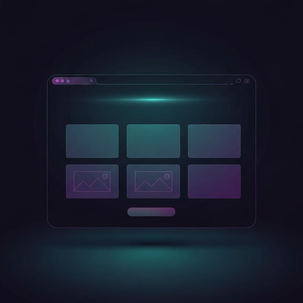
Core Elements of a Hero Section
Most hero sections include four core elements. First, a headline that communicates the central value proposition in plain language. Second, a subheadline that provides context, addresses objections, or clarifies the audience. Third, a primary call to action button that invites the visitor to take a specific next step. Fourth, a visual element that reinforces the message and adds emotional resonance. Some hero sections also include trust signals such as customer logos, ratings, or short testimonials.
Layout Patterns
Several layout patterns dominate modern hero design. Centered layouts place text and the call to action in the middle of the screen, often over a background image or color. Split layouts divide the screen between text and visual, which works well for product screenshots or photography. Full-screen video heroes create an immersive feel but must be used carefully to avoid harming performance. Minimalist text-first heroes can feel premium when the brand voice is strong enough to carry the section without heavy visuals.
Headline Strategy
The headline is the most important piece of copy in the hero section. It should focus on the visitor’s outcome rather than the brand’s features. Specific, concrete language outperforms vague phrases. Avoid clever wordplay that requires interpretation. The headline should be readable in a single glance and supported by a subheadline that adds depth without repeating the same idea.
Visual Strategy
The hero visual should reinforce the message, not compete with it. Authentic photography, real product screenshots, original illustrations, or short looping animations all work well when chosen with intention. Avoid generic stock imagery that adds no meaning. The visual must also be optimized for performance, since it often dominates the largest contentful paint and influences perceived load time.
Calls to Action
The primary call to action should be highly visible, clearly labeled, and aligned with the visitor’s likely intent. Use action-oriented language such as Start Free Trial, Book a Demo, or Get Started. A secondary, lower-commitment action like Learn More can serve visitors who are not ready to convert immediately. The button should have strong color contrast and enough whitespace around it to feel inviting rather than crowded.
Mobile Hero Sections
On mobile, hero sections must adapt gracefully. Headlines should stay short and punchy. Visuals may need to switch to a mobile-optimized version. Calls to action should be large enough for thumbs and positioned within easy reach. Avoid stacking too many elements above the fold on small screens, which can overwhelm the visitor and push the call to action out of sight.
Performance and Accessibility
The hero loads first, so its performance shapes the visitor’s first impression. Optimize images, defer non-critical assets, and avoid heavy animations that block rendering. Solid website development ensures the hero feels fast on every device. Accessibility is equally important: text contrast should meet WCAG guidelines, alt text should describe meaningful visuals, and the call to action should be fully usable with a keyboard and screen reader.
Common Mistakes to Avoid
Common hero mistakes include vague headlines, overcrowded layouts, weak or hidden calls to action, generic stock imagery, autoplaying audio, and slow-loading videos. Another frequent error is trying to communicate too many ideas at once. The hero is not the place for everything; it is the place for the single most important message and action.
Final Thoughts
The hero section in web design is the front door of a webpage. Its definition is simple, but its impact is enormous. By combining a clear headline, supportive subheadline, focused call to action, and meaningful visual, you can build a hero section that quickly explains your value, earns trust, and guides visitors confidently into the rest of the experience.