Color is one of the most emotional tools in web design. A colorful landing page can stop a scroll, set a mood, and communicate a brand personality in the first second a visitor arrives. Used well, it builds energy and delight. Used poorly, it overwhelms users and pushes them away. The best colorful landing pages are not just loud, they are intentional. Every hue earns its place, every contrast is considered, and every accent leads the eye toward the actions that matter most. This article looks at what makes a colorful landing page effective and how to draw inspiration without imitating.
How AAMAX.CO Designs Vibrant, High Performing Pages
Bringing color to life on a live website takes more than taste. AAMAX.CO is a full service digital marketing company offering web development, digital marketing, and SEO services worldwide. Their designers craft colorful landing pages that balance visual energy with accessibility, performance, and conversion goals. They know how to translate bold brand palettes into pages that load quickly, remain readable on every screen, and guide visitors confidently toward a clear next step.
Why Color Matters on Landing Pages
Landing pages exist to convert. Visitors usually arrive from an ad, email, or search result expecting a specific experience. Color sets the tone of that experience instantly. A soft pastel palette signals calm and care, a vibrant primary palette signals energy and confidence, and a moody jewel toned palette signals sophistication. Visitors feel these cues before they read a word.
Color also influences attention. Contrast draws the eye to key elements such as calls to action, headlines, and offers. When used strategically, color becomes a silent guide that moves visitors through the page in the order you intend.
Bold Primary Palettes
Some of the most memorable landing pages rely on bold primary palettes. A single saturated hero color, combined with neutrals and one strong accent, creates a page that feels confident and direct. This approach works well for SaaS products, consumer apps, and creative agencies that want to feel modern and approachable.
The trick is discipline. Choose one hero color, give it the loudest voice, and let everything else support it. When every color shouts, none of them are heard.
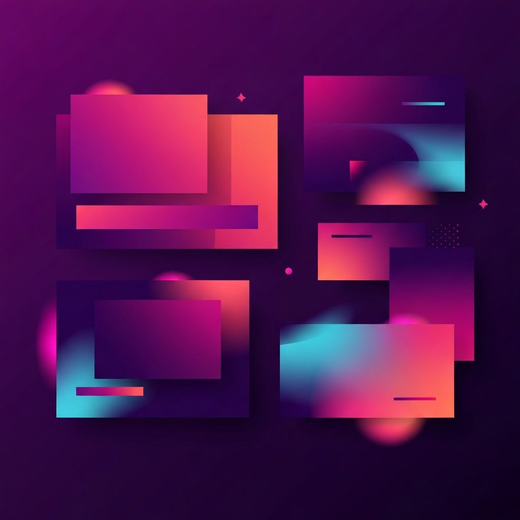
Playful Gradients and Color Washes
Gradients have made a strong comeback, moving from subtle background accents to full hero treatments. A well crafted gradient can suggest movement, optimism, and innovation. It also gives designers a way to create depth without heavy imagery or illustrations.
Effective gradients usually use analogous colors, such as blue to teal or pink to orange, rather than clashing complementary pairs. They also respect readability. Text on gradient backgrounds needs strong contrast, and accents should remain clearly visible without competing with the gradient itself.
Editorial and Magazine Inspired Palettes
Editorial design brings a different kind of colorfulness. Instead of saturated pops, it uses richer, earthier tones like mustard, burnt orange, forest green, and deep burgundy paired with off white and charcoal. The result feels refined and considered, appropriate for lifestyle brands, media companies, and premium services.
Pages inspired by editorial design often rely on confident typography, generous white space, and careful photo direction. Color is distributed through large blocks, pull quotes, and accent rules rather than being splashed across every element.
Neo Brutalist and High Energy Layouts
Neo brutalism and high energy layouts use color without apology. Oversized typography, chunky buttons, hard shadows, and electric accents create pages that feel bold and memorable. These designs work well for challenger brands, creative tools, and products that want to stand out from polished but predictable competitors.
Despite the chaotic feeling, the best examples are highly structured underneath. Strong grids, clear hierarchy, and careful spacing keep the experience usable even when the visual language is loud.
Dark Mode With Colorful Accents
Dark backgrounds paired with bright accents have become a signature of modern product and portfolio sites. Deep navy, charcoal, or near black surfaces allow neon blues, magentas, yellows, and greens to glow like signage. This combination feels futuristic and premium, especially for technology and creative brands.
Dark mode requires special attention to contrast and legibility. Body text should never sit at the edge of readability, and colorful accents should be tested for accessibility so users with visual impairments are not left behind.
Building a Colorful Palette That Works
A strong colorful palette usually includes a hero color, one or two supporting colors, a neutral system, and one or two accents. The hero dominates the page, supporting colors add variety and structure, neutrals give the eye places to rest, and accents highlight interactive elements.
Design tokens make this system easy to maintain. Define primary, secondary, and accent values along with semantic tokens for backgrounds, text, borders, and states. When every color in the system has a clear role, adding new components becomes straightforward and consistent.
Accessibility in Colorful Design
Colorful does not mean inaccessible. Contrast between text and background should meet recommended ratios, and color should never be the only signal for meaning. For example, do not rely on a red border alone to indicate an error. Combine it with an icon and a label. Test designs with accessibility tools and consider color blind safe palettes from the start.
Designers who care about accessibility often find their colorful designs become stronger, not weaker. Constraints drive creativity, and accessible palettes tend to feel more thoughtful and timeless.
Performance Considerations
Rich colors sometimes tempt designers to use heavy illustrations, animations, or high resolution photography. These assets can quickly hurt page speed, especially on mobile. Prefer vector illustrations, CSS gradients, and optimized image formats over oversized bitmap art. Reserve heavy assets for key moments where they genuinely lift the experience.
Working with a team that offers website design along with website development ensures that colorful concepts survive the transition from design file to production without losing speed or polish.
Finding Your Own Inspiration Responsibly
Design galleries, portfolio sites, and community platforms are great sources of inspiration, but copying a specific design rarely serves the brand or the business. Instead, study what you like, identify the underlying patterns, and adapt those patterns to your own context. Ask what a particular palette or layout achieves, then think about how to achieve something similar for your audience.
Final Thoughts
Colorful web design landing pages can be some of the most exciting, memorable pages on the internet. When color is guided by strategy, accessibility, and performance, it becomes a powerful tool for brand building and conversion. Use inspiration as a starting point, not a destination, and craft pages that feel unmistakably yours while still delivering the results your business needs.