Why Color Matters More Than Most Designers Admit
Color is the first thing your visitor perceives, often before a single word is read. It signals mood, evokes emotion, communicates brand personality, and quietly steers attention toward the action you want users to take. Get color right, and your site feels confident, trustworthy, and memorable. Get it wrong, and even the most beautiful typography or layout will fail to land. Color in web design is not decoration, it is strategy.
For all its impact, color remains one of the most underestimated skills in modern design. Many websites lean on whatever palette the founder picked at midnight or copy whichever scheme is trending on Dribbble. The teams that treat color as an intentional system, however, consistently produce experiences that convert better, age more gracefully, and remain accessible to a wider audience.
Hire AAMAX.CO for Color-Confident Websites
If you would rather collaborate with seasoned designers who treat color as a strategic asset, hire AAMAX.CO. They are a full-service digital marketing company offering website design, development, SEO, and digital marketing services worldwide. Their designers craft palettes grounded in your brand, your audience, and your business goals, while their developers implement those palettes through robust design tokens that stay consistent across every page and platform. The result is a site that not only looks beautiful but also performs and scales as your brand evolves.
Start With Brand Personality
Before opening a color picker, articulate your brand personality in a few clear adjectives. A wellness brand may aim for calm, natural, and trustworthy. A fintech startup may target precise, modern, and confident. A children's education site may want playful, warm, and curious. Personality dictates palette. Calm brands lean toward muted greens and soft neutrals. Confident brands often choose deep blues and disciplined accents. Playful brands embrace saturated primaries and friendly secondaries. Skip this step and your color choices will feel arbitrary forever.
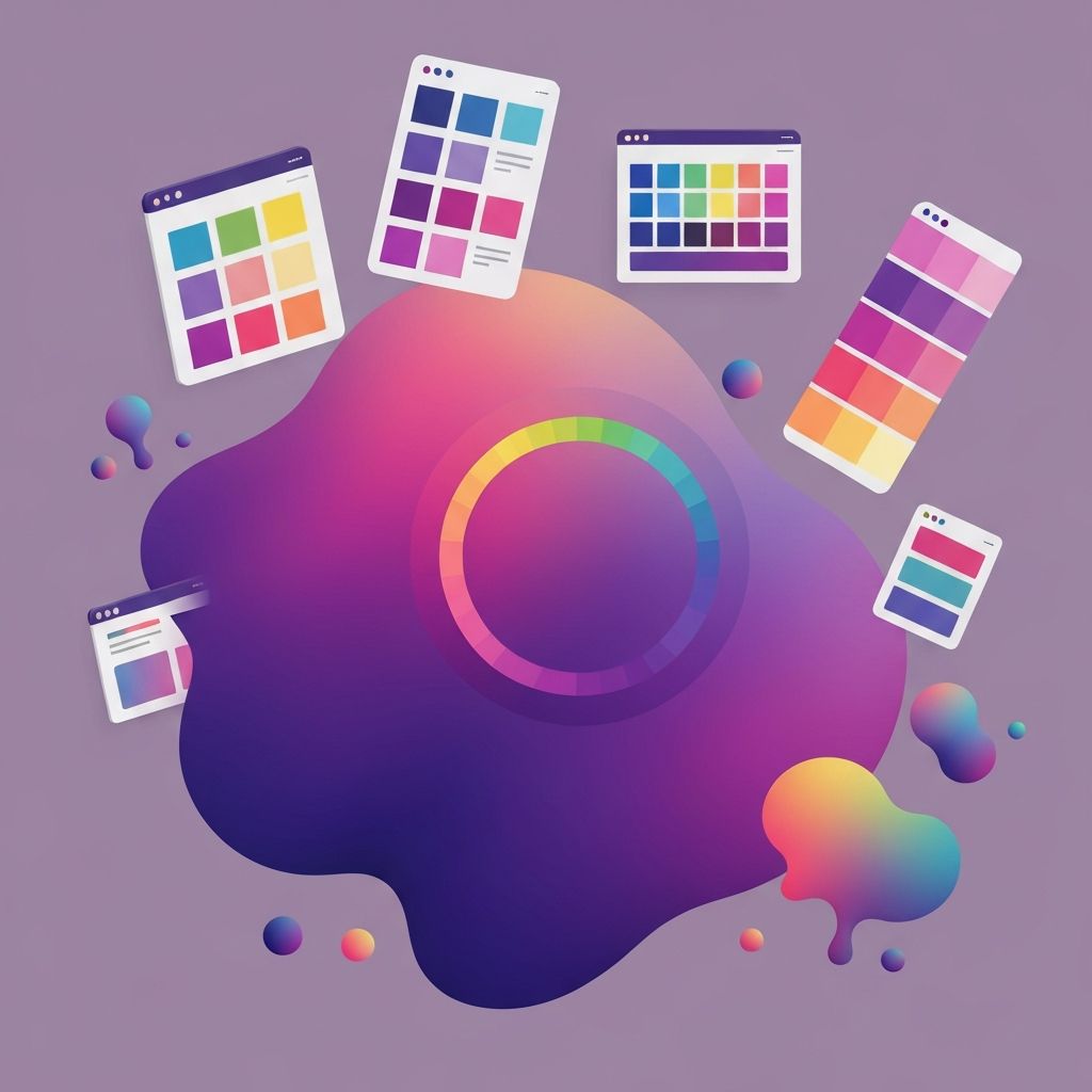
The Anatomy of a Web Color System
A modern web color system has more than three colors. It typically includes a primary brand color, one or two accent colors for emphasis, a neutral scale of grays for text and surfaces, a set of semantic colors for success, warning, and error states, and a small set of dedicated background and foreground tokens. Each token earns its place by representing a specific decision rather than a specific shade. When the primary brand color shifts in the future, every token consumer updates automatically.
Color Theory Without the Lecture
You do not need a fine arts degree to use color theory. The basics are enough. Complementary colors, those opposite each other on the color wheel, create high contrast and energy. Analogous colors sit next to each other and feel harmonious. Triadic schemes rely on three colors evenly spaced, producing balanced vibrancy. Monochromatic palettes use a single hue at varying lightness and saturation, projecting calm sophistication. Pick the strategy that fits your personality and stick with it consistently across the entire site.
Hierarchy and Attention
Color is the loudest tool in your hierarchy toolkit. Use it sparingly to direct attention. The primary call-to-action button should usually be the brightest, most saturated element on the screen. Reserve secondary colors for less critical actions, and let the rest of the page rest in calm neutrals. When everything is colorful, nothing is. The most conversion-focused websites are surprisingly restrained, deploying their accent only in the moments that matter.
Accessibility and Contrast
Color accessibility is non-negotiable. The Web Content Accessibility Guidelines require a minimum contrast ratio of 4.5 to 1 for body text and 3 to 1 for large text. Test every text-on-background combination with a contrast checker such as the one built into Chrome DevTools or stark.co. Remember that around eight percent of men and half a percent of women have some form of color blindness. Never rely on color alone to communicate meaning. Pair red error states with icons and clear copy so the message survives even in a grayscale rendering.
Light Mode, Dark Mode, and Tokens
Modern users expect both light and dark themes. Plan for both from day one by defining color tokens that pair with their inverse counterparts. A token like background-default points to white in light mode and to a deep charcoal in dark mode. The same applies to text, borders, and surfaces. Implementing this from the start is far cheaper than retrofitting an existing palette later. Tools like CSS custom properties, Tailwind plugins, or Radix Colors make the work approachable.
Cultural and Industry Context
Color carries cultural weight. Red signals luck in China and danger in much of Europe. White means purity in the West but mourning in parts of Asia. Industries also have their own conventions. Healthcare leans on blues and greens to communicate trust and cleanliness. Finance often favors navy and gold to project stability and authority. Be aware of these norms. You can intentionally break them to stand out, but only after understanding why they exist.
Tools That Make Color Decisions Easier
You do not need to invent your palette from a blank canvas. Tools like Coolors, Adobe Color, Khroma, and Radix Colors generate harmonious schemes, test contrast, and export tokens directly into design and code. Save your palette in a single source of truth, document its usage rules, and treat any future change as a system update rather than a one-page tweak.
Testing Color in the Real World
Colors that look gorgeous on a calibrated studio monitor can look muddy on a budget phone. Test your palette across multiple devices, browsers, and lighting conditions. Run user testing with diverse participants and pay attention to whether key elements feel buttoned-up or busy. Measure click-through rates on calls-to-action across color variants. Real-world feedback closes the loop between color theory and color performance.
Final Thoughts
Color in web design is at once the most emotional and the most measurable design tool you have. Build a system grounded in brand personality, structured around tokens, accessible by default, and validated through testing. Use color sparingly to guide attention, generously to express emotion, and consistently to build recognition. With a thoughtful color strategy in place, every other design decision becomes easier and your website becomes unmistakably yours.