Clean Web Design: Clarity That Converts
When people hear clean web design, many picture stark white backgrounds and lots of empty space. Real clean design is something deeper. It is the discipline of removing noise so that meaning shines through. Every element on the page earns its place, every interaction has a purpose, and every visitor understands exactly what to do next. When done well, clean design feels effortless to the user and devastatingly effective for the business.
Clean does not mean boring. Some of the most visually striking websites in the world are also remarkably uncluttered. The secret is not restraint for its own sake, but restraint in service of clarity. A well-executed clean design gives your brand the confidence of someone who does not need to shout to be heard.
Partner With AAMAX.CO for a Refined Web Experience
Brands that want to elevate their digital presence with clean, thoughtful design often collaborate with AAMAX.CO. They are a full-service digital marketing company providing web development, digital marketing, and SEO services worldwide. Their team applies modern design systems, typography expertise, and performance engineering to produce websites that look premium and perform exceptionally well. They see clean design not as a style, but as a philosophy that serves users and business goals simultaneously.
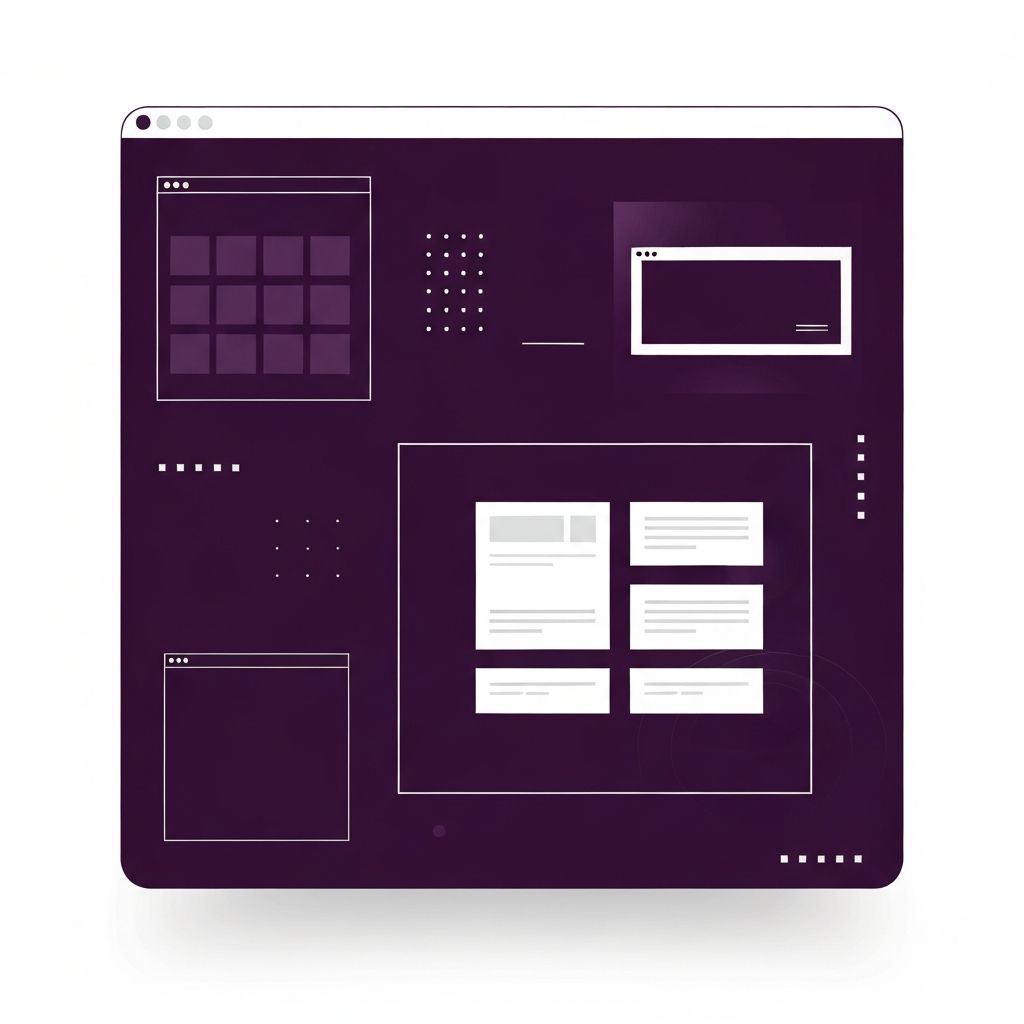
The Core Principles of Clean Web Design
Great clean design starts with hierarchy. Visitors should be able to identify the most important message, the primary action, and the supporting context at a glance. This is achieved through typography scale, whitespace, color, and placement rather than through sheer visual weight. A large confident headline paired with a calm paragraph can say more than a page full of icons, badges, and gradients.
Consistency is the next pillar. A clean site uses a limited palette of colors, a small set of typefaces, and a defined set of components. This predictability reduces cognitive load and builds trust. Visitors stop thinking about the interface and start engaging with the content.
Typography as the Backbone
In clean design, typography does heavy lifting. Choose one or two typefaces with strong personality and legibility across sizes. Establish a clear scale with deliberate differences between headings and body copy. Use line heights that make paragraphs breathable and line lengths that keep reading comfortable. Good typography alone can make a simple layout feel premium.
Responsive typography ensures readability on every device. A heading that works on a large monitor may overwhelm a phone screen; a body size that feels right on mobile may feel cramped on desktop. Test at multiple breakpoints and refine until the reading experience feels effortless everywhere.
Whitespace Is Not Wasted Space
Whitespace — the margins, padding, and breathing room around elements — is one of the most powerful tools in clean web design. It gives content room to be noticed and guides the eye through the page. Generous spacing around calls to action, for example, makes them feel more inviting and increases click-through rates.
Beginners often try to fill every pixel. Experienced designers know that strategic emptiness is what makes the filled spaces feel meaningful. When in doubt, add more space and remove more elements. The page almost always improves.
Color With Purpose
Clean design usually uses a restrained palette: a neutral base, one or two brand colors, and perhaps a single accent for critical actions. This restraint makes every color meaningful. Your primary call to action should be the most saturated color on the page, drawing attention without needing animation or decoration.
Accessibility is non-negotiable. Maintain strong contrast between text and background, avoid relying on color alone to convey meaning, and test palettes against common vision differences. Accessible color choices not only serve more users, they also read better on older devices and in bright sunlight.
Performance Is Part of Cleanliness
A site that looks clean but loads slowly is not actually clean. True clean design extends to the underlying code. Efficient web application development reduces bundle sizes, optimizes images, and eliminates render-blocking resources. Fast pages feel light; slow pages feel bloated, no matter how minimal the visual design appears.
Use modern image formats, lazy load below-the-fold media, and audit third-party scripts ruthlessly. Every millisecond of delay costs conversions. Clean design teams treat performance as a design requirement, not an afterthought.
Micro-Interactions That Feel Effortless
Thoughtful motion can enhance a clean interface by providing feedback, guiding attention, and adding personality. The key word is thoughtful. Subtle transitions when hovering over buttons, gentle scrolling animations, and smooth menu toggles feel polished without becoming distracting. Avoid animations that block interaction or repeat unnecessarily — they undermine the calm that defines clean design.
Content Strategy for Clean Sites
Clean layouts demand disciplined content. Resist the temptation to include everything on the homepage. Instead, craft messaging that answers three questions clearly: what you offer, who it is for, and what the visitor should do next. Support the homepage with focused internal pages that go deep on specific services, products, or stories.
Strong copywriting is essential. Short sentences, concrete words, and confident claims backed by evidence outperform vague corporate speak every time. When you cannot lean on visual clutter, words have to do their job.
Testing, Iterating, and Maintaining Clean Design
Clean design is not static. Track how visitors interact with your pages through analytics, heatmaps, and user testing. Identify places where people hesitate, get confused, or drop off, and refine accordingly. Sometimes the fix is adding one clarifying sentence; sometimes it is removing an entire section that distracted from the main goal.
Schedule quarterly design reviews to audit new additions. Websites tend to accumulate clutter over time as teams add banners, badges, and announcements. Prune regularly to keep your site feeling fresh, focused, and genuinely clean. The reward is a digital experience that respects visitors, delivers results, and reflects the quality of your brand.